
A Century of Colour in Design is design journalist David Harrison’s dazzling anthology of 250 furniture, fabric, lights and decorative objects, illustrating how colour has defined key designs over the last century. This vibrant history will be a discovery for both design newbies and aficionados, broad in scope and filled with everything from classics to eye-catching new pieces.
We spoke to David about his long relationship with Australian and international design, the idea behind A Century of Colour in Design and his thoughts on the future of colour in design.

You have been writing and styling for some of Australia’s best interiors magazines since 1999, how did you go about developing such an extensive knowledge of design and furniture?
In the 1990s I lived in Islington, London. A shop called twentytwentyone opened on the high street selling vintage furniture and lighting along with really interesting contemporary design. It was there that I discovered the brilliance of Charles and Ray Eames and saw the work of British designers Barber Osgerby for the first time. I was hooked and spent many a late night perusing Bonham’s and Christies twentieth century auction catalogues. My knowledge has stemmed from this period of intense discovery and then later from running a design gallery which sold Noguchi lights from Japan and Danish and American furniture from the 1950s and 60s. I also discovered a lot from doing research for my regular Cult Classic page for Inside Out magazine which ran for nearly 20 years.
Your blog, Design Daily, has been praised by designers and creatives from across the globe. Tell us what drew you to this work, and what you like to report on.
The blog was a way of writing about interesting design topics that were outside of commissions that I received from magazines. It allows me to see something exciting or particularly beautiful and write about it. It is a personal exploration of what has come across my desk or what I have seen at design fairs overseas or through meeting and interviewing designers. What I feature can be a new design or a designer retrospective, a building or exhibition – there are no rules as it is just whatever takes my fancy. That’s the beauty of writing your own blog.
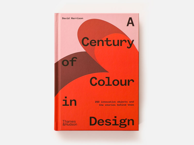
A Century of Colour in Design is your first solo book project. What led you to its concept and how did the book come to life?
The general premise came about through visiting the Milan Furniture Fair (Salone del Mobile) year after year and noticing how the design world was embracing colour more and more. There has literally been an explosion of colour since 2000 and it is growing exponentially. The colour component in a design is critical now where it often wasn’t given much consideration in years gone by – it was usually an afterthought at the end of the design and manufacturing process. Certain designers ALWAYS considered colour as an essential component. This is why there are eight sections in the book that highlight particular designers or design studios that have a major fascination with colour. Four of them are from the past and four are contemporary.
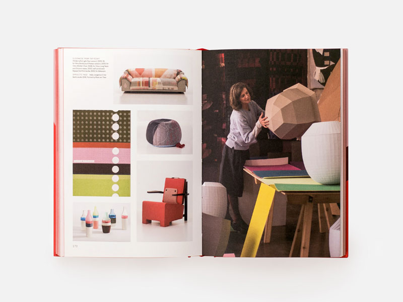
In the introduction to the book, you say that ‘making selections that cover a century of furniture, lighting and other interior design objects is an enormous and somewhat daunting task.’ Aside from of course ‘applying the filter of colour’, what was the process behind the selection of objects?
Of the tens of thousands of objects that fit within the loose area of interior products – lighting, furniture decorative objects and textiles – I selected designs from the past that used colour as an essential part of their overall expression. These have stood the test of time, in that they have often been reissued and are still considered exciting 20, 30 or even 80 years after their original release. I also chose pieces that had used or were currently using colour in innovative or surprising ways. The book is full of these examples.
Was there an object you loved that didn’t make it into the book?
There were many, many objects that I would have liked to include but which there simply wasn’t room for. In addition, there were times where I couldn’t obtain suitable images. After much agonising I am happy with all the products that are included. Some are famous while others are hardly known at all. I tried to get a balance so that it wasn’t all about design classics and I could showcase the huge number of contemporary designs that used colour in highly effective ways.
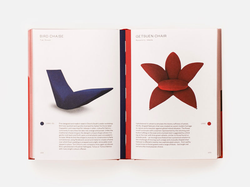
What role do you think colour will play in the next ten years of furniture and interior design?
Colour will be massively important. It is such an emotive thing – without it life is instantly less exciting. Designers already consider colour much earlier on in the design process and this will only become more accentuated as time goes on. Colour choices will become an essential part of the design process with plenty of discussions on exact shades with designers creating their own colours, beyond the industrially available palette, to help express their concept more fully or to deliver a particular emotion.
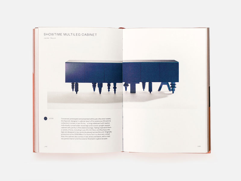
Have you faced many challenges in your line of work since the pandemic begun?
Actually, after being isolated day after day working on the book for a solid six months at the end of 2019 and early 2020, my life is much the same but without a deadline so somewhat more relaxed! For the design world everything has had to go virtual – new product launches, design fairs, talks, everything. It is a shame as these events were often incredibly stimulating and fun but I am sure things will eventually get back to being more immediate and real. It’s hard to capture the true spirit of furniture and interior objects unless its shown in a real space as the environment has such a massive effect on how these objects feel and the type of reactions they create.
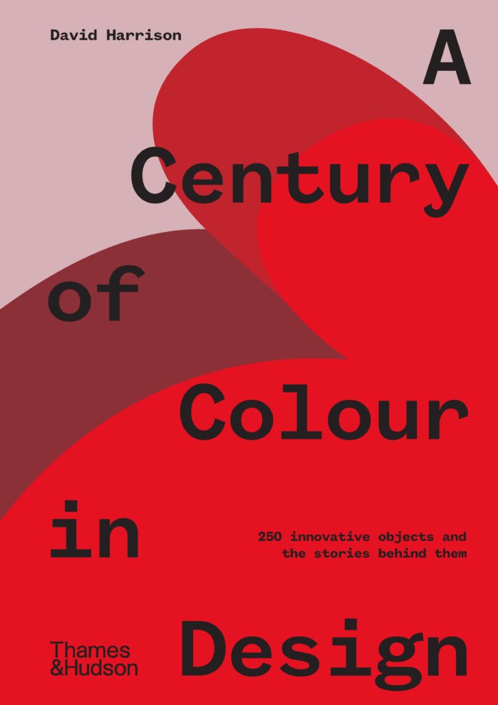
A Century of Colour in Design is available now. Text by David Harrison and design by Evi-O.Studio.
AU$39.99
Posted on October 15, 2020