Posted on

Illustrator Spotlight: Wonder Woman Laura Bernard

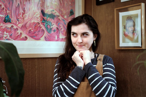
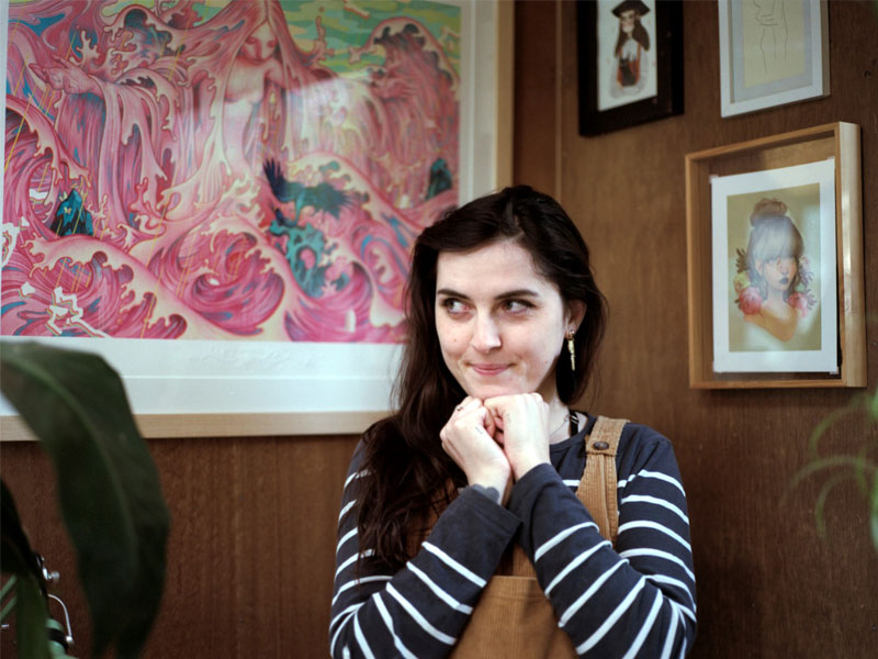
Laura Bernard works from her cosy studio in Wellington, New Zealand. She is a self-confessed nerd, homebody and introvert. Laura has inspired young creatives across the world to ignore the negativity that surrounds a career in illustration and to pursue their passion.

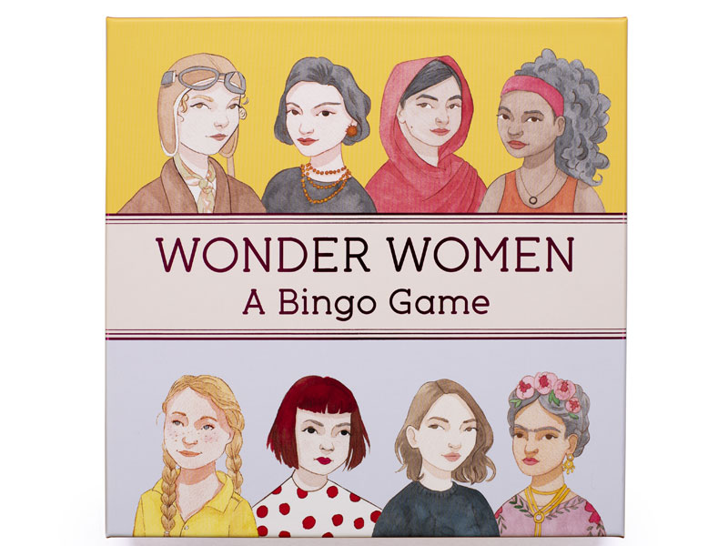
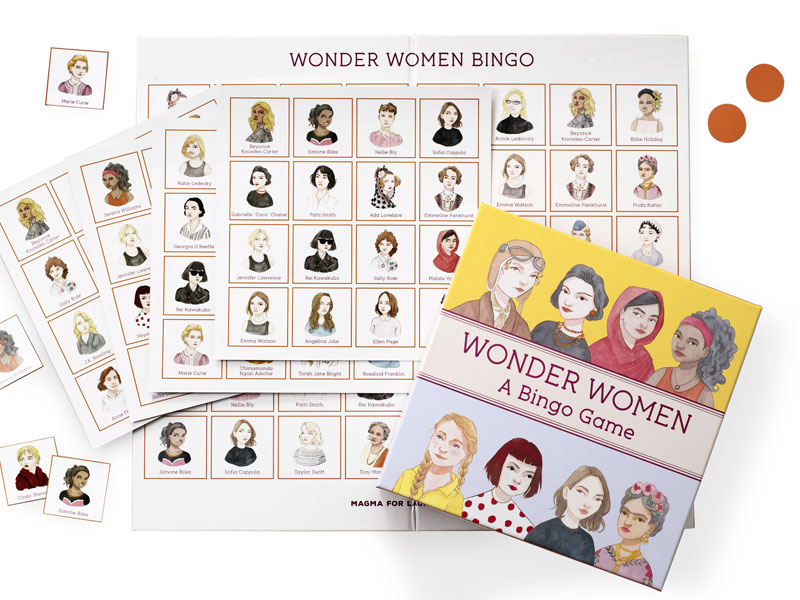
To celebrate the release of Wonder Women Bingo, we caught up with Laura to chat about the game, the female creatives she looks up to and how to stay sane when your home sanctuary becomes your workplace.

Laura Bernard

The illustrations for Wonder Women Bingo are phenomenal. What was your favourite part of working on this project?
Thank you! My favourite part was adding the finer detail to the garments and accessories that the women were wearing: the jewellery, the beaded and embroidered elements and the various patterns. That was so much fun. I feel like that’s one of the main elements that brings these ladies to life and makes them each unique.

Wonder Women Bingo, published by Laurence King Publishing, $29.99

Why do you think it’s important to have a children’s game dedicated to inspirational women?
Too often we are taught the names of famous, genius, amazing men that have achieved great things (Albert Einstein, Isaac Newton, Stephen Hawking, Nikola Tesla to name a few). I think we often forget that there were incredible women who did equally amazing things, but we are rarely taught about them in the same way due to our unbalanced gendered history. Plus, a lot of women had to keep their intelligence a secret or pretend to be a man to be recognised. I think we need a game like this to help balance things out. Hopefully, it can inspire young women and teach them that they can be anything they want to be.

Laurence King Publishing is fortunate to work with a number of fantastic female illustrators like yourself, including Laura Callaghan, Marion Deuchars and Harriet Lee-Merrion. Can you tell us about the female illustrators and creatives that inspire you?
Creatively, I look up to Rebecca Sugar a lot. She created the Steven Universe series and creatively directed a lot of the character design, screenplay and music. She also worked on Adventure Time for a long while. I also admire Jennifer Lee, who is a screenwriter and a head creative at Disney studios. She worked on Frozen and Frozen 2, which are masterpieces for character, background, outfit and song design (all things she helped with).

As a freelancer, do you have any tips for staying sane when working from home? I think we need all the tips we can get right about now!
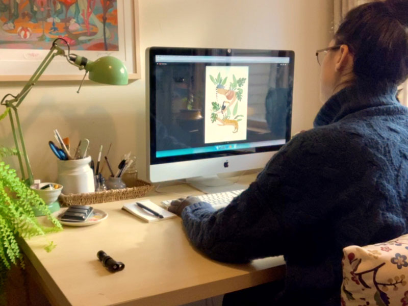
To be honest, being an introvert really helps. I can’t speak for more extroverted people but I love hibernating and working on my illustration. Working and living in the same space can be a huge challenge, so I do have one very helpful tip. I have a studio for my work, and when I am in there I am in ‘work mode’, when I am anywhere else in the house I’m in ‘home mode’. I’ve always used this mentality even before I had a studio and I worked at the dining room table. I would always sit on one chair and work so then that particular space is associated with working. I think that’s a super important thing to define when working from home as too often we work from bed or the couch, which I try to avoid.

Any tips for overcoming creative block?
Oh jeez, this is a hard one. Over the past five or so years that I’ve been freelancing, and where my creativity is my job, there’s that extra pressure to be creative ALL THE TIME. When I’m at a total creative loss and I’ve gone into a creative depression, I generally have a lot of negativity about my own work. I’ve realised that my creative block generally looks and feels the same: a lot of self doubt and self creative pessimism. If I’m telling myself all of these terrible things about my own work, putting it down and comparing it to others, how can I feel proud and happy with the work I’m making? To help break the cycle, I’ll go back to my old sketchbooks from yonks ago and see how far I’ve come. I’ll also look at all of my old random ideas and concepts to give myself a much needed pep talk: Look! These are your ideas and you are creative and awesome! I will then try and learn from my past works and ideas. I think it’s very important to be critical of your own work otherwise you will struggle to grow, but balancing that with self support, encouragement and feeling proud of yourself too.

We can see that you paint in both a traditional medium and digital. Do you prefer one over the other?
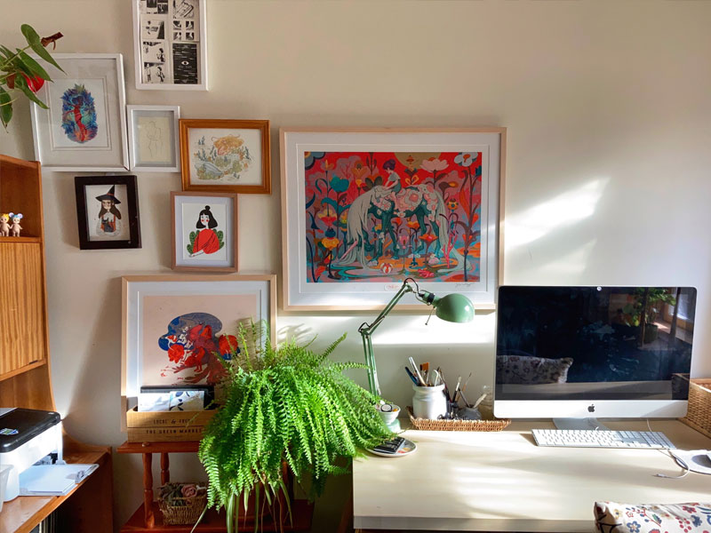
I fell in love with watercolour quite quickly after buying my first set when I was about nineteen. I think it will always be very special to me. I then transitioned into digital to broaden my skillset and I thought it would help me find more illustrating opportunities too, as we live in such a digital age. I think watercolour will always be my favourite medium, however I find digital has helped me grow and learn more as a creative — it’s a very forgiving medium and you are able to undo, flip canvases to check proportions, and change colours so easily: all things that you can’t really do with a traditional medium.

We are obsessed with all the work in your portfolio. Can you tell us about your favourite one?
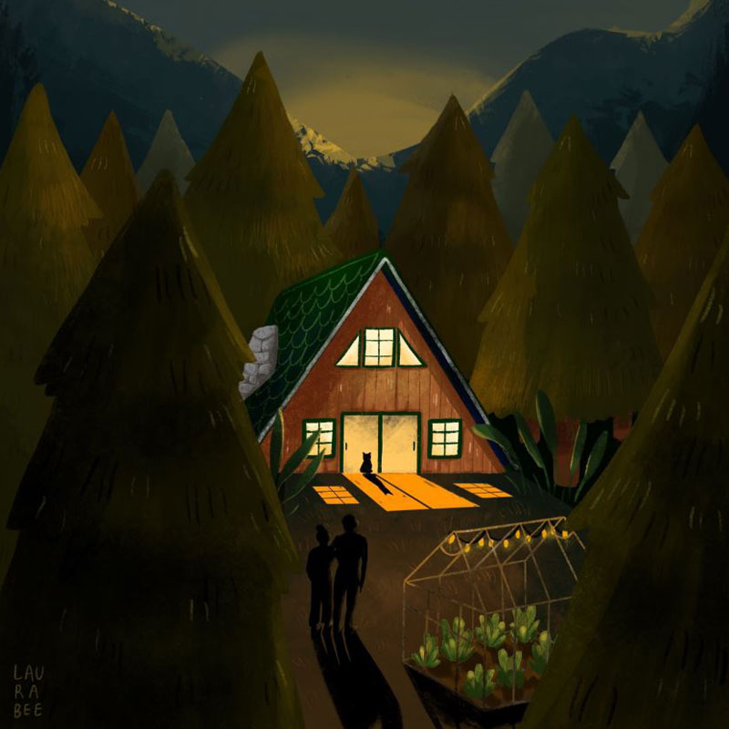
Thank you so much! From my personal works, there’s an illustration of an A-frame house among some trees at night. I am super proud of this and the simplicity of it, but the fact that it still tells a story — a difficult balance. Professionally, I absolutely loved working on the Wonder Women Happy Families card game, and the Wonder Women Bingo. Learning about amazing women in history and having the opportunity to paint their portraits was so inspiring.

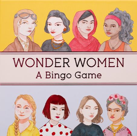
Wonder Women Bingo is out now. Text by Isabel Thomas and illustrations by Laura Bernard.

AU$29.99


Posted on August 7, 2020
Posted on

Complete your creative bookshelf

At Thames & Hudson Australia, we pride ourselves on our ‘museum without walls’, our books which explore every interest and spark creative energy.

Product photography and styling: Jackie Money

Over the coming weeks, we will be sharing our top titles for key interest areas, from lifestyle and architecture books, to activities, puzzles and games.

Complete your creative bookshelf today.

Complete your fashion bookshelf

Run away with the latest fashion bibles.

EXPLORE ➔

Product photography and styling: Jackie Money

Complete your activities collection

Fight boredom with our best activities on bread baking, bingo playing, fortune telling and collage making.

DISCOVER ➔

Product photography and styling: Jackie Money

Complete your lifestyle bookshelf

Discover a heady mixture of our favourite books on topics spanning plant medicine, floristry, home plant care and career advice in the creative industry.

READ MORE ➔

Product photography and styling: Jackie Money

Coming soon…

  • Complete your picture book collection
  • Complete your architecture bookshelf
  • Complete your art bookshelf
  • Complete your interior design bookshelf

Posted on May 20, 2020
Posted on

The art and musing of Ken Done

Playful, vibrant and bold, Ken Done’s artwork is truly one-of-a-kind. In the Ken Done: Painting Australia series, Ken captures his love of the Australian landscape, from the joyful shout of Sydney and the Aussie Beach to the calm beauty of the Outback and Reef.

Scroll through some selections of Ken’s work below, carefully curated from each book and accompanied by his charming commentary.

Story by Jackie Money

SYDNEY

Sailboats on music sheets
The Wednesday Race I, 1980. Oil crayon and ink on paper. ©Ken Done

“The world-famous musician James Morrison is an old friend. He once released an album of music inspired by a number of my paintings. In one song he gave a musical notation to the way I had placed my drawings of yachts in this work, The Wednesday Race. Who could ask for more?”

– Ken Done

Book cover of Ken Done's Sydney
Cover design: Evi-O.Studio
On the cover: White Opera, yellow sky, 1998. Acrylic on canvas. ©Ken Done

BEACH

Sunbakers at the beach
Sunbakers II, 1995. Acrylic on canvas. ©Ken Done

“This work was one of a number I showed in my first exhibition in Paris. The picture of the sunbaker by the famous Australian photographer Max Dupain is one of our most revered images. I’ve made numerous paintings using the iconic form as a graphic device, always with reverence and respect.”

– Ken Done

Book cover of Ken Done's Beach
Cover design: Evi-O.Studio
On the cover: Balmoral I, 1993. Oil and acrylic on canvas. ©Ken Done

OUTBACK

Ned Kelly in a canyon
Nolan canyon, 2019. Oil on canvas. ©Ken Done

“When I look at the Outback, I often think of Sidney Nolan. One of our most influential artists, I was lucky enough to meet and talk with him a couple of times. For me, he will always be the Kelly figure looking at the landscape.”

– Ken Done

Book cover of Ken Done's Outback
Cover design: Evi-O.Studio
On the cover: Postcard from the Bungle Bungle, 2001. Acrylic on canvas. ©Ken Done

REEF

Sea creatures
Drawings of things in the sea, 1993. Oil, acrylic, oil crayon, pencil and ink on canvas.
©Ken Done

“A jelly and a fish. Then a jellyfish. Lots of things you find in the sea. This painting, now in a big Japanese collection, is fun. Some images are tight, and some I’ve played games with. Being underwater should always be fun.”

– Ken Done

Book cover of Ken Done's Reef
Cover design: Evi-O.Studio
On the cover: Zebra fish, 2013. Oil and acrylic on linen. ©Ken Done


Posted on February 26, 2020
Posted on

The First Colour – an extract from Chromatopia by David Coles

In this extract from his new bestselling book Chromatopia, author and master paint maker David Coles looks at the origin of ochre – believed to be the first pigment used to create human artworks.

The oldest human artworks still in existence are vivid depictions of animals, humans and spirits that were created using ochres. There is evidence of their use as far back as 250,000 years ago. Ancient ochre artworks are found all over the world, from the earliest cultures of India and Australia to the famous cave paintings of Lascaux in France.

Naturally occurring iron-containing ochres of the earth provide a wide range of yellow, red and brown colours.

The natural mineral could be collected or dug-up and then simply ground against a harder rock and water added to make fluid. Later civilisations refined this process to include washing the ochre of impurities, drying and then grinding to a fine powder. 

Yellow ochres are an impure form of iron oxide called limonite. They can also be roasted to produce other hues

by placing on a fire or in an oven. A moderate heat turns the yellow to orange; stronger heat makes the colour turn red. These roasted red ochres are often called ‘burnt’ (for example, burnt sienna). Naturally occurring red ochres are richer in anhydrous iron oxide called haematite. They also vary widely in shade, hue and transparency.

There are many earth pigments whose specific colour comes from natural mineral admixtures. The pigments known as ‘umber’ contain iron plus manganese oxide that lends a greenish hue. Iron-oxide-free earths are not strictly ochres, but it is important to include them here as their use alongside the true ochres is significant throughout history; white earths from pipe-clay, black earths of manganese and the light green pigment terre-verte (green earth) from mineral celadonite.

Text © David Coles from CHROMATOPIA, published by Thames & Hudson.

Photographs © Adrian Lander

Chromatopia by David Coles is out now.  AU$49.99

Posted on September 7, 2018