Posted on

A Q&A with Kim Walvisch, author of The Burbs

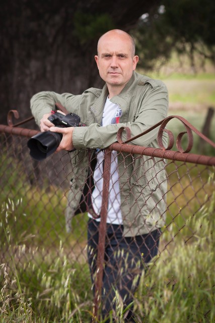
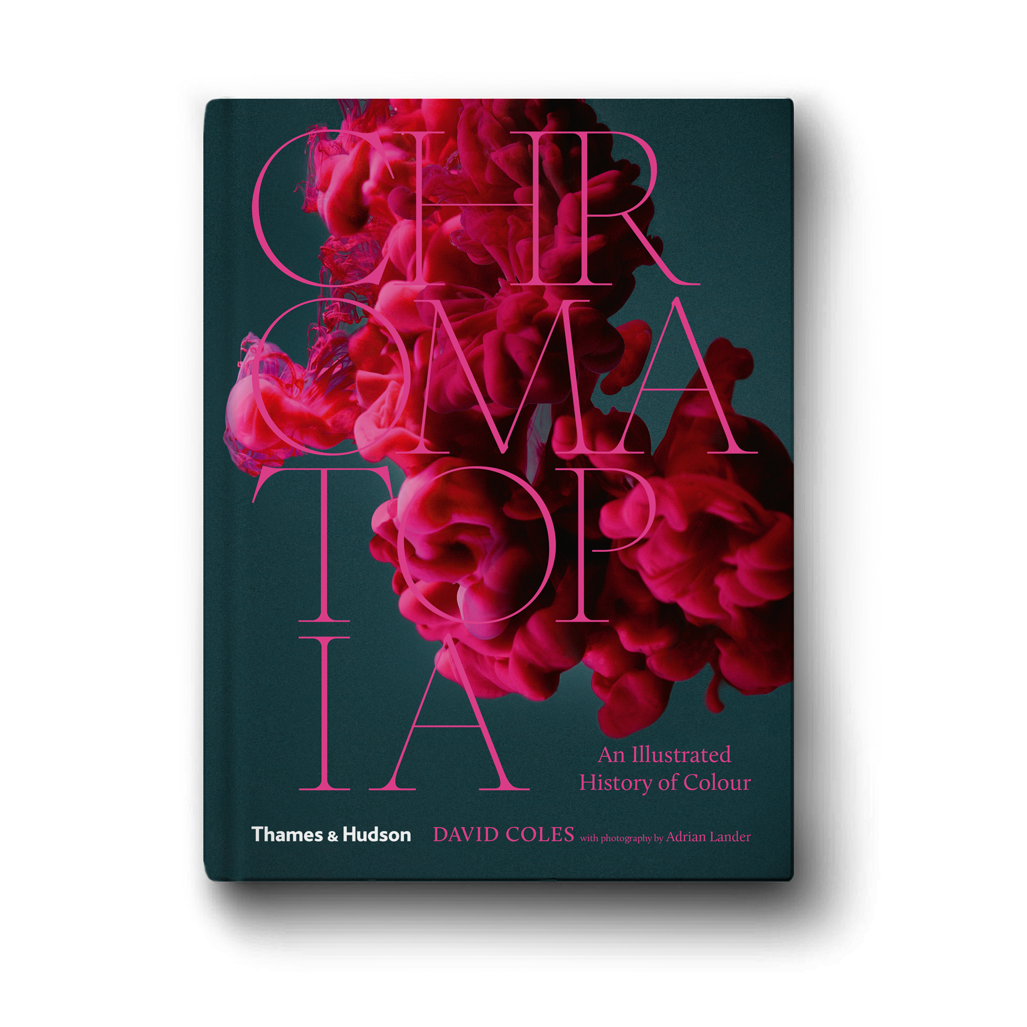
We spoke to Kim Walvisch about her new book, The Burbs: A Visual Journey Through the Australian Suburbs 

How did you start as a photographer, and what was your inspiration to create the @sublurb Instagram account?

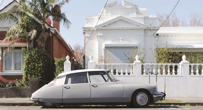
My daughter was an atrocious sleeper and the best way to get her to nap was to go on long walks around the local streets. Sometimes I’d walk for hours and, to keep myself occupied, I started taking photos of things that caught my eye – weird gardens, unusual chimneys, unique fences, peculiar letterboxes and other odd suburban details. I decided to start sharing those photos on Instagram to my account @sublurb and, after a number of years, I built up quite a loyal following of people also interested in suburban curiosities. Whenever I left the house to push Peggy in her pram, I’d also take my camera. I started travelling to suburbs all over Melbourne and photography became a serious passion. I decided to create an archive of what the Australian suburbs looked like before there was so much architectural development. I was keen to capture old-school suburbia before it vanished.

Who are your favourite photographers?

I’m a huge fan of American photographer William Eggleston and his use of colour. I’m crazy about Stephen Shore and his shots of banal scenes across the States: lots of old cars, parking lots, storefronts and that kind of thing. Joel Sternfeld takes photos in a similar vein, same with Fred Herzog. I’m basically a huge fan of colour photography of mundane or ordinary subject matter and the places we live.

What draws you to photographing homes?

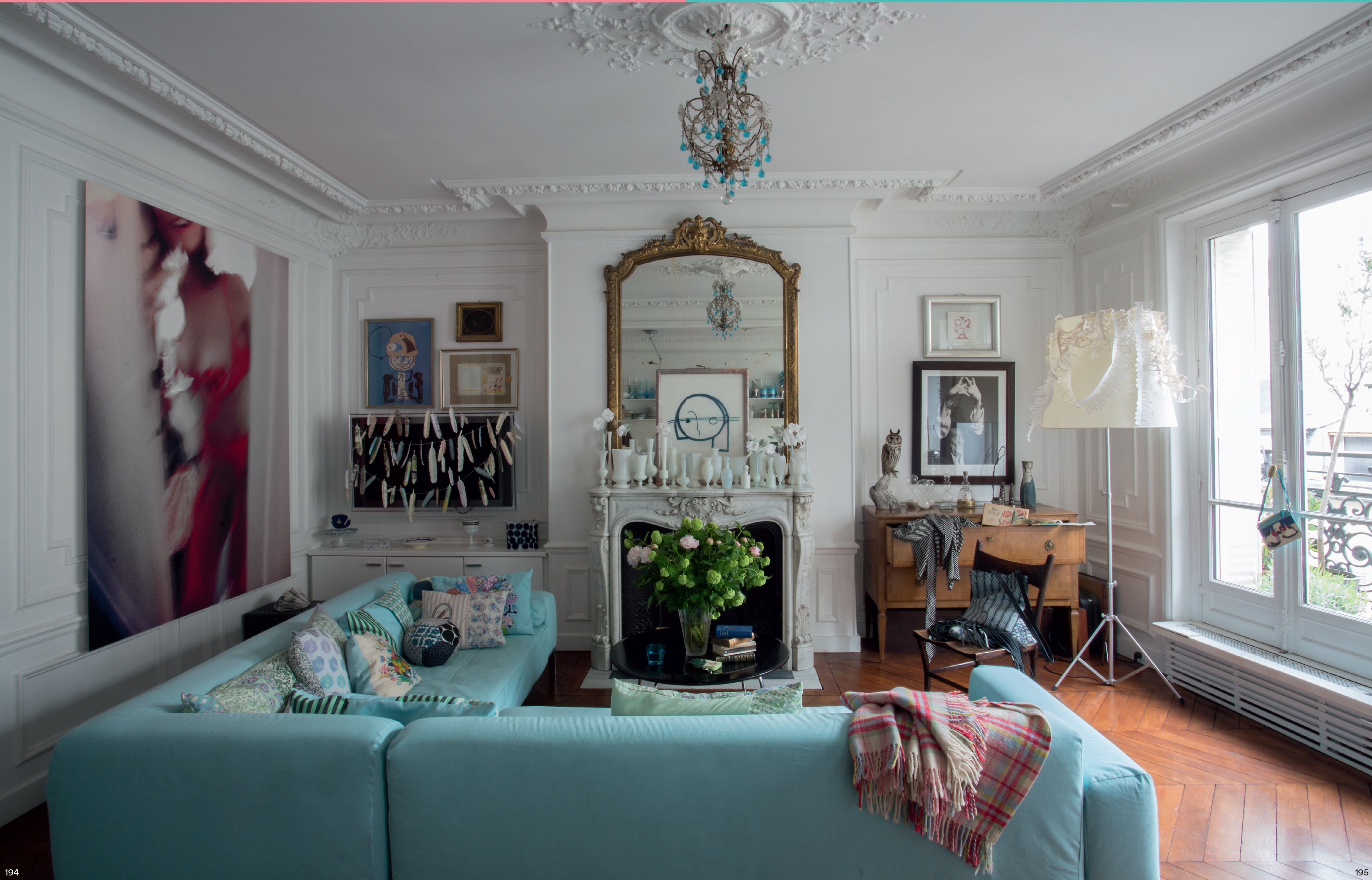
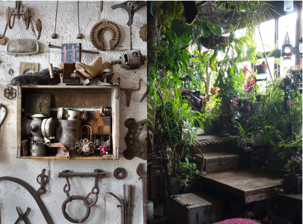
A few things. I definitely appreciate certain styles of architecture, such as art deco and mid-century modernism, so I’m attracted to houses that reflect those eras. I also like unusual architectural detail that might appear on simpler postwar houses – ornate chimneys, stair railings, fancy brickwork – special touches that would have been made by brickies and other thoughtful tradesmen. I feel like a lot of housing today just doesn’t reflect the same level of technical skill, so I’m always on the lookout for those stand-out details. I’ve seen a house where the chimney is shaped like a large jug. Apparently, the owner was a wine connoisseur and had this detail built in especially. I love that kind of thing. Sometimes the ‘plain Jane’ houses have very special touches.

What is it that draws you to the buildings you photograph?

I’m looking for buildings with personality. I like imperfection, dilapidation, obvious signs of ageing. I like to capture buildings that might imminently disappear. I’m also a huge fan of symmetry, so I love houses that have symmetrical gardens or old matching chairs on the porch. Peculiar buildings intrigue me too. I’m looking for homes, buildings or gardens that convey the occupant’s eccentricities.

What was the biggest challenge you faced in creating The ’Burbs?

Deciding what pictures to include! I literally had thousands of shots, so it was really hard narrowing it down to a number that could be featured in the book.

How long did the project take?

I’ve been accumulating photos for about seven years now and was always hopeful a book project would arise. Thankfully, Thames & Hudson gave me the opportunity to share my shots with a larger audience.

This is your first book. What have you most enjoyed about the process of creating it?

I’ve found the whole process pretty fascinating. My first ever job was in a bookshop and I’ve always had a bit of a dream of creating my own book. I had no idea the publishing world moved so slowly, so it’s definitely been an exercise in patience! I enjoyed working alongside the designer and seeing the pages come to life. The most exciting moment was going into the Thames & Hudson offices and flicking through the advance copy. It was like holding a baby for the first time!

Kim Walvisch has been steadfastly documenting Melbourne suburbia for the past five years. Her Instagram account @sublurb now has more than 13k followers. She has taken photos in more than 100 suburbs and created a nostalgic archive of how things looked before the takeover of development. 


Posted on December 12, 2018
Posted on

Bohemian Living: An interview with the author

  • On Creating Authentic Spaces Full of Verve and Vitality with Juliette Arent and Sarah-Jane Pyke
  • Read an Extract from The Conversation's Latest Book of Essays: Long COVID should make us rethink disability and the way we offer support to those with ‘invisible illness’
  • The Contemporary, Textural and Colour Oriented Work of Yvette Coppersmith
  • Christmas Gift Guide 2022


‘Everyone lives in a bubble, so why not make it a beautiful bubble.’ – Gavin Brown
An interview with the creator of Bohemian Living


Bohemian Living by acclaimed Australian photographer and writer Robyn Lea features the homes of 20 accomplished creatives from Australia, Europe and the USA and celebrates what it’s like to live a uniquely creative life. In each artist’s profile, Robyn explores their often unusual childhoods and often unorthodox adult worlds, asking what does it mean to be bohemian in the modern world.  

We spoke to author Robyn Lea and her editor Kirsten Abbott about this visually stunning and thought-provoking new book.


Robyn, firstly, congratulations on this, your new book. It is stunning to behold and the stories behind your pictures are a delight. They are insightful, curious and sometimes sad – providing such texture to the artists’ homes and deep insights into their styles. This is a book that feels very personal to read. How did the project take shape for you?

When Kirsten Abbott from Thames & Hudson Australia called me to discuss this concept, I was immediately attracted to the idea. I’ve always loved writing about art. When I studied at RMIT, I did some journalism subjects and I’ve always had a deep interest in understanding why people are who they are. This book really allowed me to explore that question and feed my curiosity. More than any other book I’ve done, I think this book has a broad appeal. The diversity of the artists, their interests and their backgrounds will speak to many different people.

I know you as an acclaimed photographer; I think everyone who reads this book will agree that you are a beautiful writer too. You clearly love words as much as you do pictures. How did you start writing and what do you enjoying reading?

I started writing regularly when my husband and I moved to the US with our children in 2011. The country was just beginning to regain a little confidence after the global financial crisis, but local agents weren’t putting on new photographers, and photographers were not getting as much work. So it was quite a hard time to be there. In an effort to stay sane and feed myself creatively, I called interesting people in New York and asked them if I could interview and photograph them. Surprisingly, given I did not have a writing CV, most of them said yes. I then found a magazine that printed my stories. Each time I created a new feature, the process got a little easier and over time my confidence in interviewing and writing began to grow.

In regard to books I enjoy, well, I certainly love art and design books. Two of my favourite books, which I purchased in the 90s,are The English Archive of Design and Decoration and The French Archive of Design and Decoration, both published by Thames & Hudson. I also love biographies and autobiographies and prefer those written about women. Favourites include Personal History by Katharine Graham and Indira: The Life of Indira Nehru Gandhi by Katherine Frank.


What prompted the idea of the book initially?

Kirsten: I am quite a maximalist and I wanted to see a book that celebrated maximalist, eccentric interiors with real people and the way they create a space with meaning.

How did you select your list of people to interview and photograph?

Robyn: It started out as a very long list of artists whose work I felt drawn to. I took the list to Kirsten and we narrowed it down together. Then I would dive into some more research on each person – looking deeper into their work, their lives and how they viewed the world. Logistics, of course, also played a par tin the final selection – how many weeks I would be in a country, for example,and who was available at that time. As I got into it, I also found that one interview led to another, that the artists would recommend others in their networks, or people they admired.

Your eyes light up when you talk about research, Robyn!

Yes, I do love research, it stimulates the grey matter and forces you to consider things from other perspectives. Trying to understand someone’s point of view when it’s different to your own experience can be fascinating and it can even be transformative. This project did that for me and I hope it will for others too. .

Were there any themes that emerged during this project?

Robyn:  Ah, yes, as I wrote in my introduction, I’ve always thought of my camera as a magic key, a key to adventure and key to connecting with people. What was interesting was that the motif of the key also came up in the work of a few artists I interviewed and that they also felt drawn to a symbol of a key, a key that connected them to different worlds.

What was the was the most challenging part of this project?

Robyn:What was surprising, and what emerged as a major theme, was how much significance there was behind the interiors: that these homes really weren’t designed for the approval of others, or to be sold, but as a personal extension of self and artistry – like living visual diaries. As I started to understand this, I realised that the artists’ homes told me so much about their dreams, their troubles, their hopes, their heritage and their families.

Artist Gavin Brown said to me: ‘Everyone lives in a bubble, so why not make it a beautiful bubble.’ This really resonated with my experience on this project, as one of the most attractive themes I experienced was a shared sense of joy. Modern life is busy and domestic life can really weigh you down; it can be very monotonous and mundane. I found a lot of the artists worked to maintain the joy in their homes and their lives.

What was the most challenging part of this project?

Robyn: Well, for me it was writing the first paragraph of the introduction! I drafted it a number of times, but it just never seemed right. It was only after I saw the final book cover design by Daniel New, with the concept of the key, that everything clicked, or should I say unlocked. I’ve always thought of my camera as a magic key – a key to adventure and key to connecting with people. It made perfect sense to open the introduction with that concept. What was interesting was that the key motif also appeared in the work of several of the artists, including Annabelle Adie and Barnaba Fornasetti.

Page Stevenson

After interviewing so many fascinating people, what tips, or insights do you have for others who would like to emulate bohemian style?

Robyn: That is good question, as all of the artists were truly unique, but if I had to outline some commonalities I would say:

  • Follow your heart, not trends
  • Celebrate colour
  • Collect on your travels
  • Showcase your obsessions
  • Decorate with passion and personal meaning

Bohemian Living is available now and features the lives and times of artists including Barnaba Fornasetti, Joshua Yeldham, Simone Bendix, Helene Schjerbeck, Greg Irvine, Gavin Brown, Peter Curnow, Claire Guiral and many more.

More about Robyn Lea

Robyn Lea is an acclaimed photographer, writer and director whose work has been published in Elle Décor UK, The New York Times, Vogue, Architectural Digest, Wall Street Journal and The New Yorker Magazine amongst many others. She is the bestselling author of Dinner with Jackson Pollock: Recipes, Art and Nature and Dinner with Georgia O’Keefe: Recipes, Art and Landscapewww.robynleaphotography.com

Robyn Lea and Kirsten Abbott

Posted on November 21, 2018
Posted on

For the love of gardening: a Q&A with Simon Griffiths

To celebrate the publication this week of the stunning Garden Love, we caught up with photographer, gardener, dog lover and bestselling author Simon Griffiths, to discover a little more about his fabulous new book, his approach to photography, how he got started and, of course, dogs, plants and country gardens.

How did you first start as a photographer, and what was your earliest inspiration?

I got my first camera when I was about 5 years old – a funny plastic ‘Diana’ camera, but it used real film, and I was hooked. At school I was good at art and science, and I suppose that’s why I was drawn to photography, as it’s that creative mix of both. After high school, I went to study photography at RMIT, which is still probably considered one of the best photography courses in the world.

Who are your favourite photographers?

I love Eugène Atget, a French 19th-century photographer, who was one of the first people to photograph gardens. His work documented French streetscapes and gardens around Paris, and also the French people. His body of work is still amazing all these years later. He had special times of the year when he would shoot gardens, such as when the buds were just about to burst in spring, which he said made the trees glow. He created stunning images, all on an early plate camera.

Jardin [du] Luxembourg (Luxembourg Gardens); Eugène Atget, French, 1857 – 1927; Paris, France, Europe; 1902 – 1903; Albumen silver print; Image: 17.5 x 22.1 cm (6 7/8 x 8 11/16 in.); 90.XM.64.54
Eugène Atget [No restrictions or Public domain], via Wikimedia Commons

John Dugdale is another photographer whose work inspires me. His beautiful still lifes and portraits are shot on a plate camera and printed using early photographic techniques. They have a quiet, fragile beauty to them, which is different to the clinical properties of digital photography.

How many books have you been involved in, and do you feel that the process has changed at all?

I have worked on over 70 books now. They really are a passion of mine and I have been lucky enough to travel all over the world shooting for different authors and publishers. Garden Love is the fourth book I have both written and photographed.

The process has changed a lot over the years. I used to shoot on film and it was always stressful to be travelling with 400 or 500 rolls of film and going through x-ray machines, worrying the film would be damaged. Digital is fantastic and has helped free up the creative process for me: I can shoot as many images as I want as there is no film budget now for books. When I started, the books I worked on had a limited number of colour photographs, with many still printed in black and white, as printing in colour was much more expensive. Now there seems to be no limitation to the number of photographs a book can contain.

What draws you to photographing plants and gardens?

I’m a gardener at heart, so I approach shooting gardens from that perspective. I’m interested in plants, in how they grow and in documenting that. You can learn something from every garden you visit. It might be a colour combination or a plant you have never seen before, or it might be the way a gardener has grown a plant, pruned or shaped it. If you lived for 1,000 years, you would still not learn everything about gardening and that’s what fascinates me. And when I’m not photographing gardens, I’m gardening at home.

What is your favourite part of your own garden?

I love the topiary in our garden – the Buxus (English box) shapes I have been clipping for 10 years now, which act like punctuation marks in the garden in the same way that full stops or exclamation marks complete a sentence. The topiary gets clipped twice a year and helps give the garden structure. I actually think I might add some more as it’s very effective.

Was there anything uniquely Australian that connected all of the gardens in the book?

Yes – all the incredible stories the garden owners had about snakes and other garden critters. One gardener, who thought she had picked up the garden hose, had actually picked up a snake. And nearly all the garden owners had stories like it. Gardening in Australia is a difficult process – we have a climate of extremes, and lengthy periods of drought – and you could only be in Australia with all those snake stories.

What inspired you to feature the dogs (and other animals in your new book)?

The dogs and cats or other animals we choose to surround ourselves with become part of our gardens, bringing them to life – they are as much a part of the garden as the plants themselves. I have two whippets and our garden wouldn’t be the same without them. Animals bring life and warmth to a garden.

If there was one garden from Garden Love that you would like as your own, which one would it be?

I have to say probably ‘Foss’. It’s a really magical place, and you always feel great whenever you wander around the garden there. It’s six parts magic, four parts garden. Last time I was there, the Manchurian pear trees were in flower, and it was incredible. The blossom was so thick on the trees, it was like walking through a large white fluffy cloud.

Plants, Dogs and Country Gardens … what else do you need to add to the list, for complete happiness?

A cottage and books, then life would be perfect.

Garden Love, priced $59.99, is available now in all your favourite book shops across Australia.


Posted on September 27, 2018
Posted on

John Russell and Vincent Van Gogh

John Russell was a close friend of Vincent van Gogh and Auguste Rodin, taught impressionist colour theory to Henri Matisse and dined with Claude Monet.  Watch this fascinating short video to learn a little more about the particular bond he shared with Van Gogh.

John Russell: Australia’s French Impressionist has been published by the Art Gallery of NSW to accompany the exhibition of the same name which runs until November. 

Bringing together 120 paintings, drawings and watercolours – including a number of works by his contemporaries – this major retrospective is the first survey of Russell’s work in 40 years. It offers fresh perspectives on French impressionism, reintroducing Russell’s extraordinary painting to today’s audiences.

John Russell: Australia’s French Impressionist by Wayne Tunnicliffe

Posted on September 21, 2018
Posted on

Wild Land, a journey into the Earth’s last wilds

Four years in the making, this is one of the most ambitious travel stories of our time.

Wild Land is an epic and unprecedented portrait of some of the most untouched parts of our planet, and a timely message highlighting the urgent need for them to be preserved for the future of the planet, and a future on which humankind’s very survival is dependent.

The video below shares the story of the inspiration behind Peter and Beverly Pickford’s quest to find the last remaining wild lands on each continent, as well as some of the stunning images they created on their journey.

Wild Land by Peter and Beverly Pickford

Posted on September 14, 2018
Posted on

The beautiful Southern Highlands of New South Wales

Author Jaqui Cameron on the unique appeal of the Southern Highlands of NSW, and its community.

I am not a horticulturist. At this point in my life I am barely even a gardener, but I grew up with a large country garden and understand the dedication such a space demands. Having lived on a farm in the Southern Highlands with my young family for nearly a decade, growing and selling trees, I have come to know the dedication and passion of garden owners in this area. I also know that every garden comes with a tale as unique as its design and I’m incredibly inquisitive – some would say nosy! I love writing, I love a good story and I have always loved a great romance.

Over the years I have learnt that the Southern Highlands is an area with a gardening history as rich and deep as the local soil. Well known for its beauty, it has long attracted garden enthusiasts because the climate provides the opportunity to celebrate the beauty of a garden across the four distinct seasons. What is not so well known is the extraordinary variety of gardens that exist across the region, nor that it can deliver four seasons in a single day, with a clear summer morning quickly transformed by a thick wintry mist rolling in.

I have spent countless happy days driving along the quiet village streets and country laneways of the Southern Highlands, looking over gates and hedges, desperately trying to get a glimpse of whatever hidden gem might lie beyond.

I have met a wonderfully eclectic community of gardener owners, garden specialists and artists, and I have been lucky enough to visit some of the most breathtaking landscapes. I have found the beauty and the very personal love affairs people have with their gardens inspiring and delightful, and with each new discovery the idea to create a book telling the stories behind Southern Highlands properties began to grow. I wanted to uncover hidden, previously unseen gardens and explore the passions of the owners who had dreamt and worked hard to create their own private oases. My challenge was to find these private gardens and convince their owners to allow me to share their stories.

That’s where the strength and generosity of the local community came to the fore. It quickly became evident to me that there is no ego in a garden. At each site I visited, the owner would recommend another garden they considered to be an equal, if not grander, triumph with its own amazing story.

This serendipity led me to the wonderful characters, beautiful gardens and amazing stories that fill this book. I was overwhelmed with suggestions and never disappointed.

Beyond the Garden Gate, by Jaqui Cameron 

You never can tell what lies beyond the garden gate.

Text © Jaqui Cameron, Photography © Sue Stubbs


Posted on September 7, 2018
Posted on

The First Colour – an extract from Chromatopia by David Coles

In this extract from his new bestselling book Chromatopia, author and master paint maker David Coles looks at the origin of ochre – believed to be the first pigment used to create human artworks.

The oldest human artworks still in existence are vivid depictions of animals, humans and spirits that were created using ochres. There is evidence of their use as far back as 250,000 years ago. Ancient ochre artworks are found all over the world, from the earliest cultures of India and Australia to the famous cave paintings of Lascaux in France.

Naturally occurring iron-containing ochres of the earth provide a wide range of yellow, red and brown colours.

The natural mineral could be collected or dug-up and then simply ground against a harder rock and water added to make fluid. Later civilisations refined this process to include washing the ochre of impurities, drying and then grinding to a fine powder. 

Yellow ochres are an impure form of iron oxide called limonite. They can also be roasted to produce other hues

by placing on a fire or in an oven. A moderate heat turns the yellow to orange; stronger heat makes the colour turn red. These roasted red ochres are often called ‘burnt’ (for example, burnt sienna). Naturally occurring red ochres are richer in anhydrous iron oxide called haematite. They also vary widely in shade, hue and transparency.

There are many earth pigments whose specific colour comes from natural mineral admixtures. The pigments known as ‘umber’ contain iron plus manganese oxide that lends a greenish hue. Iron-oxide-free earths are not strictly ochres, but it is important to include them here as their use alongside the true ochres is significant throughout history; white earths from pipe-clay, black earths of manganese and the light green pigment terre-verte (green earth) from mineral celadonite.

Text © David Coles from CHROMATOPIA, published by Thames & Hudson.

Photographs © Adrian Lander

Chromatopia by David Coles is out now.  AU$49.99

Posted on September 7, 2018
Posted on

Botanical Treasures from Cook’s First Voyage

This is the first full-colour publication of some of the most extraordinary botanical prints of the 18th century. Banks’ Florilegium is not only a great scientific record, but also a major achievement of collaborative Enlightenment art, and a work of botanical illustration of outstanding beauty.

Joseph Banks accompanied James Cook on his first voyage around the world between 1768 and 1771. A gifted and wealthy young naturalist, Banks collected exotic flora from Madeira, Brazil, Tierra del Fuego, the South Pacific, New Zealand, Australia and Java, bringing back over 1,300 species hitherto unknown to science.

On his return, Banks commissioned over 700 superlative engravings as a scientific record. Known collectively as Banks’ Florilegium, they are some of the most precise and exquisite examples of botanical illustration ever made – yet they were never published in Banks’ lifetime.

The present selection has been made from a unique limited colour edition of the prints, with expert botanical commentaries provided by Professor David Mabberley. Mel Gooding describes the Endeavour voyage and the making of the Florilegium. An afterword by Joe Studholme outlines the history of the modern printing.

Mel Gooding is an art historian, writer and curator. He has taught at Edinburgh and Wimbledon Schools of Art, among others, and contributes regularly to the art press.

Professor David Mabberley has served as Executive Director of the Royal Botanic Gardens and Domain Trust in Sydney. He is an Emeritus Fellow at Wadham College, Oxford, Adjunct Professor at Macquarie University, Sydney, and Professor Extraordinary at the University of Leiden, The Netherlands.

Joe Studholme co-founded Editions Alecto and undertook the printing of Banks’ Florilegium from the original copper plates between 1980 and 1990.

‘Splendid … much to enjoy for the general reader’
Apollo

‘A stunning piece of history, art and botany in one’
The Field

‘This magnificent modern compilation is quite breathtaking in its beauty and detail’
This England

‘Beautifully crafted and lovingly presented … a joy to behold’
The Garden, Royal Horticultural Society’s magazine


Contents List

The Making of Banks’ Florilegium I: The voyage of Endeavour, Mel Gooding • The Plates, David Mabberley • The Making of Banks’ Florilegium II: The Florilegium, 1772–1990, Mel Gooding • The Modern Printing of the Florilegium, Joe Studholme


Specifications

Format:Hardback with tipped on colour plate to front board (without jacket)

Size:35.5 x 26.5 cm

Extent:320 pp

Illustrations:181

Publication date:19 October 2017

ISBN:9780500519363


Posted on July 16, 2018
Posted on

Chanel: A Fashion Icon

Ever since his first show for the house in 1983, Karl Lagerfeld’s Chanel collections have consistently made headlines and dictated trends the world over. For the first time, the key looks of every Chanel collection ever created by Lagerfeld are gathered in a single volume, offering a unique opportunity to chart the development of one of the world’s most influential fashion brands and rediscover rarely seen collections.

This definitive publication opens with a concise history of the house of Chanel, followed by a brief biographical profile of Karl Lagerfeld. It goes on to explore the collections themselves, which are organized chronologically and introduced by a short text unveiling each collection’s influences and highlights.

Each collection is illustrated with carefully curated catwalk images, showcasing hundreds of spectacular clothes, details, accessories, beauty looks and set designs – and of course the top fashion models who wore them on the runway, from Claudia Schiffer and Linda Evangelista to Kate Moss and Cara Delevingne. A rich reference section, including an extensive index, concludes the book.


Posted on July 16, 2018
Posted on

Pitch Perfect

Man about town and author of Saturday Night Fever Pitch Simon Doonan introduces five charismatic geniuses who changed footballer fashion forever.

Footballers exist for our vicarious pleasure. We ordinary mortals might not be winning trophies, growling through the streets in a Lamborghini Aventador, or executing bicycle kicks, or wearing $800 Saint Laurent jeans, or zipping about on private planes snuggling under Hermès blankets with top-shelf tottie, or pouring artisanal tequila down our throats, but somebody sure as hell better be doing it. In their strange meteoric footballing lives we need to see all our hopes and fantasies distilled and writ large, exploding and imploding.

George Best


The wage cap was officially lifted in 1962, and suddenly British footie players began coining it. They became part of the Swinging Sixties and began to live like rock stars, or at least to aspire to. Chief among them was raven haired stallion and Manchester United winger, Mr. George Best, the guy the press dubbed The Fifth Beatle, the guy who famously declared, “I spent a lot of money on booze, birds and fast cars. The rest I just squandered.”

Paul ‘Gazza’ Gascoigne 


In the 90s men’s designer fashion went global, and footballers were first in line: ‘I went out and bought ten Versace suits – but in all the brightest colours…and I got my hair bleached. I can’t remember why. It must have seemed like a good idea at the time.’ Thus spake footballing folk hero Paul Gascoigne, “the most naturally gifted footballer of his generation” and the poster child for footballer excess, and post-retirement struggles.

David Beckham 


In 2001, David Beckham, complete with Mohawk, appeared on the cover of The Face, the now-extinct bible of fashion esoterica, thereby achieving something unprecedented for a footballer: complete fashion legitimacy. No longer just a consumer of clothing and a popularizer of blokey trends, Becks becomes a bona de inspirational icon of cool. In the subsequent decade Beckham took his cool and his fashion legitimacy and made it into a brand that could sell anything from Brylcream to undies. Especially undies.

Mario Bolatelli


It’s just ‘andbags. In the 21st Century metrosexual footballers like Italian national Mario Bolatelli take their accessories very seriously. Carrying the latest Gucci or Louis Vuitton washbag into the changing room becomes an important moment of bravado and status. In addition to his appreciation for a good handbag – and his athletic skills – Bolatelli is also known for his camouflage-painted Bentley which racked up thirteen thousand dollars in parking tickets during his time at Manchester City.

Lionel Messi 


At the 2013 FIFA Ballon d’Or awards Lionel Messi – many would argue that the Barcelona forward is one of the greatest players of all time – makes fashion history. Signor Messi wears an extraordinary suit made from shiny red shantung silk, a raging, blazing disco-inferno of red bespoke Dolce & Gabbana. The social media reaction is brutal, many accusing Messi of nicking his gran’s curtains. I, for one, think he looks damn good.

Photo by Joe Gaffney


Simon Doonan is the Creative Ambassador for Barneys New York. He has worked in fashion for over 35 years, and is the author of six books, including the tongue-in-cheek style guides Eccentric Glamour and Gay Men Don’t Get Fat.


Posted on July 9, 2018
Posted on

An Interview With Author Yuval Zommer

The internationally renowned children’s author discusses exploring the ocean in his latest work ‘The Big Book of the Blue’.

“I try to connect with my inner child: that eager curiosity about the world around us,” explains author Yuval Zommer. Having applied that winning process to bugs and beasts, his latest creation is The Big Book of the Blue – supplying readers with illustrated fun facts about everything from whales and dolphins to jellyfish and sea turtles.

The non-fiction book process is a lengthy one, notes Zommer. “It’s double or more the pages of a normal picture book, and you’re packing in lots of information. Details are very important to me, like the patterns, textures, structures and just sheer beauty. Nature is an unparalleled artist. Even the tiniest creature is amazing when you look at it closely – which is what children do.” There’s a lovely literal example of that in the book, as Zommer gets up close with krill through a magnifying glass.

“Children appreciate anatomically correct depictions,” notes Zommer. “When I draw, I try to understand the creature’s shape, movement and colour palette, then add in the detail. I always think: ‘What is its essence?’” He worked with sea life expert Barbara Taylor to ensure that “everything is factually robust, as well as asking what would be fun to discover – those quirks and surprises.”

From interacting with fans of his books on social media and at events, Zommer knows they’re adopted by a wide age range, so he takes care to include elements for everyone: from striking visuals for non-readers through to fascinating facts for those who are knowledgeable about the topic. Appropriate analogies help readers connect (such as comparing sea turtles’ sight to swimming goggles), and there’s plenty of wit to make parents smile.

One striking aspect of his work is the way that he overlays text and pictures. “My pet hate is books with one page that’s just an image and another that’s a big chunk of text. That’s a disconnect. Reading is about travelling through the story. It also works well for repeated reading, as you come back and discover something new, or can easily find your favourite page.”

Zommer’s personal favourites include the jellyfish page, which is backed by black so we can see the jellyfish glow and get a sense of their transparency, as well as the evocative night-time krill page and that depicting the duality of penguins: gangly on land and “almost balletic” in their grace underwater. But he’s delighted with the book’s overall variety, reflected too in its form: “It’s good to have a mix of portrait and landscape pages in a large format like this, so readers can twist the book or read it upside down. It adds another dimension to the experience.”

On a more serious note, there’s a section on threats to marine life – from oil spills and overfishing to global warming and plastic. “It’s something I thought about from the start. Even as a child, I was interested in ecology and wanting to protect the planet,” recalls Zommer. “It’s something kids really connect with, and they want to know how they can help.” An illustration of a whale whose belly is packed with plastic waste is a potent image for readers of any age.

Zommer is thrilled that his books have been translated into different languages and travelled everywhere from Europe to China, America and Russia. “The books travel more than I do! Once a book exists, it has its own life – you never know where it will go or who will read it. I love seeing kids getting into reading, and it really shows that children worldwide are fascinated by nature; its appeal is universal. That gives me great joy.”

Interview conducted by Marianka Swain @ The Arts Desk.


Posted on June 14, 2018
Posted on

The Allure of Retro Cameras

To celebrate the release of Retro Cameras, photographer Bill Knight delights in the inestimable charms of Leicas, Rolleiflexes, and the Nikon F1.

Will anyone ever care about outdated digital cameras the way they do about film cameras? Maybe, but it is difficult to believe that they will. The D1 was Nikon’s first digital single lens reflex camera, introduced in 1999. It may find its way into a museum but who is going to love it? It would be like loving an IBM PC. My D5 – its modern successor – is a wonderful thing, built like a brick, fast as lightning, sees in the dark, intuitive autofocus, you can work it with gloved hands in a freezing rainstorm. It is one of the finest picture-taking machines ever made.  But when the D6 comes along I will trade up without a second thought. It’s just a toothbrush really. Keep it while it does the job and chuck it out when something better comes along.

But film cameras have magic, and provided you want to work with film they don’t really go out of date. Look at the pictures of the Exaktas Contaxes, and Rolleiflexes in this book and the years roll away. I used to look at pictures like these when I was supposed to be doing my homework. By the time I could afford any of these cameras their time was passing, but they are still beautiful, in the way an old Rolex watch is beautiful. I did come to own one of the cameras illustrated – a Pentax ME Super – and jolly good it was too.

And then there’s the Leica – a piece of history in a class of its own. Henri Cartier Bresson had one; any serious photographer had one or wanted one. Small, beautifully made, with incomparable lenses, they have always been ludicrously expensive and I put off buying one for years. Then I read an article by a hospice nurse who recorded her patients’ dying regrets. You know the sort of thing – ‘I wish I hadn’t worked so hard.’ ‘I wish I had lived the life I wanted instead of the one expected of me.’ I wasn’t worried about  any of those things but it did occur to me that I wouldn’t want to be lying there saying, ‘I wish I had owned a Leica.’ The man in the shop said that was quite a common reason for buying one.

So what is that about? Does my Leica M10 really take better pictures. Is that why I love it, even though it’s digital? Weirdly, the answer seems to be yes. I have taken my favourite pictures with a Leica, but it is hard to say why. When I get it out sitters sometimes think they are not getting their due. ‘Oh, you are using the little camera.’ Such ignorant fools.

Looking at these cameras you have to think that there is a lot of history there, some of it quite dark. The best models are German and Japanese, countries with whom we had a certain amount of political difficulty in the 20th century. What have those cameras seen? Some of the German brands were manufactured in the east and one imagines the Stasi were pretty good customers.

But so what. The camera is innocent. Even if you are not a collector you have to be impressed by the sheer range and number of the precision instruments so beguilingly laid out across the pages of this book. But it’s not just the mechanical beauty of these machines that gives them their charm. The Leica, the Nikon F1 and all the rest gave us our memories of the 20th century. Of course they have picked up a patina along the way. They were there. They saw.

Bill Knight @ theartsdesk.com


Posted on June 7, 2018
Posted on

ABIA 2018 Small publisher of the year

Thames & Hudson Australia was awarded the Australian Book Industry AwardsSmall Publisher of the Year. This is an award for an Australian publisher whose program (including sales, promotion, editorial and production) demonstrated excellence throughout 2017, and who has contributed to the overall success of the industry.

While we are celebrating the award here in Port Melbourne, we wanted to extend our congratulations to all of the authors, editors, designers, illustrators, photographers, distributors and booksellers who have helped make this possible. Your creative vision, professional skills and incredible talent have helped us to produce and sell the innovative high-quality illustrated books that are synonymous with the Thames & Hudson brand.

We are immensely proud of the award, and we hope that you are too.


Posted on May 16, 2018