Posted on

The story behind This Small Blue Dot with Zeno Sworder

This Small Blue Dot is one of a kind when it comes to picture books. With a strong message of interconnectedness, hope, inclusivity and empowerment, the book follows a little girl exploring the big and small things in life. We chatted to first-time author, illustrator and all-round talent Zeno Sworder about his fascinating career and the inspiration behind this powerful story.

You have certainly had a multifaceted career, working in immigration law, journalism, teaching, advocacy for refugees and immigrants, and even a jewellery designer. Can you tell us about one of your career highlights?

One of the absolute highlights was working on the Australia China adoption program for the Australian Consulate General in Shanghai. Although reading the babies’ abandonment reports could be heartbreaking, meeting with the Australian parents and the adopted Chinese babies was wonderful.

There were a few occasions when I had to sit down and explain to the adopting parents that the baby’s medical results showed a developmental delay. You can imagine how difficult this news was. At this point they had already spent a day or two with the baby. Because of the baby’s young age, it wasn’t clear whether the delay was due to a lack of interaction in the orphanage or a congenital disorder. But on each occasion, the parents expressed that they wanted to go ahead with the adoption and that the baby was now their responsibility to care for. One adopting father simply said that they were a family as soon as the baby was in their arms. I found that courage to be deeply moving.

How did you learn to do pencil and crayon drawing, and how long have you been an illustrator for?

I think pencil and crayon are the tools that most of us use for our first scribble. Foolishly, I kept going with them rather than move on to more technical mediums like pastels and conte sticks. I didn’t grow up with a TV, so drawing was the main source of entertainment in my house. I remember always wanting more and more pencils. For years I longed for a Derwent pack of 72 pencils, but it never happened until I was an adult (and it turns out 72 pencils still isn’t enough). I have been working as an illustrator for roughly ten years and dabble with a lot of different traditional and digital mediums, however I loved returning to pencil and crayon for this book. The pencils allowed me to make realistic graphite renderings of the young protagonist, Ms Crayon, while the loud, vibrant colour of the crayons was perfect for the world of her wild imagination.

Illustration by Zeno Sworder

Just to add to your many talents, what led you to authoring a children’s book?

It was a number of things that happened in succession. Within the space of a few years my Chinese grandmother and my English father passed away and then our second daughter was born. My grandmother and father were both wise, kind souls and I was left remembering what they had taught me and wondering what lessons they would have wanted to pass forward to our young girls. I decided to put some of these down in writing and then thought it would be a good idea to illustrate them. Every night, when everyone else was asleep, I would spend an hour or two at my desk doing this. It was time that I could spend with the memories of my grandmother and father while also making a gift for my daughters. I thought of this work as a kind of bridge to help connect these different souls that shared so much but were separated by time.

Your young narrator is loosely based on your eldest daughter. How did she inspire you to tell this story?

When I first started drawing these pages there wasn’t really a protagonist, just a colourful illustration with text and then a character kind of crept into the book to help tie things together. The first iteration of this character, Ms Crayon, was older and had a different appearance than my daughter. At that time my daughter would have been 6 and one day she came into the studio to tell me very matter-of-factly that she couldn’t be a princess. I asked why, and she explained that none of the princesses wore glasses. I was certain that with the power of the internet I could find a picture of a princess with glasses and I did manage to find a photo of a European princess but my daughter wasn’t very convinced – she was after a Disney princes. So after that I redrew the book with a protagonist who looked more like her with glasses.

Illustration by Zeno Sworder

Both my daughters and I come from multicultural backgrounds. They attend public schools full of kids from different backgrounds. For purely selfish reasons, I love the idea that some of that diversity is reflected on bookshelves and that my children will be able to see faces in books that represent the multicultural world they inhabit.

What message do you want to get across to young readers?

The main message of the book is summed up in the title of This Small Blue Dot. I wanted to get across the idea that we are all inhabitants of a bright dot spinning in space, which is home to all of us. It is up to us to take care of our home and each other. I also wanted to pass on the important lessons that I remembered from my grandmother and father: lessons about interconnectedness, beauty, the human continuum and how to use an imagination. In short, lessons about how to be in this world. These lessons were passed onto me with a spirit of fun and generosity and I have done my best to capture that tone in the book.

Do you have any advice for first time children’s authors?

My advice is to dream up a big idea that will sustain you creatively for a year or so and then start to chip away at it, one page at a time. A routine is key to this. For many years I thought that great work required an alignment of the planets and an angel to whisper an idea into an ear. It turns out the reality is a lot more mundane. For me, it is about placing my bottom in a chair every day at a specific time to do specific creative work. You won’t always make gold with the first attempt, but you will be able to put something onto paper. That in itself is precious because once it exists in the world it can be worked into something better.

What’s next for you?

I am currently working on my next book, which will also be published by the wonderful people at Thames & Hudson Australia. In my spare time I am slowly but surely learning how to use Instagram.

This Small Blue Dot is available now. Text and illustrations by Zeno Sworder.

AU$24.99


Posted on September 11, 2020
Posted on

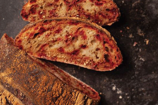
How to Grow Beetroot With as Little as a Windowsill

There is little more satisfying than growing something you can eat. The joy of picking a ripe tomato, digging out a wonky potato or ripping off some fresh basil leaves is spring’s very own drug.

Claire Ratinon is an organic food grower who once grew food for Ottolenghi’s kitchen. In this extract from her first book, How to Grow Your Dinner Without Leaving the House, Claire demystifies an Australian favourite: beetroot.


As a child, I only ever tasted cooked supermarket beetroot. It was always a bit soggy and sour, and made all that touched it bright pink. Suffice to say, it was not my favourite. But as a grown-up vegetable fancier, I find my love for beetroot is constantly expanding. I’ve come to appreciate its earthy sweetness, and I adore the colours and tastes of the more unusual varieties, such as ‘Choggia’, with its concentric circles of magenta and white, or golden beetroot, which is a bright, warm yellow in appearance and flavour. You can also eat the highly nutritious leaves, although take only a few at a time or your beetroot plant will stop growing.

Photography by Ida Riveros

Timing
You can sow beetroot seeds indoors from early spring, plant them out 4–6 weeks later and harvest by early summer. Sow seeds every few weeks if you have the space, for a regular supply. Seeds sown in mid summer will yield roots that can be kept into winter, as long as they’re harvested and stored before the first frost.

Getting started
Beetroot seeds benefit from being soaked before sowing so put your seeds in a glass of water for 24 hours. Plant a couple of seeds in each module, as they grow well in a little group. Each seed is actually a cluster of seeds with the potential to produce a few germinated seedlings, so thin the bunch down to four or five strong plants while they’re still small. You can also sow directly into the final container. If you’ve used modules, transplant the seedlings while they’ve got two sets of leaves per plant: they won’t appreciate being moved once they’re bigger.

Growing

Container
Beetroot doesn’t need a huge container, and you can plant one cluster of seedlings in a 5-litre pot with a diameter of 22cm. If you grow the plants close together, you will still get a harvest but the roots will be on the small side.

Water
It’s important not to let your beetroot plants dry out or their roots will become woody, so be generous when you water, especially in hot, dry weather.

Light
Beetroot grows best in a sunny position, but it can tolerate some shade as long as it has had a strong start in life, with adequate light.

Feeding
Beetroots are vigorous growers and will benefit from feeding when grown in pots. A fortnightly feed of liquid seaweed or comfrey will support the plants to grow and roots to develop.

Harvesting

Your first beetroot harvest can arrive as early as two months after sowing, when the root is the size of a golf ball. At this stage you can also harvest the leaves and cook them as you would spinach. These early harvests will be the sweetest and most tender. Gently twist off the largest roots and leave the remaining ones to keep growing, harvesting them as you want to eat them. Just don’t let them get much larger than a tennis ball, or they’ll be tough and less delicious.


How to Grow Your Dinner: Without Leaving the House is out now. Text by Claire Ratinon and cover by Rita Platts.


Posted on September 10, 2020
Posted on

Pups, photography and property: a Q&A with Nicole England

When we first released Nicole England’s Resident Dog in 2018, we were amazed at the response we received. Who knew that the crossover between architecturally superb houses and the adorable dogs that roamed them would resonate with so many people?

With the recent re-release of the book in a compact edition, we chatted to Nicole about all things architecture and interiors, and why the book continues to be a fan favourite both locally and internationally.

Tell us a bit about your path to becoming an architecture and interiors photographer.

After completing a Bachelor of Fine Arts at Auckland University, I went off to pursue a career in photography, working in fashion, advertising and music. After a couple of years, I gave it up, feeling disillusioned and disheartened by working within the commercial arena. My mother had a strong interest in interior design and my brother was an architect, so I settled on a job working in sales and marketing for an interior design company. Six years later, I picked up the camera again and decided to photograph within the design industry that I had grown to love. That was the ah-ha moment… this was where I was meant to be all along, photographing architecture and interiors. This was my style and my passion, and I haven’t looked back since.

What are some of your key tips for setting up the perfect photoshoot?

Be organised, be flexible, arrive early, be aware of the light and how it moves around the space, stay focused, have an assistant to help, a stylist to set things up, and of course, a dog to remind us to relax and have fun.

What challenges have you faced in your line of work since the pandemic begun?

Unfortunately, most of my shoots have been put on hold. It’s not too bad though, as I’ve had time to work on my business, learn some new skills, and start a couple of personal projects. The shoots will re-book again, I’m certain of that, so I’m just trying to enjoy the downtime before things go crazy again.

Skipper. Photography by Nicole England

Where did the concept of Resident Dog come from?

One day a friend and mentor asked me what my favourite shoot day would look like. I told her I would be photographing the most incredible architecturally designed home you’ve ever seen, surrounded by forest and ocean. There would be a great crew of people to work with, the architect, the homeowner, a stylist and an assistant, a dog would be running around, the weather would be perfect, we would eat great food and drink wine at the end of the day… an opportunity to combine all of my favourite things. From that story, the one fly away comment about the dog was honed in on, and Resident Dog was born. We see a lot of dogs in architecture photography, more and more these days, but nobody had dedicated an entire project or book to our furry friends, the most important member of our home.

Scout, Diesel and Boston. Photography by Nicole England

Do you have a favourite project from Resident Dog?

To be honest, I don’t. I love them all for different reasons. If I had to choose, it would probably be the residence of Canela (the cover star of the compact edition). She lives in an incredible concrete box, designed by Mexican architect Andres Castilles. The house has a hard brutalist exterior but is filled with love and warmth.

Canela. Photography by Nicole England

And a favourite pup?

I couldn’t possibly say, imagine if one of them read this! Charlie definitely has the best hair do, Ginger and Harry made me laugh the most, Enzo and Carlo were the most stylish, little Gaston the loudest, April and Muffy the cheekiest, and Skipper the softest…

Why do you think that the book continues to resonate with people two years on from publication?

We all love dogs and, especially at the moment, I think we find comfort in their silliness, how they live in the moment, and the way they love us unconditionally. And combined with incredible, architectural homes, that inspire us to live a little differently… I think it’s a combination that we will never get tired of, for years to come.

Enzo and Carlo. Photography by Nicole England

Resident Dog is available now in a compact edition. Text and images by Nicole England and design by JAC&.

AU$39.99


Posted on September 1, 2020
Posted on

What matters now: a gallery from Human Nature

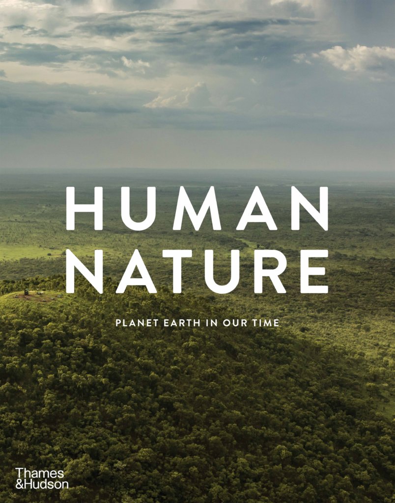
Humanity has reached a pivotal point in time. Human Nature brings together twelve of the world’s most influential photographers to show us why. With compassion and empathy, their extraordinary images and the stories behind them help us to understand what matters now for humanity and the planet.

Get to know the different photographers featured, some of their work from the book and their views on the Age of Anthropocene.

Brian Skerry

Brian Skerry is a photojournalist with a focus on underwater environments and marine wildlife and is a lecturer on exploration, photography and conservation. His work has been featured in many publications and he has produced over twenty-five stories for National Geographic magazine.

‘The decisions that we make today are going to determine the future of this planet, and the future of our species. It’s a time for truth; it’s a time for science and storytelling and journalism to work together collaboratively. The stakes have never been quite so high.’

From Human Nature: Planet Earth in Our Time, edited by Geoff Blackwell and Ruth Hobday, image copyright © Brian Skerry.

Frans Lanting

Hailing from the Netherlands, Frans Lanting is a renowned photographer and naturalist whose work has frequently appeared in National Geographic, where he served as a photographer-in-residence.

‘Nature can help us overcome the effects of climate change in a much more effective way than anything else. If we invest in nature, in protecting nature as habitats, as forests, as lungs of the planet, then we can save species that are dependent on those habitats.’

From Human Nature: Planet Earth in Our Time, edited by Geoff Blackwell and Ruth Hobday, image copyright © Frans Lanting.

J Henry Fair

Based in New York City and Berlin, J Henry Fair creates imagery and media to explain the science of complex environmental issues.

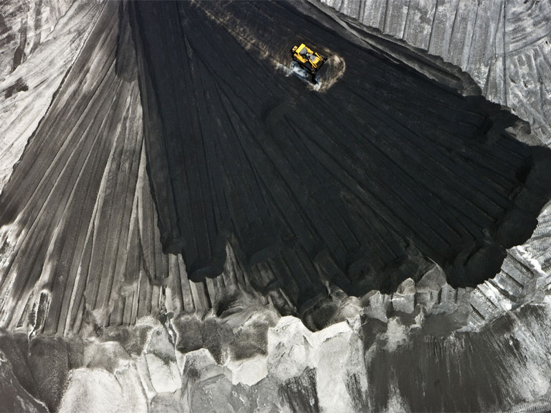
‘What we see in these pictures are the hidden costs of mining; the detritus from the production processes that make the things that we buy every day, whether it’s electricity, bread or the soda cans we throw away on the street. We are complicit, but it’s a complicity of ignorance.’

From Human Nature: Planet Earth in Our Time, edited by Geoff Blackwell and Ruth Hobday, image copyright © J Henry Fair.

Paul Nicklen

Paul Nicklen is a Canadian photographer and marine biologist specialising in the polar regions and their wildlife.

‘Change is happening. A little too late and too slowly, but it is happening and that’s what gives me hope. We know that there’s no other option but to fight for this and I think we are going to win. There is hope everywhere around us.’

From Human Nature: Planet Earth in Our Time, edited by Geoff Blackwell and Ruth Hobday, image copyright © Paul Nicklen.

Cristina Mittermeier

Cristina Mittermeier is a marine biologist and activist who pioneered the concept and field of conservation photography, founding the International League of Conservation Photographers in 2005 to provide a platform for photographers working on environmental issues.

‘This lack of commitment to community, this lack of care for the other, is absolutely at the heart of the environmental issues we are confronted with. Inequality and climate change are the two biggest issues that we’re facing.’

From Human Nature: Planet Earth in Our Time, edited by Geoff Blackwell and Ruth Hobday, image copyright © Cristina Mittermeier.

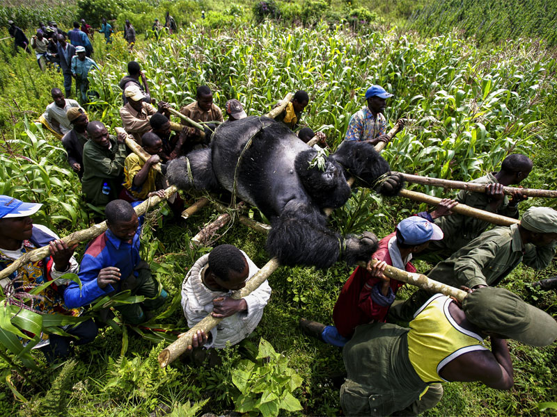
Brent Stirton

Brent Stirton is a South African photographer and a senior staff photographer for Reportage by Getty Images, specialising in documentary work covering global topics including health, the environment and conflict.

‘It’s almost suicidal in terms of our civilisation’s thinking on these issues, but a lot of that’s because people are simply in the process of surviving, feeding their families. Conservation is almost considered a luxury, when it should be a necessity.’

From Human Nature: Planet Earth in Our Time, edited by Geoff Blackwell and Ruth Hobday, image copyright © Brent Stirton/Getty Images.

Ami Vitale

Ami Vitale is a photographer, filmmaker, writer and explorer who tells stories about our fragile relationship with the natural world.

‘We all have the capacity to get engaged and use our voices to make a difference. The messenger matters just as much as the message itself. Each of us can be a powerful voice when speaking to the people in our lives.’

From Human Nature: Planet Earth in Our Time, edited by Geoff Blackwell and Ruth Hobday, image copyright © Ami Vitale.

Steve Winter

Steve Winter has been a photographer for National Geographic for over two decades. He specialises in wildlife and particularly big cats.

‘If we can save the ecosystems and these animals’ habitats, we can help save ourselves. That’s my mantra: if we can save big cats, we can help save ourselves. We don’t have a choice; we either save the planet or we perish.’

From Human Nature: Planet Earth in Our Time, edited by Geoff Blackwell and Ruth Hobday, image copyright © Steve Winter/National Geographic.

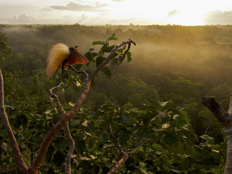
Tim Laman

Tim Laman is a field biologist, wildlife photographer and filmmaker.

‘It’s hugely important for climate change that forest stays as forest – all that carbon that’s in there – and the birds of paradise are flagship species that can focus people’s attention on conserving New Guinea’s forests.’

From Human Nature: Planet Earth in Our Time, edited by Geoff Blackwell and Ruth Hobday, image copyright © Tim Laman.

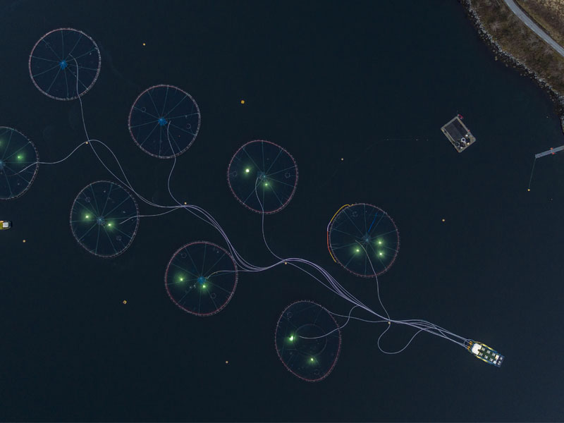
George Steinmetz

A regular contributor to National Geographic magazine, George Steinmetz’s work has examined subjects ranging from global oil exploration and the latest advances in robotics, to the innermost stretches of the Sahara and the little-known tree house people of Papua, Indonesia.

‘Over the years, my work has turned me into an accidental environmentalist. I never set out to be an advocate for our planet, but I think that if people know more about an issue, they can make choices that will lead to solutions. Our individual choices add up.’

From Human Nature: Planet Earth in Our Time, edited by Geoff Blackwell and Ruth Hobday, image copyright © George Steinmetz.

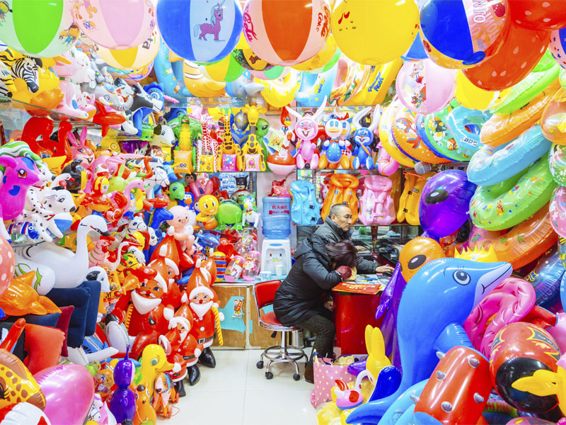
Richard John Seymour

British photographer, designer and filmmaker Richard John Seymour uses photography and film to explore the connections between cities, economies and landscapes in an effort to draw attention to the political, environmental and social issues that stem from human-made environments.

‘In the last fifteen years we’ve produced half of the plastic ever made and in the last twenty-five years we’ve emitted half of the CO2 ever emitted in the history of humanity. Since we’ve had the information that we’ve needed to change our habits, we’ve massively done the opposite.’

From Human Nature: Planet Earth in Our Time, edited by Geoff Blackwell and Ruth Hobday, image copyright © Richard John Seymour.

Joel Sartore

Joel Sartore is an award-winning photographer, speaker, author, conservationist and the 2018 National Geographic Explorer of the Year.

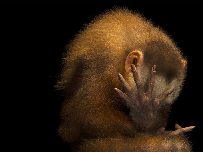
‘Human beings are the ones that hold earth’s fate in our hands. We really do need to pay attention and look these animals in the eye. Hopefully then people will decide whether or not the future of life on earth is worth it.’

From Human Nature: Planet Earth in Our Time, edited by Geoff Blackwell and Ruth Hobday, image copyright © Joel Sartore/National Geographic Photo Ark.

This is an edited extract from Human Nature, out now. Text edited by Geoff Blackwell and Ruth Hobday, copyright © Blackwell & Ruth.

AU$65.00


Posted on September 1, 2020
Posted on

An Unconventional Abode from Hare + Klein Interior

Product Design and Decoration: Eloise Fotheringham

Photography: Shannon McGrath

Hare + Klein Interior is our second book to showcase the signature use of texture, colour and scale in Hare + Klein’s exceptional and responsive interior design practice.

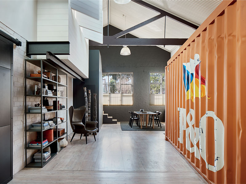
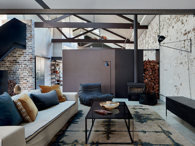
With a 20-foot shipping container in the living room, the once Old Furniture Factory is one of the most unconventional homes in the book. The previous fit-out of this 1920s furniture factory and warehouse was mostly demolished, aside from the footprint of the mezzanine floor and the 20-foot shipping container. As author and Hare + Klein’s principal and artistic director Meryl Hare writes, “I could see no way of getting it out without removing the front of the building. The concept of working with this extraordinary item in the living room was challenging, but I decided that the ‘elephant in the room should be acknowledged – and repainted orange!”

The impressive result of Hare + Klein’s work here is a fully functioning home for a young family, complete with the shipping container turned children’s playroom, a communal dining area, a practical kitchen with an industrial feel, floods of light and staircases finished in steel to keep in theme with the original look of the building.

Hare + Klein Interior is out now. Text by Meryl Hare, design by Daniel New and cover photograph by Shannon McGrath.

AU$65.00


Posted on August 25, 2020
Posted on

Father’s Day Gift Ideas

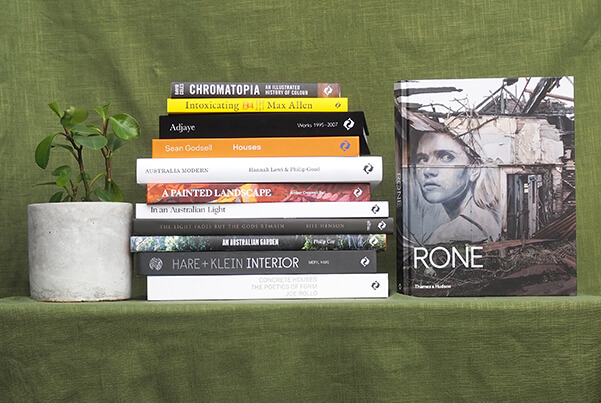
Complete Dad’s bookshelf with these captivating titles, carefully selected by our staff for their own Dads, Grandads and all loved-ones as a Father’s Day gift.

From intriguing narrative non-fiction to colourful tomes on art, architecture and photography, we have a book to pique nearly any interest.

Art

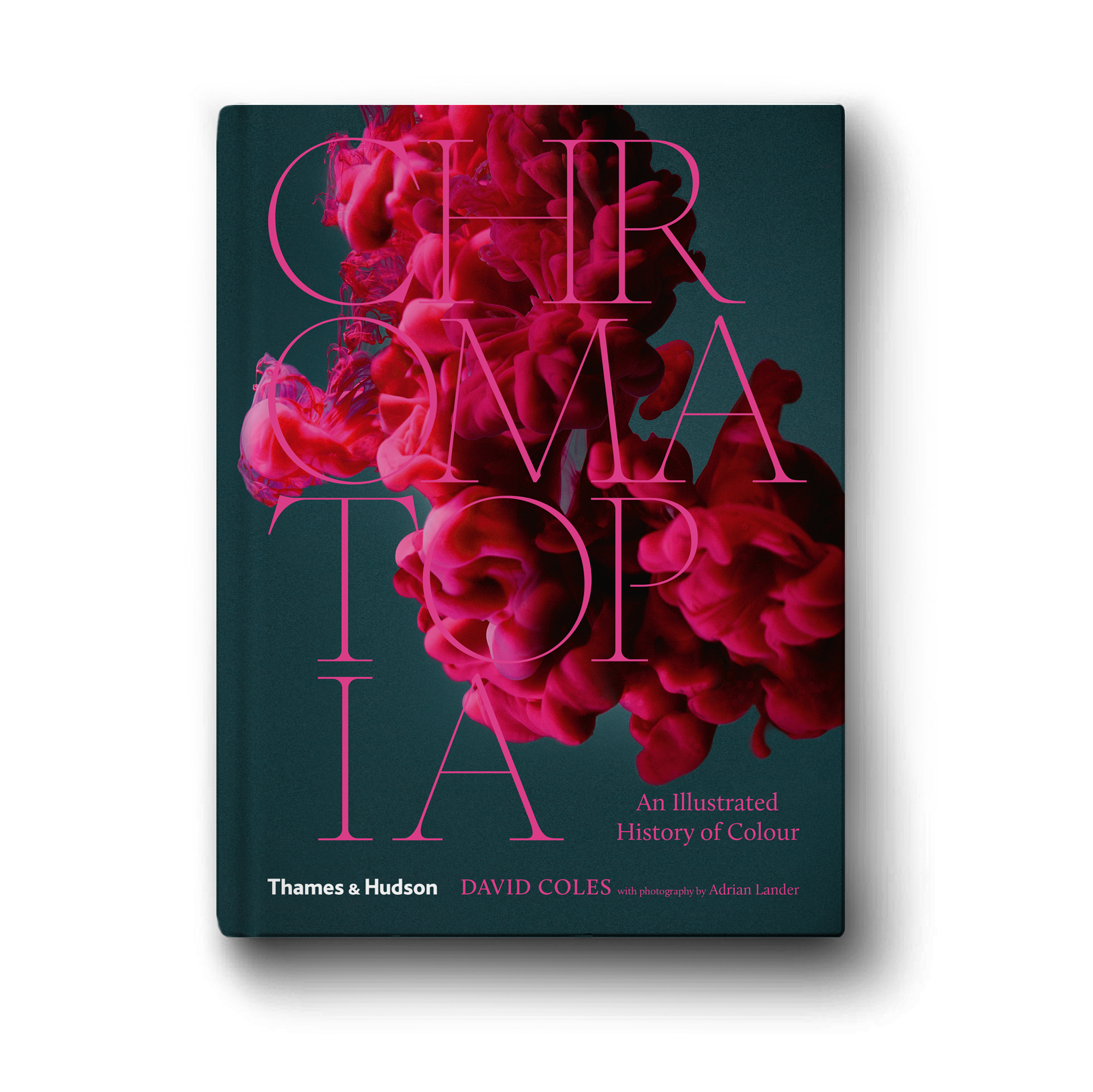
Pore over these visual beauties on Australian artists, from the multi-storey murals in Rone to the diverse works in A Painted Landscape, topped off with Chromatopia‘s illustrated history of colour.

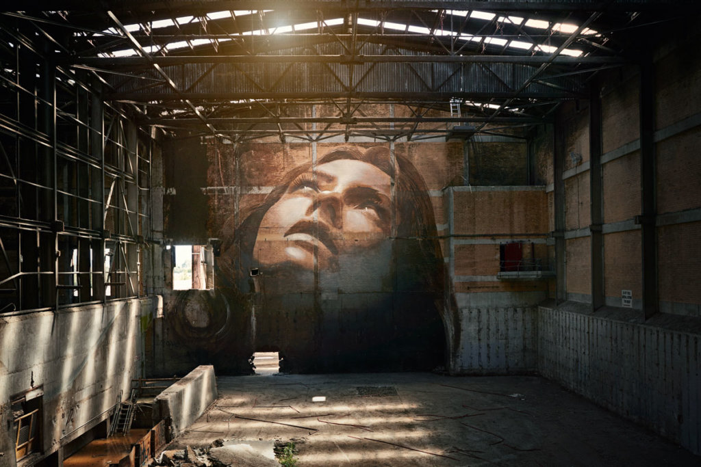
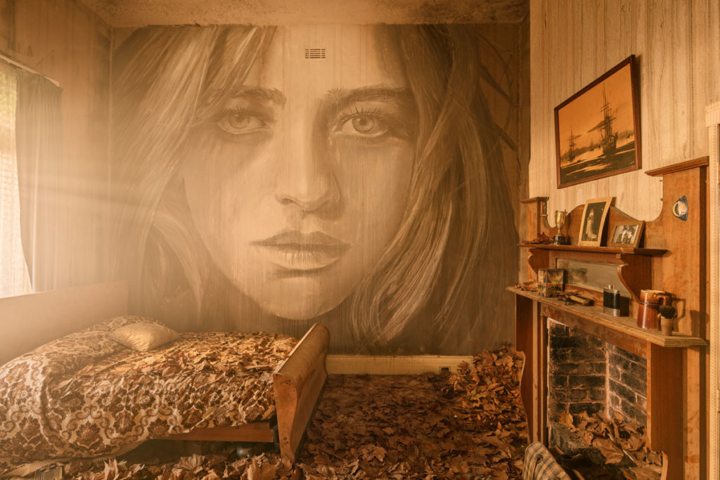
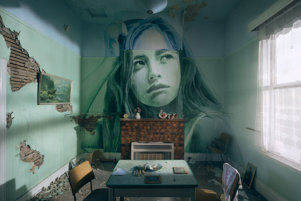
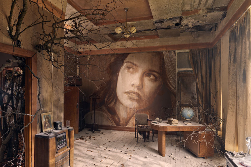
Rone

Known for his multi-storey murals gracing buildings all over the world, Melbourne-based artist Rone uses his work to explore the friction and connection between beauty and decay, youth and ruin.

AU$59.99

Discover ➔

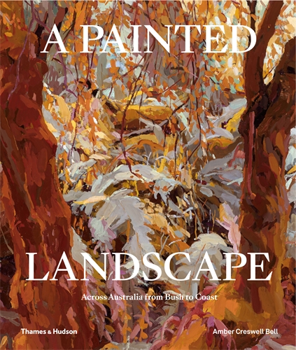
A Painted Landscape

Amber Creswell Bell

A Painted Landscape forms an aesthetic study of the landscape as seen, experienced and expressed by 50 Australian artists who choose to paint it.

AU$59.99

Learn more ➔

Chromatopia

David Coles

Chromatopia is an illustrated history of colour, spanning the ancient world to modern leaps in technology. This is a book for the artist, the history buff, the science lover and the design fanatic.

AU$34.99

Explore ➔

Photography

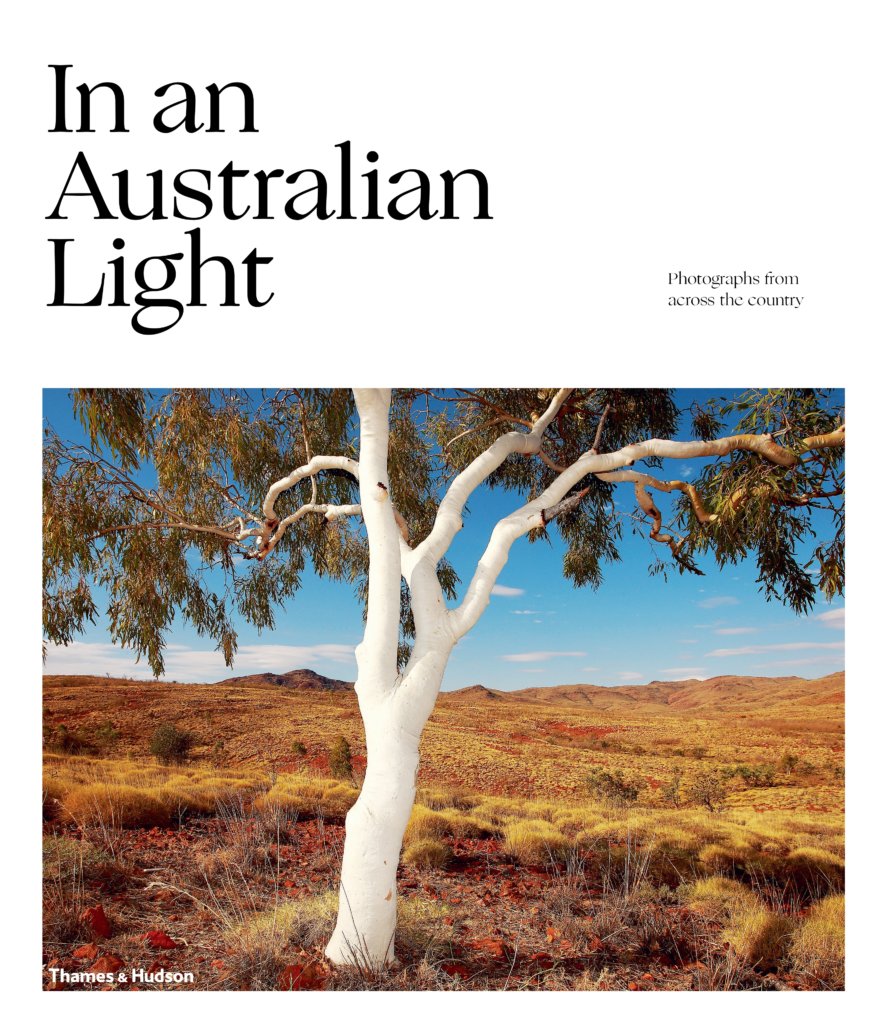
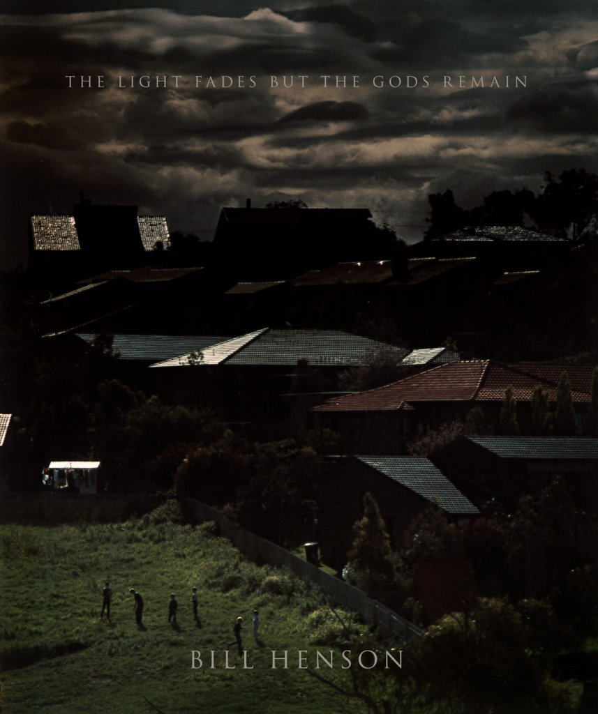
Explore the world through spellbinding photography, beginning with our country’s luminous landscapes through In An Australian Light to the gritty textures of Melbourne and Egypt in Bill Henson’s The Light Fades but the Gods Remain.

In An Australian Light

In an Australian Light reminds us of the myriad ways we experience light in this vast and diverse land.

AU$59.99

Read more ➔

The Light Fades But The Gods Remain

Bill Henson

A significant publication of images by one of Australia’s most extraordinary imaginations, The Light Fades But The Gods Remain is the bound collection of Bill Henson’s work.

AU$100

Discover ➔

Architecture

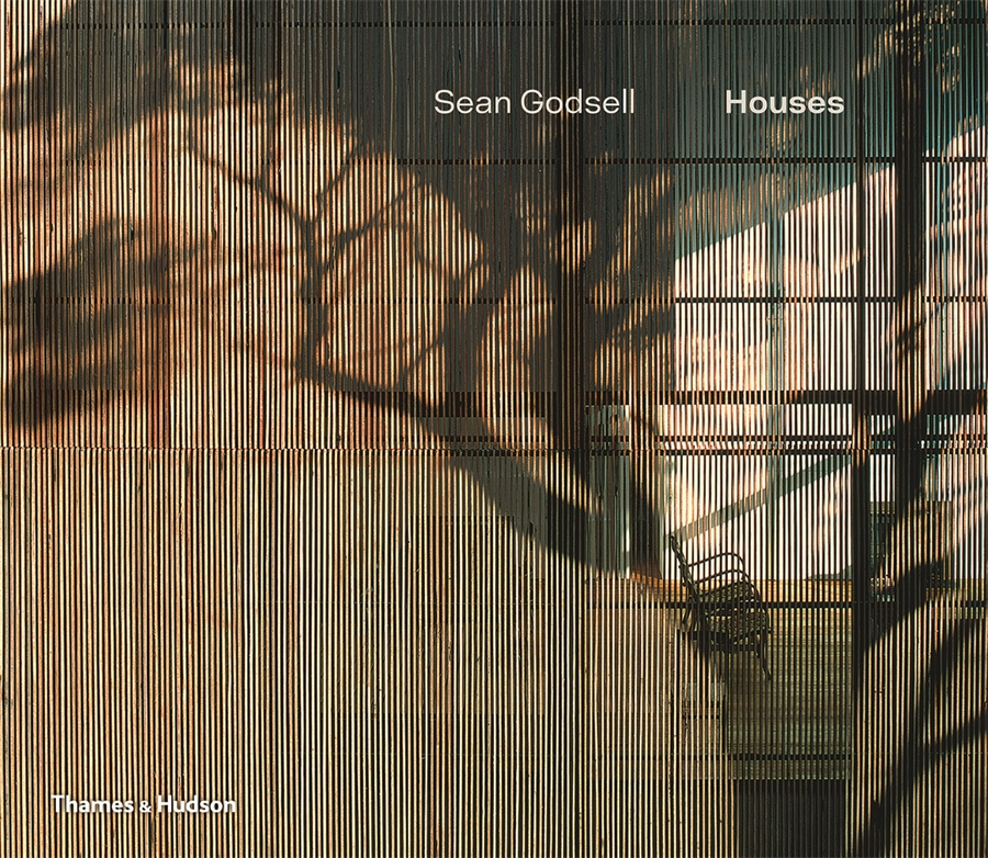
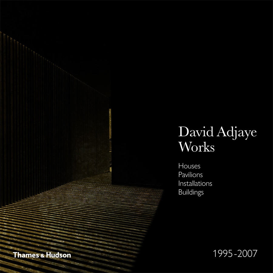
Build up your architecture bookshelf with these tomes on beautiful buildings, houses and projects. Peer inside Sean Godsell: Houses, and the first projects of an architectural icon David Adjaye – Works. Read Australia Modern for your comprehensive visual guide to modernism in our country, and Concrete Houses to explore the lyric beauty, versatility and brute force of concrete as a building material.

Sean Godsell: Houses

The first survey of residential projects designed by award-winning Australian architect Sean Godsell.

AU$100

Explore ➔

David Adjaye – Works

This monograph presents the early works of Sir David Adjaye, one of the most important architects at work in the world today.

AU$120

Learn more ➔

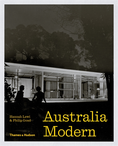
Australia Modern

Hannah Lewi & Philip Goad

Australia Modern vividly captures this architectural legacy with a survey of 100 significant modern sites, richly illustrated with archival images and newly commissioned photographs. 

AU$80

Discover ➔

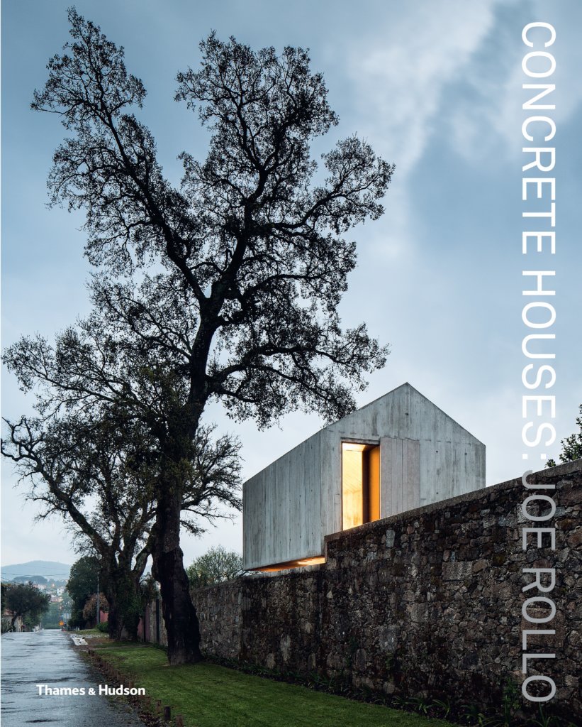
Concrete Houses

Joe Rollo

Concrete Houses explores the use of concrete in landmark contemporary residential architecture from Australia and abroad.

AU$75

Read more ➔

Interiors and Gardens

Find inspiration for the indoors with celebrated interior designer Meryl Hare in her new book Hare + Klein Interior, and enjoy the outside with the beautifully photographed pages of In An Australian Garden.

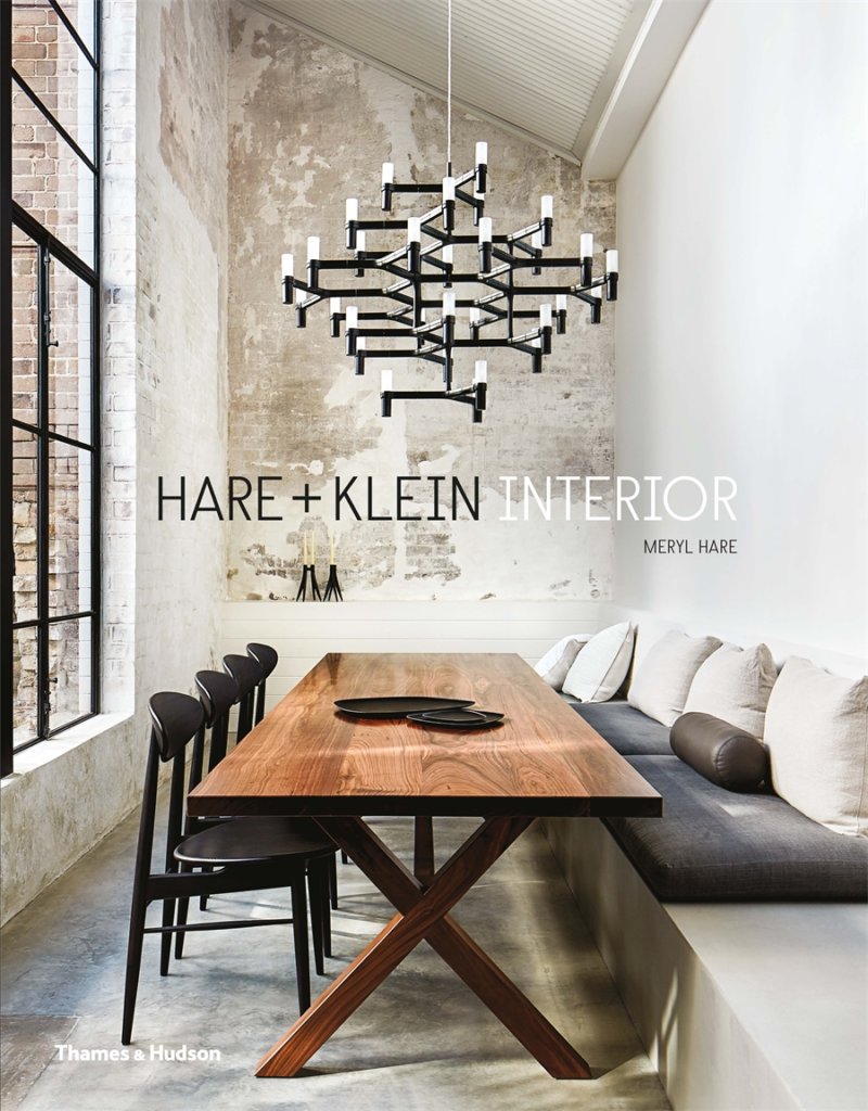
Hare + Klein Interior

Meryl Hare

With a focus on detail and ambience, this is a personal invitation into the elegant and alluring designs of Hare + Klein.

AU$65

Explore ➔

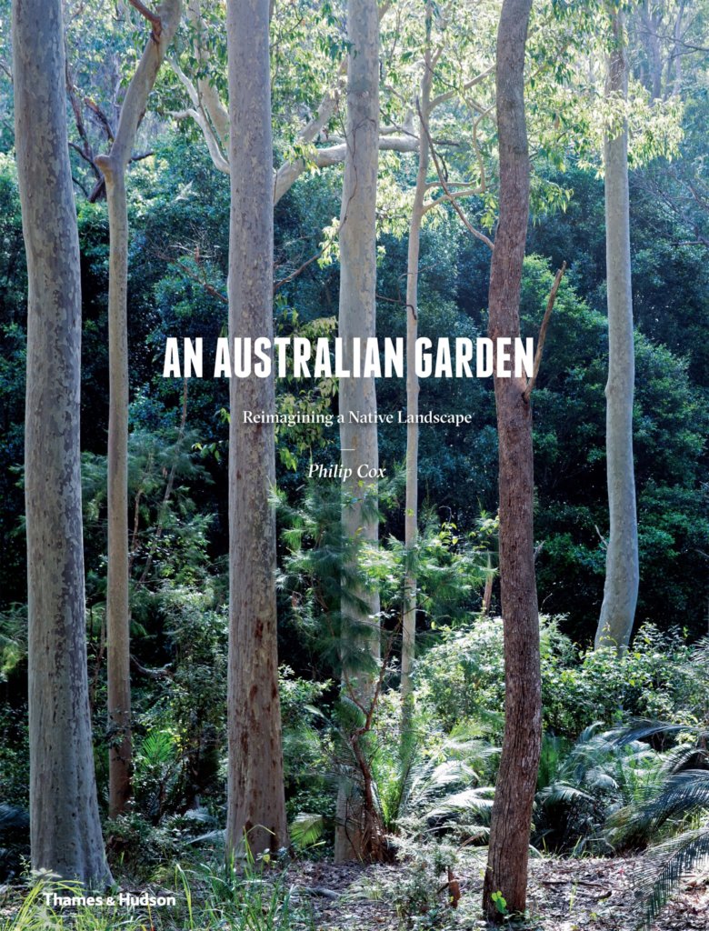
An Australian Garden

Philip Cox

Both private retreat and conservation exercise, An Australian Garden uses nature as muse to reveal the arresting beauty of the natural landscape.

AU$70

Learn more ➔

Narrative non-fiction

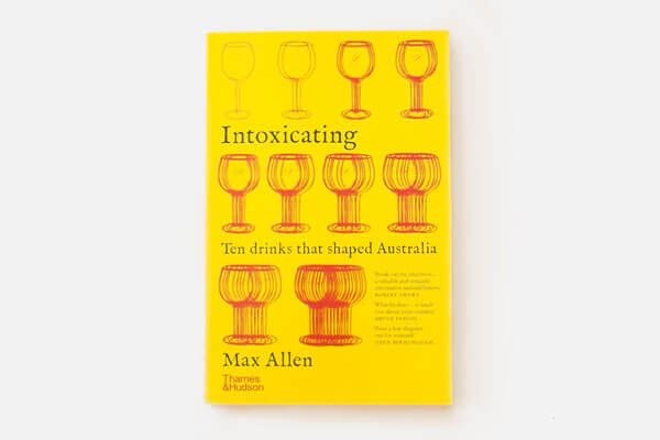
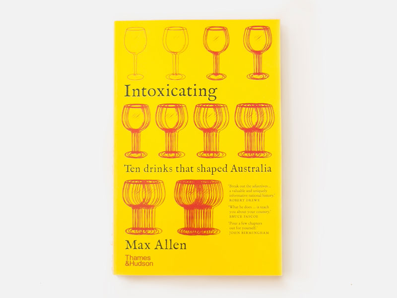
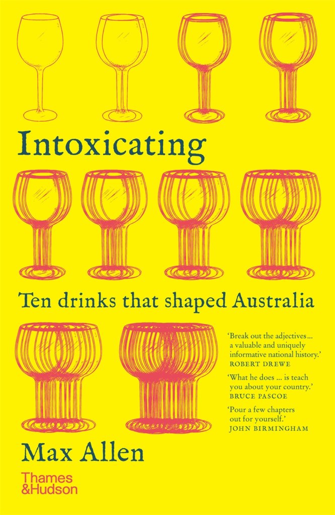
Mix a drink from Max Allen’s Intoxicating, complete with cocktail recipes and a history lesson on Australia’s colourful and complex drinking history. Then, change the way you see our country in Landscapes Of Our Hearts.

Intoxicating

Max Allen

In search of answers, Intoxicating takes us on a personal journey through Australia’s colourful and complex drinking history, glass in hand.

AU$32.99

Discover ➔

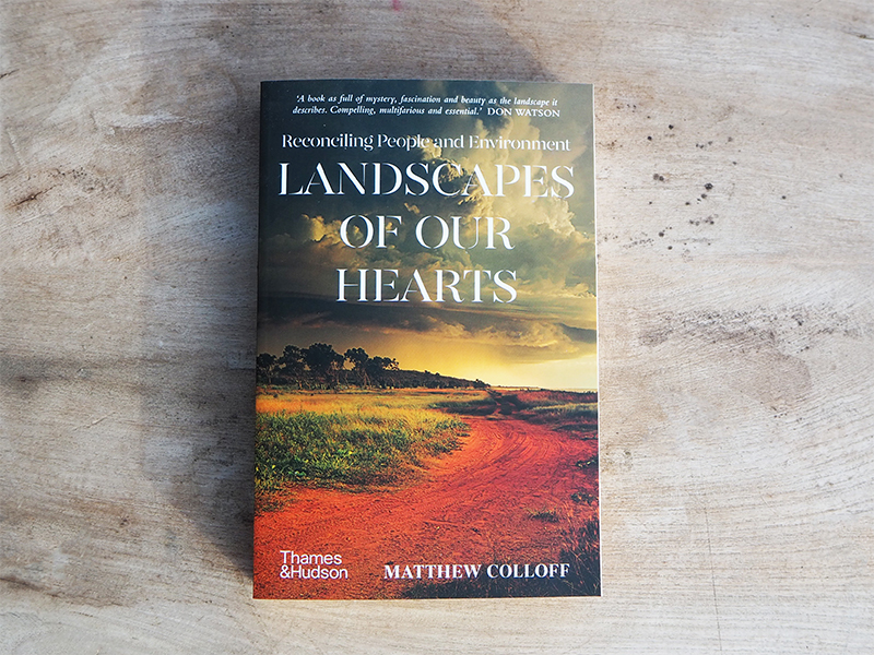
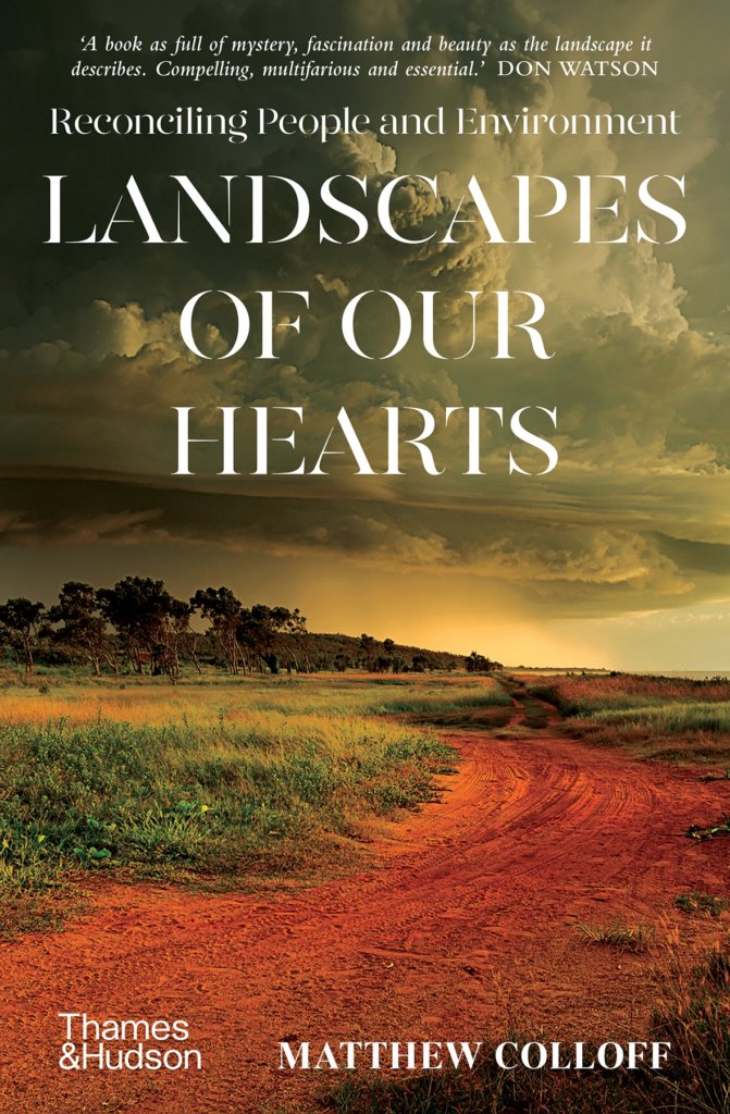
Landscapes of Our Hearts

Matthew Colloff

An epic exploration of our relationship with this country, Landscapes of Our Hearts offers the possibility that a renewed connection to the landscape and to each other could pave the way towards reconciliation.

AU$34.99

Read more ➔


Posted on August 10, 2020
Posted on

Illustrator Spotlight: Wonder Woman Laura Bernard

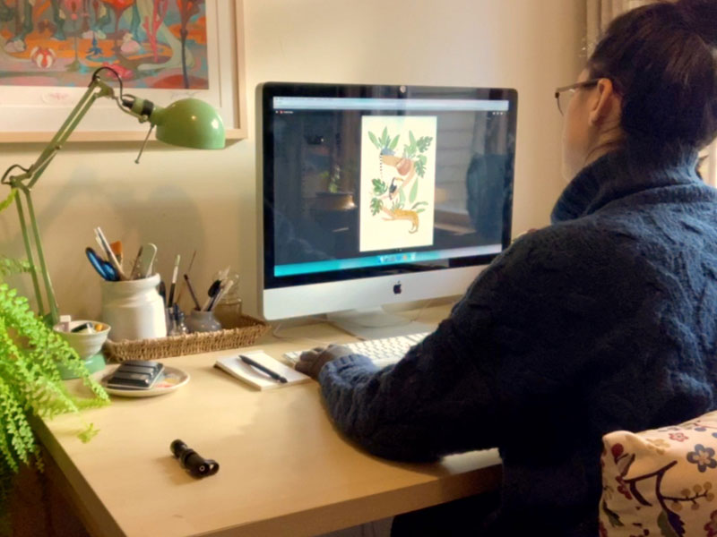
Laura Bernard works from her cosy studio in Wellington, New Zealand. She is a self-confessed nerd, homebody and introvert. Laura has inspired young creatives across the world to ignore the negativity that surrounds a career in illustration and to pursue their passion.

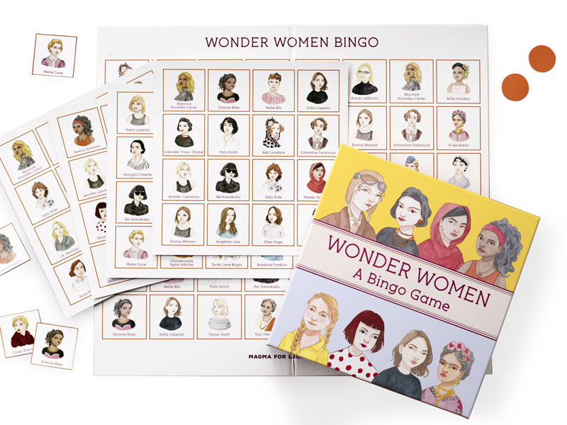
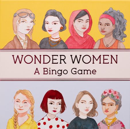
To celebrate the release of Wonder Women Bingo, we caught up with Laura to chat about the game, the female creatives she looks up to and how to stay sane when your home sanctuary becomes your workplace.

Laura Bernard

The illustrations for Wonder Women Bingo are phenomenal. What was your favourite part of working on this project?
Thank you! My favourite part was adding the finer detail to the garments and accessories that the women were wearing: the jewellery, the beaded and embroidered elements and the various patterns. That was so much fun. I feel like that’s one of the main elements that brings these ladies to life and makes them each unique.

Wonder Women Bingo, published by Laurence King Publishing, $29.99

Why do you think it’s important to have a children’s game dedicated to inspirational women?
Too often we are taught the names of famous, genius, amazing men that have achieved great things (Albert Einstein, Isaac Newton, Stephen Hawking, Nikola Tesla to name a few). I think we often forget that there were incredible women who did equally amazing things, but we are rarely taught about them in the same way due to our unbalanced gendered history. Plus, a lot of women had to keep their intelligence a secret or pretend to be a man to be recognised. I think we need a game like this to help balance things out. Hopefully, it can inspire young women and teach them that they can be anything they want to be.

Laurence King Publishing is fortunate to work with a number of fantastic female illustrators like yourself, including Laura Callaghan, Marion Deuchars and Harriet Lee-Merrion. Can you tell us about the female illustrators and creatives that inspire you?
Creatively, I look up to Rebecca Sugar a lot. She created the Steven Universe series and creatively directed a lot of the character design, screenplay and music. She also worked on Adventure Time for a long while. I also admire Jennifer Lee, who is a screenwriter and a head creative at Disney studios. She worked on Frozen and Frozen 2, which are masterpieces for character, background, outfit and song design (all things she helped with).

As a freelancer, do you have any tips for staying sane when working from home? I think we need all the tips we can get right about now!
To be honest, being an introvert really helps. I can’t speak for more extroverted people but I love hibernating and working on my illustration. Working and living in the same space can be a huge challenge, so I do have one very helpful tip. I have a studio for my work, and when I am in there I am in ‘work mode’, when I am anywhere else in the house I’m in ‘home mode’. I’ve always used this mentality even before I had a studio and I worked at the dining room table. I would always sit on one chair and work so then that particular space is associated with working. I think that’s a super important thing to define when working from home as too often we work from bed or the couch, which I try to avoid.

Any tips for overcoming creative block?
Oh jeez, this is a hard one. Over the past five or so years that I’ve been freelancing, and where my creativity is my job, there’s that extra pressure to be creative ALL THE TIME. When I’m at a total creative loss and I’ve gone into a creative depression, I generally have a lot of negativity about my own work. I’ve realised that my creative block generally looks and feels the same: a lot of self doubt and self creative pessimism. If I’m telling myself all of these terrible things about my own work, putting it down and comparing it to others, how can I feel proud and happy with the work I’m making? To help break the cycle, I’ll go back to my old sketchbooks from yonks ago and see how far I’ve come. I’ll also look at all of my old random ideas and concepts to give myself a much needed pep talk: Look! These are your ideas and you are creative and awesome! I will then try and learn from my past works and ideas. I think it’s very important to be critical of your own work otherwise you will struggle to grow, but balancing that with self support, encouragement and feeling proud of yourself too.

We can see that you paint in both a traditional medium and digital. Do you prefer one over the other?
I fell in love with watercolour quite quickly after buying my first set when I was about nineteen. I think it will always be very special to me. I then transitioned into digital to broaden my skillset and I thought it would help me find more illustrating opportunities too, as we live in such a digital age. I think watercolour will always be my favourite medium, however I find digital has helped me grow and learn more as a creative — it’s a very forgiving medium and you are able to undo, flip canvases to check proportions, and change colours so easily: all things that you can’t really do with a traditional medium.

We are obsessed with all the work in your portfolio. Can you tell us about your favourite one?
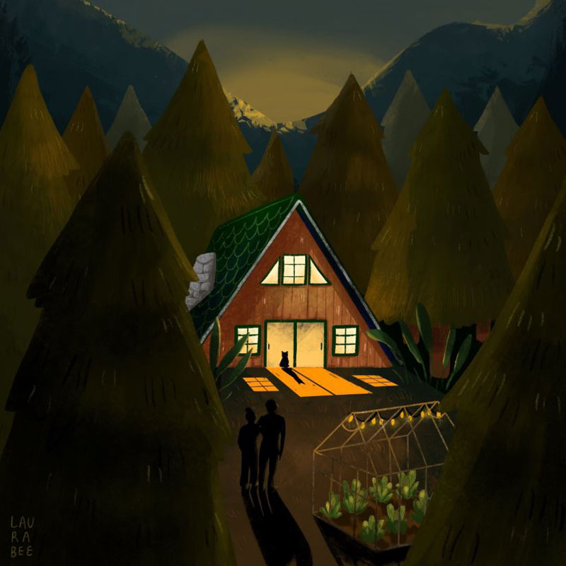
Thank you so much! From my personal works, there’s an illustration of an A-frame house among some trees at night. I am super proud of this and the simplicity of it, but the fact that it still tells a story — a difficult balance. Professionally, I absolutely loved working on the Wonder Women Happy Families card game, and the Wonder Women Bingo. Learning about amazing women in history and having the opportunity to paint their portraits was so inspiring.

Wonder Women Bingo is out now. Text by Isabel Thomas and illustrations by Laura Bernard.

AU$29.99


Posted on August 7, 2020
Posted on

An Extract from Max Allen’s Intoxicating

Intoxicating is award-winning journalist Max Allen’s personal journey through Australia’s colourful and complex drinking history, glass in hand. In the book, Max uncovers ten of Australia’s most famous – and most surprising – drinks, sharing anecdotes about each.

In this edited extract, Max discusses his first forays into cider and home distillation, from the chapter ‘Peach Cyder’.    

I was born and spent the first few years of my life in Bristol, in the heart of England’s West Country, epicentre of traditional cider production. As a teenager living in London, some of my first experiences of alcohol came in the form of big plastic bottles of cheap Woodpecker Medium Dry cider bought underage at the local off-licence. Then, travelling around the West Country in the late 1980s, I discovered the real thing: farmhouse scrumpy, stuff of legend.

The revelation came in a crumbling 16th-century pub called the Three Tuns in Hay-on-Wye, a little town famous for its bookshops and literary festival, just over the Welsh border from Herefordshire. Saggy wooden benches by the smoke-blackened inglenook, an ancient shillings-and-pence slot machine in one corner, and an even older landlady tending the tiny bar.

When I asked for cider, instead of reaching for the hand pump on the bar or a bottle from the fridge, she rummaged around in the gloom and hauled out a plastic gallon container of cloudy golden liquid. This was scrumpy, made by a local farmer using nothing but freshly pressed apple juice and wild yeasts and time.

‘Be careful,’ she warned, as she poured out a pint. And she was right: with its huge, sharp aromas of pulpy windfall fruit and its furry taste of tough, brown apple cores strewn across a barnyard, this was a deeply challenging explosion of agricultural flavour. I think it might also have had mild hallucinogenic properties. I was hooked.

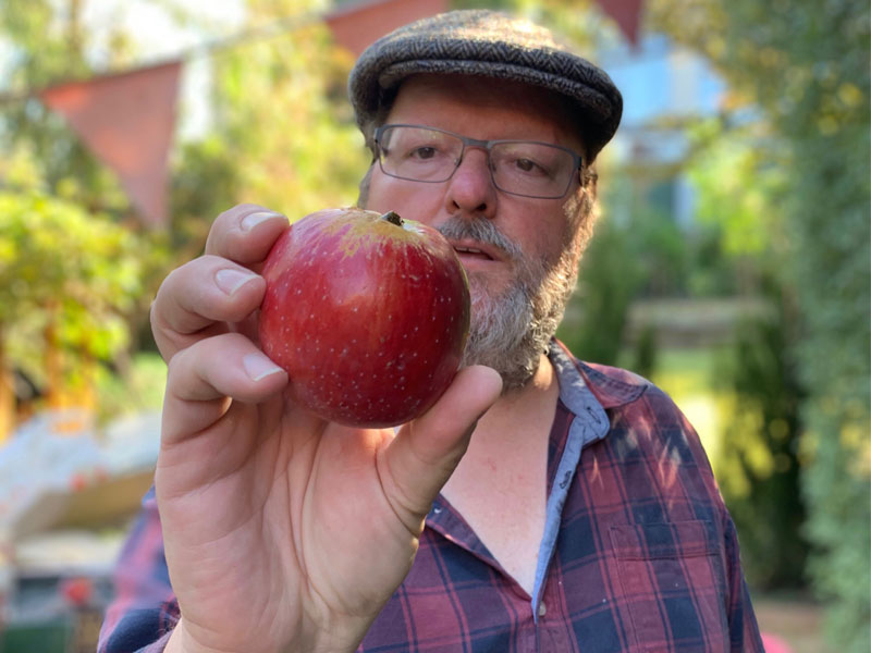
I first made cider in my backyard in Melbourne in 2011. I’d found a small orchard full of old apple varieties just a few blocks from my house, in the grounds of Rippon Lea, the National Trust–owned Melbourne mansion built by merchant and politician Frederick Sargood in 1868. Like many grand estates established on the outskirts of Australia’s emerging capital cities in the late 19th century, Rippon Lea was originally surrounded by farmland. Much of that country is now covered in suburban houses, schools, cinemas and the ABC’s old Gordon Street studios where my mum worked with my wife’s parents in the 1960s. But in the 1980s, one corner of the estate near the original 1860s stables was converted to an orchard that now boasts over 130 varieties of heritage apples and pears, including Golden Pippin and the classic cider variety Kingston Black.

I’d heard that the gardeners at Rippon Lea had harvested enough fruit to make cider by netting some of the trees to stop the local flocks of lorikeets munching the crop. So I contacted the head gardener and asked if I could gather enough of what was left over – those few apples still clinging unscathed to higher branches, the unbruised windfalls lurking in the grass below – to make a demijohn of cider myself.

Photography by Riley Allen

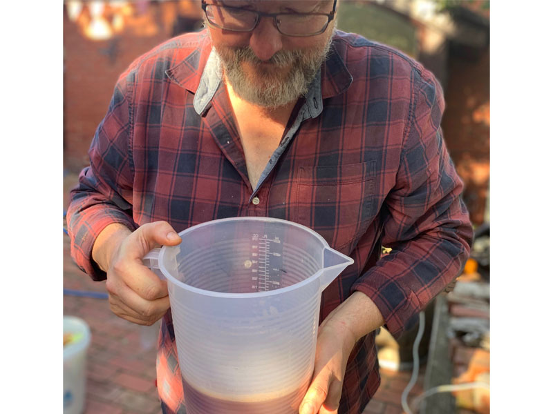
Not owning any cider-making equipment at that time, I crushed the apples in the most rudimentary way by bashing them to a pulp with a block of wood in a bucket. Then I borrowed a winemaker friend’s old basket press, wrapped the apple pulp up in parcels of shade cloth, put them in the press, slowly squeezed them and filled a glass demijohn with golden-brown sticky syrupy juice.

At this stage, according to all the modern cider-making manuals I’d read, I should have added some safe, reliable cultured yeast from a packet. Instead, I did nothing. I walked away and waited for nature to take its course. I wanted to do what the farmer who made that scrumpy in Hay-on-Wye had done and just let the wild yeasts on the apple skins and flesh and stalks and pips, in the air, on the press, do what yeasts do naturally: turn sugar into alcohol.

Nothing happened at first. The juice just sat there. But then, after a few hours, up from the depths of the murk emerged tiny pinprick bubbles of carbon dioxide: a definite sign of microbial activity. Fermentation had started. The wild yeasts were getting to work.

As I watched those little bubbles slowly rise, I felt another strange and profound feeling of connection with the generations of people before me who have marvelled at this seemingly miraculous process. And not just the cider makers: the winemakers and brewers, all those innumerable human beings who, for thousands of years, long before scientists identified yeasts and bacteria as the living organisms responsible for fermentation, have simply trusted in the mystery to produce a delicious drink.

I’ve made my own cider each autumn almost every year since that first fermentation epiphany. I’ve bought my own small-scale cider-making equipment. I’ve crawled around on my hands and knees in the mud and damp grass under apple trees foraging for windfalls in the Goulburn Valley. I’ve scrambled over gates and fences to reach fat ripe apples on wild roadside trees in Coonawarra. I’ve made friends with orchardists on the Mornington Peninsula who have old heritage varieties: proper cider apples like Kingston Black, almost-forgotten English apples like Sturmer Pippin, unfashionable Australian apples like Sundowner.

Each year I’ve brought my motley harvest back home and dragged my crusher and press out of the garage and invited friends and family, reluctant teenagers and eager neighbours, to help me make cider. And after the crushing and pressing, we’ve all sat down for a meal and opened bottles of last year’s batch and celebrated the season.

I now take bottles of my cider with me when I travel, to share with friends or to pour for winemakers or brewers or other, professional cidermakers. Sometimes people even say they like it, which makes me feel proud – and connected, as though the annual autumn West Country rituals are echoing in my own creaking basket press.

Photography by Riley Allen

Intoxicating is out now. Text by Max Allen and cover design by Josh Durham.


Posted on July 31, 2020
Posted on

Admiring the ephemeral: a gallery from RONE

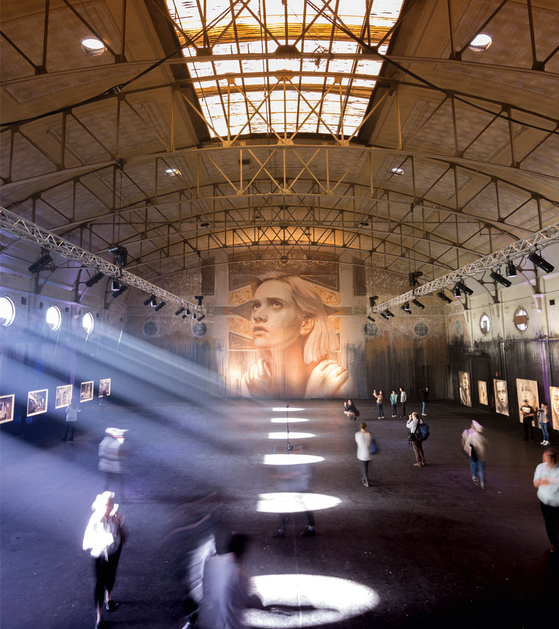
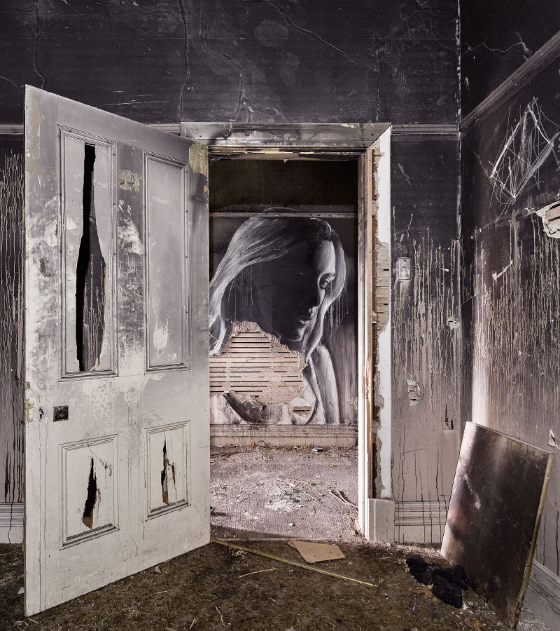
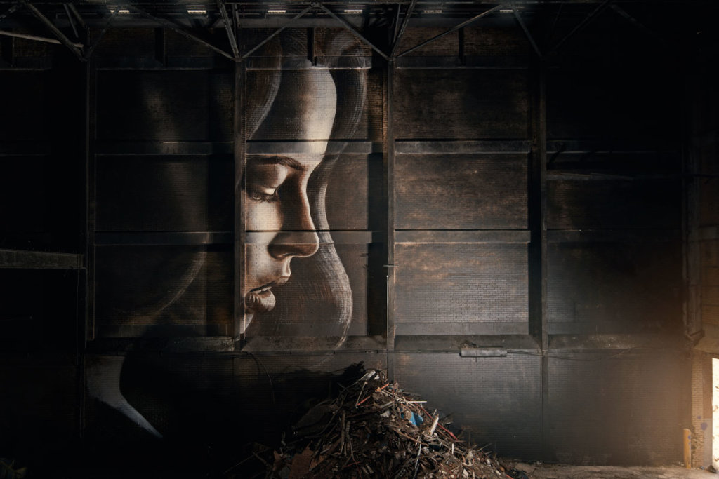
Rone: Street Art and Beyond brings together almost two decades of awe-inspiring work created by one of Australia’s most renowned street artists. This striking survey weaves through Rone’s early street work and stencils, to his arresting murals, and finally the large-scale projects he has ambitiously taken on in the past five years. These projects, immersive installations resulting from the transformation of condemned, derelict or forgotten spaces, have been praised across the globe. Undeniably unique, they explore divergent themes of beauty and decay, youth and ruin. Each artwork is painstakingly produced in immense detail, only to be destroyed, defining them as utterly ephemeral.

Here, we take a sneak peek at Rone’s fascinating installation projcts featured in the book.


EMPTY. October 2016, Fitzroy, Melbourne, Australia.

“Empty sparked Rone’s passion for creating immersive experiences and fuelled a deeper relationship: fusing art, architecture, decay and fleeting beauty.”

The Empire, 2016. Photography by Rone.


ALPHA. February 2017, Alphington, Melbourne, Australia.

“For Rone, Alpha was about taking the ugliest, crudest, dirty, masculine walls and turning them into something beautiful and fragile”.

The Shape of Things to Come, 2017. Photography by Rone, assisted by Tom Franks.

Without Darkness There Is No Light, 2017. Photography by Rone, assisted by Tom Franks.


OMEGA. June 2017, Alphington, Melbourne, Australia.

Collaborator: Carly Spooner, interior stylist.

“Omega, a natural progression from Alpha, forged connections between humans and their experiences through delicate manipulations of intimate space.”

Autumn, 2017. Photography by Rone.

The Green Room, 2017. Photography by Rone.


EMPIRE. March-April 2019, Sherbrooke, Victoria, Australia.

Collaborators: Carly Spooner, interior stylist; Loose Leaf, organic sculptors; Nick Batterham, composer; Kat Snowden, scent designer.

“To experience Empire was to experience beauty in loss.”

The Music Room, 2019. Photography by Rone.

His Room, 2019. Photography by Rone.

Rone is available now. Cover image by Rone and design by Claire Orrell.

AU$59.99


Posted on July 24, 2020
Posted on

Complete your picture book collection

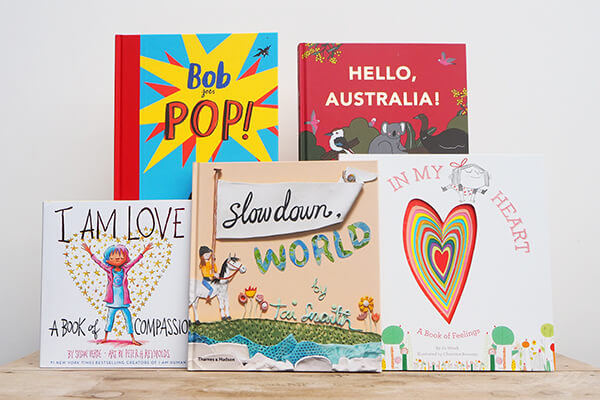
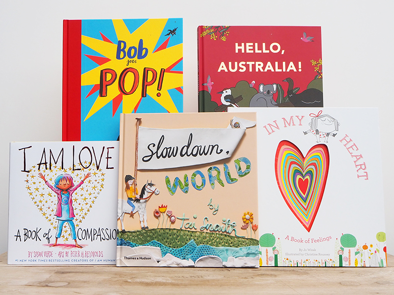
Delve into the colourful stories and illustrations of these gorgeous picture books, specially chosen by Thames & Hudson staff for the joy they bring our littlest friends and family-members.

Product photography and styling: Jackie Money

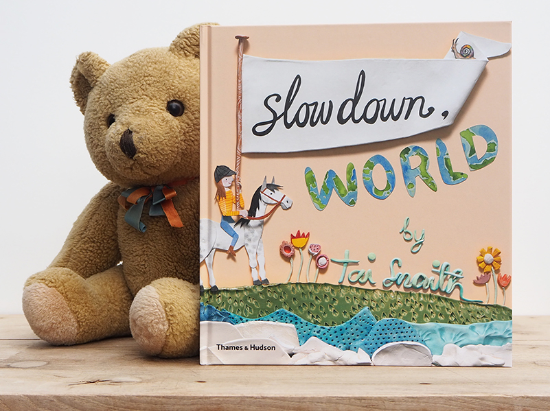
Slow Down World

Tai Snaith

Creator of Slow Down World: Tai Snaith | Book design: Wendy Fox |
Book photography: Matthew Stanton | Product photography and styling: Jackie Money

Take a whimsical journey from a fast-paced city to the magical imagination of a young girl with Slow Down World, beautifully written and illustrated by Tai Snaith.

Also available: You Might Find Yourself

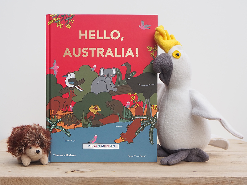
Hello Australia!

Megan McKean

Book design: Megan McKean | Product photography and styling:
Jackie Money

Follow some cheeky galahs in Hello, Australia! a look-and-find adventure from Megan McKean, author and illustrated of the beloved Hello…! series.

Also available: Hello, Sydney! Hello, Melbourne! Hello, London!

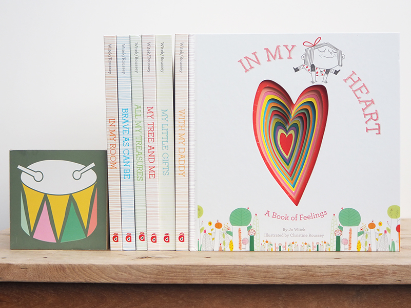
In My Heart

Part of the Growing Hearts series

Written by Jo Witek | Illustrated by Christine Roussey

Cover illustrations: Christine Roussey | Product styling and photography: Jackie Money

In My Heart is a vibrant celebration of feelings, in all their shapes and sizes, and a best-selling instalment of the Growing Hearts series, all lovingly written by Jo Witek and beautifully illustrated by Christine Roussey.

Also available: In My Room, Brave As Can Be, All My Treasures, My Tree and Me, My Little Gifts and With My Daddy.

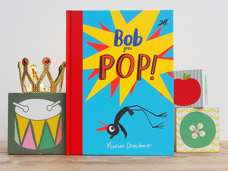
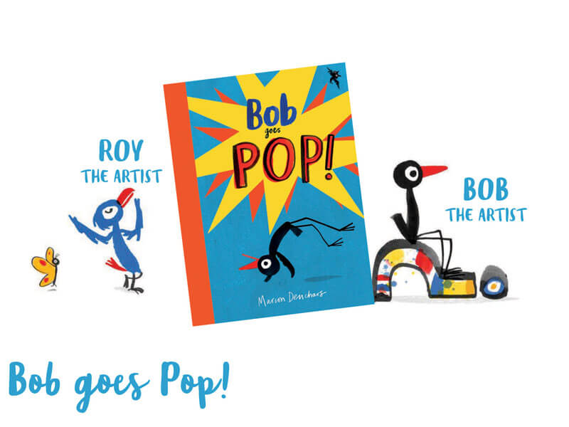
Bob Goes Pop!

Marion Deuchars

Design: Vanessa Green | Product styling and photography: Jackie Money

Bob the Artist returns in Bob Goes Pop! for a new tale of friendship, self-expression and pop-art, beautifully depicted by the award-winning Marion Deuchars.

Also available: Bob the Artist and Bob’s Blue Period

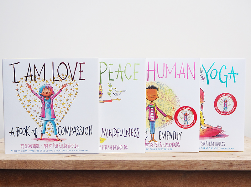
I Am Love

Part of the I Am series

Written by Susan Verde | Art by Peter H. Reynolds

Book design: Pamela Notarantonio | Product photography and styling: Jackie Money

From the bestselling team Susan Verde and Peter H. Reynolds comes a celebration of love in all its forms, the latest edition of the I Am series.

Also available: I Am Peace, I Am Human and I Am Yoga


Posted on July 10, 2020
Posted on

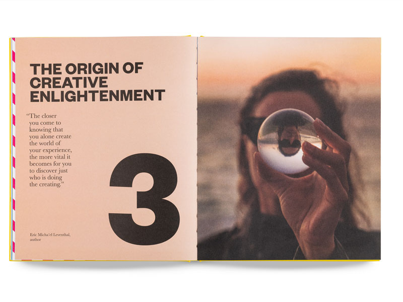
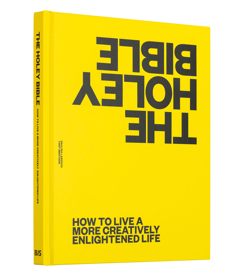
Paulina Larocca talks 2020, The Holey Bible and creative enlightenment

About to publish her third book, creative catalyst Paulina Larocca is one of the most driven, passionate and motivated authors you’ll ever meet. Her previous books on creativity can be found in homes, offices and classrooms across the globe, and we think her new book The Holey Bible is the best one yet. We caught up with Paulina to talk about creative enlightenment, the new book and the all-important year that has been 2020.

What exactly do you mean when you use the term ‘creative enlightenment’?
Creative enlightenment is a term I created based on my personal experiences and struggles with the creative process. Let’s face it, creative thinking is messy work and you must have an enormous amount of courage, belief and persistence for real breakthroughs to occur. The creative process can seem punishing, especially when you are in the weeds looking for a way out, but when you get to a resolution you experience a flood of relief and euphoria; you experience what I call creative enlightenment. For each person, the experience will be different but the result will be the same. You have a new direction and a new purpose that creates a deeper meaning in your life and your work. You are permanently transformed. It may feel like hell going through it, but it’s heavenly when it’s done.

What benefits will living a more creatively enlightened life have for those who don’t consider themselves creative or who don’t have a creative job?
That is the sad irony about creativity – it’s sold to us as something we either have or don’t have. We are all creative. Our brain is active during both wakefulness and sleep and is constantly imagining. Our minds are phenomenal storytellers, constantly constructing meaning from our environment. I think of creativity as a divine force that is present in each of us and plays a much bigger role in all our lives than we tend to realise. It is the engine of our mind, the author of our story and is responsible for how we identify ourselves – it is creativity that determines how you define ‘me’. You may not nurture it, you may not notice it, but creativity is the driving force of your life, so it pays to consider what kind of fuel you are putting in your tank. My mission is to help everyone cultivate an awareness of their creativity and learn to use it. That way, it can serve a higher purpose for each and every one of you.

The Holey Bible – what’s the message behind the title?
The title came about because we wanted to help people easily spot the holes in their thinking. We wanted to use the term bible, not in the religious sense but in the colloquial sense of a guide. The title tends to stop people in their tracks, so it’s a way of shaking things up – it’s almost as if you get an experience of the book from the title.

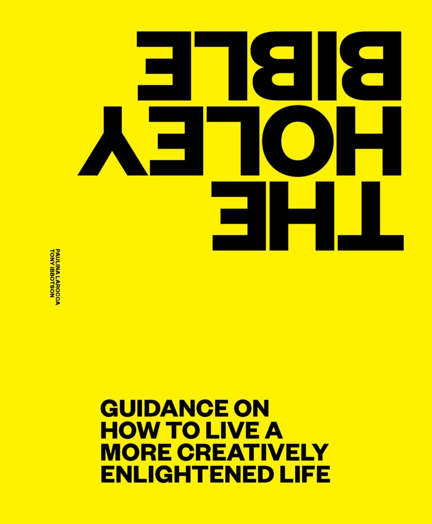
The cover is so striking. Can you tell us about those design choices – the bold font, the bright yellow and the upside-down type?
Well, with a name like The Holey Bible you cannot afford to be shy. We want to celebrate the creative spirit and yellow and black are great colours for that. Throughout the book we use bright colours. For those who know about printing, we use CMYK (cyan, magenta, yellow and black) for four colour processing printing. They’re colours that ignite creativity and get the brain buzzing. The rest of the design and images were a very deliberate choice to keep the reader emotionally engaged and surprise them every time they turn the page.

This is your third book in three years. What drives you to write books rather than use another medium of storytelling?
Books are incredibly hard work and I sometimes wonder why I keep going back. They are wonderful vehicles for distilling your ideas into cohesive thoughts and the format forces you to do the work – it’s not just a few paragraphs dashed off for an Instagram post. Plus, having a publishing deadline ensures that even if you want to slack off, you can’t. A well-written book makes everything you do – speaking, blogs, social media – so much easier. But there’s no doubt about it, writing a book feels like climbing Mount Everest without oxygen – scary and exhausting.

Some might argue that this is a tough time to publish a book. Why do you think that 2020 is the year for The Holey Bible? Why do we need this book now?
I think this pandemic has forced all of us to rethink what’s important, what are we doing with our lives and what we need to change. It hasn’t been pleasant, but it has forced us to re-evaluate things we took for granted as being ‘just the way things are around here’ and deeply question them. There is no better time for a book that makes you question your assumptions and help you create new patterns of thought that may serve you better. If you are questioning anything or any aspect of your life, then don’t hesitate to pick up The Holey Bible. It will help you live your best life, which, let’s face it, is a creative life on your terms. Who could ask for more? 

The Holey Bible is available now. Text by Paulina Larocca and published by BIS Publishers. AU$35


Posted on July 7, 2020
Posted on

At Home in a Strange Land

Landscapes of Our Hearts is an epic exploration of our relationship with this country. From distinguished research scientist and award-winning writer Matthew Colloff, the book asks the question: ‘If we look afresh at our history through the land we live on, might Indigenous and non-Indigenous Australians find a path to a shared future?’

In this extract, Colloff discusses the importance of responsibility in the pursuit of belonging for Indigenous and non-Indigenous Australians.

Photography: Jackie Money

Most Australians have connections with more than one place, whether they are Indigenous people or descended from 19th-century European settler-colonists or more recent migrants, refugees and asylum-seekers. We value and maintain our cultural identity. For many Australians, the expression of culture singles them out as ‘different’ from other Australians and creates the tension between integration into ‘the Australian way of life’ and the multicultural plurality of modern Australian society. For example, the children of Greek migrants who refused to go with their parents and older relatives to large group barbecues and picnics in parks because they regarded such an event as ‘woggy’; in other words, it represented their involvement in a cultural activity that would identify them as migrants to other Australians.1

But there is no contradiction between citizenship and cultural diversity. Attempts by politicians and populists to construct and promulgate ‘a national identity’ have tended to be unsuccessful. Sociologist Robert Van Krieken writes, ‘Political and cultural citizenship do not necessarily coincide – it is possible to be defined legally as a citizen, but still remain an outsider, with the rules governing the transition from one category to the other remaining obscure and elusive.’2 I would argue that the process of transition from one to the other often begins with developing a connection with this land and the process of place-making.

Are we all strangers in our own land, trying to make a home wherever we find ourselves? For Australians of Anglo-Celtic descent whose families have been here for several generations, they may have been born in one place, grown up in another and live as adults somewhere else again. For many Indigenous Australians, their ancestors may have been forcibly removed from their lands, their grandparents or great-grandparents raised on a mission or an Aboriginal reserve many hundreds of kilometres away, and their parents may have moved from place to place to find work, as Stan Grant’s parents did, all the while trying to stay in contact with the diaspora of their kin.

For many of us migrants, the idea of referring to Australia as my country carries with it a deeply felt sense of ambivalence. This tension emerges not only from the cultural connections with the countries of our birth but also an unease about whether we have such a right, considering this land was taken by invasion and dispossession of its Indigenous peoples during the one hundred and forty years of the Frontier Wars. As Henry Reynolds wrote: ‘It was only by forgetting that white Australia was able to overlook the violent foundation of the nation.’3

Historian Peter Read sums up the tension as follows: ‘how can we non-Indigenous Australians justify our continuous presence and our love for this country while the Indigenous people remain dispossessed and their history unacknowledged?’4 Some of us make our place and feel a strong sense of belonging accordingly. We feel we have a right to belong. Others of us feel no such right. Australia always was and always will be Aboriginal land. Belonging is a deeply personal journey, travelled by multiple routes. There was nothing in the citizenship interview and examination that I took in 1996 on how to go about the process of belonging. The only mention in official documentation on citizenship is the statement that volunteering can be a great way of increasing one’s sense of belonging to the Australian community and that, ‘You can walk the desert or the shore, the mountains or the rainforests. Every step you take is a step closer to belonging to this vast and vibrant land.’5 Indeed. A route to belonging through volunteerism and tourism. Were it that easy.

For some, claiming continuity with Indigenous people and the environment as part of our non-Indigenous heritage is a means of achieving a sense of belonging. In an interview with Peter Read, environmental historian Tom Griffiths stated: ‘Aborigines and environment: these are the two great historical revolutions of our generation. Writing both into Australian history allows you to reach back beyond the moment of invasion and draw you into deep time as part of our own inheritance. We should discover the continuities.’6

Griffiths’ perspective echoes the need to reconcile a sense of attachment to place with the history of environmental and cultural change. With this need comes a set of responsibilities to ‘a vision of a morally and environmentally integrated Australia’, in which the relationship between humans and the environment is one in which people ‘share its past and provide for its future’. Yet can non-Indigenous Australians legitimately claim to belong to deep time while Indigenous Australians remain dispossessed and governments continually seek to obstruct practical processes of reconciliation?7

Perhaps one way for non-Indigenous Australians to think construc­tively about these vexed issues is not just to focus on assumptions about rights of belonging, but on their responsibilities. Simply put, if our sense of belonging is to be gained through a continuity with deep time history, then we have an equal responsibility to Indigenous Australians, ourselves and our shared environment to do what we can to achieve reconciliation. We might start by considering and adopting elements of the ancient environmental knowledge, values and rules of Indigenous Australians that they observe and we do not. Perhaps this might form a basis to begin to shape our common future in more sustainable ways.8

If there can be no lasting or legitimate sense of belonging without a sense of responsibility to the land and each other, then here’s the challenge, as articulated by Tom Griffiths: ‘If all Australians are to rejoice in the deep past, then we must ask the non-Aboriginals to share responsibility for its mistakes. If all Australians are to rejoice in the deep future, then we must ask the Aboriginals to share in its responsibility.’ Idealistic and difficult this may seem in practice, but the alternative is worse; a business-as-usual continuation of what we have already done: ‘the mere expropriation of past and future’.9 If we can acknowledge the past, reconcile the present and nurture the future, then perhaps all Australians, one day, may truly find a place we can call home.

NOTES

1     Denis Byrne, Heather Goodall & Allison Cadzow, Place-Making in National Parks: Ways That Australians of Arabic and Vietnamese Background Perceive and Use the Parklands along the Georges River, NSW, University of Technology Sydney and Office of Environment and Heritage, Sydney, 2013, p. 17.

2     Robert Van Krieken, ‘Between Assimilation and Multiculturalism: Models of Integration in Australia’, Patterns of Prejudice, vol. 46, no. 5, 2012, pp. 500–17.

3     Henry Reynolds, Forgotten War, UNSW Press, Sydney, 2013.

4     Peter Read, Belonging: Australians, Place and Aboriginal Ownership, Cambridge University Press, Cambridge, 2000, p. 1.

5     Department of Home Affairs, Australian Citizenship: Our Common Bond, Communication and Engagement Branch, Department of Home Affairs, Canberra, 2018, pp. 17, 41.

6     Read, p. 178.

7     Read, p. 181.

8     Tyson Yunkaporta, Sand Talk: How Indigenous Thinking Can Change the World, Text Publishing, Melbourne, 2019; ‘Can Indigenous Thinking Save the World?’ Late Night Live, Radio National, 16 September 2019.

9     Read, p. 183.

Landscapes of Our Hearts is available now. Text by Matthew Colloff, cover photography by Louise Denton Photography, and cover design by Alissa Dinallo.

AU$34.99


Posted on July 1, 2020
Posted on

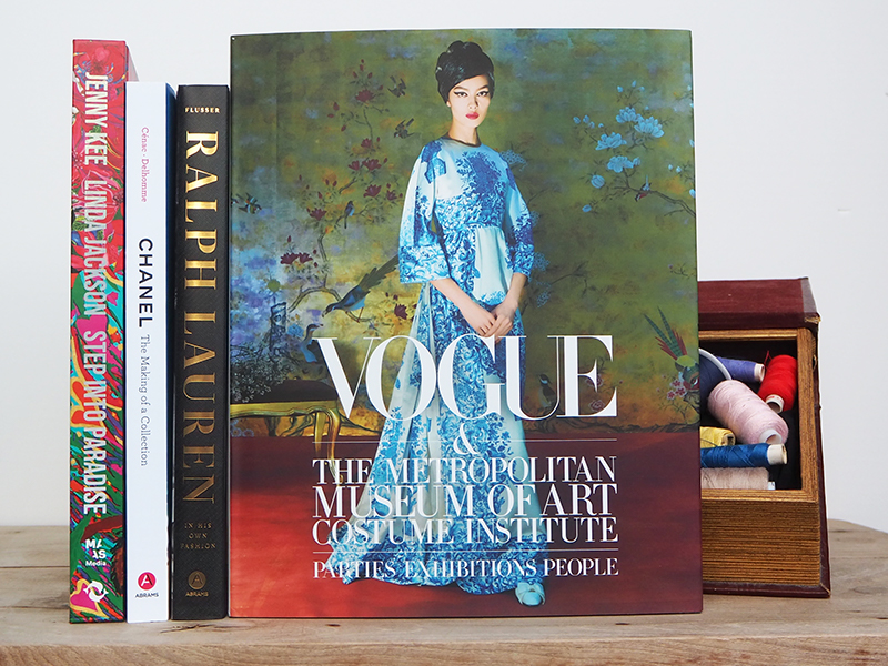
Complete your fashion bookshelf

Run away with the latest fashion bibles, specially selected by our staff for the best designs, photography and inspiration going around.

Complete your fashion bookshelf today.

Product photography and styling: Jackie Money

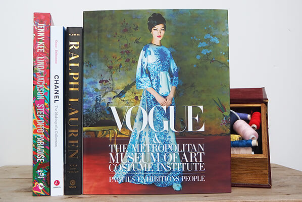
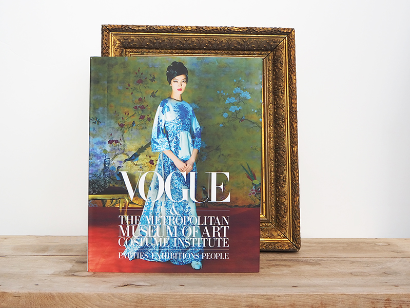
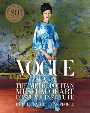
Vogue and the Metropolitan Museum of Art Institute

Cover imagery: Fei Fei Sun in Valentino photographed by Steven Meisel, Vogue, May 2015 for “China: Through the Looking Glass.” | Cover design: Alberto Orta and Nobi Kashiwagi | Product photography and styling: Jackie Money

This updated and expanded edition of Vogue & The Met covers the past five years of the Met Costume Institute’s exhibitions and galas through the lens of Vogue.

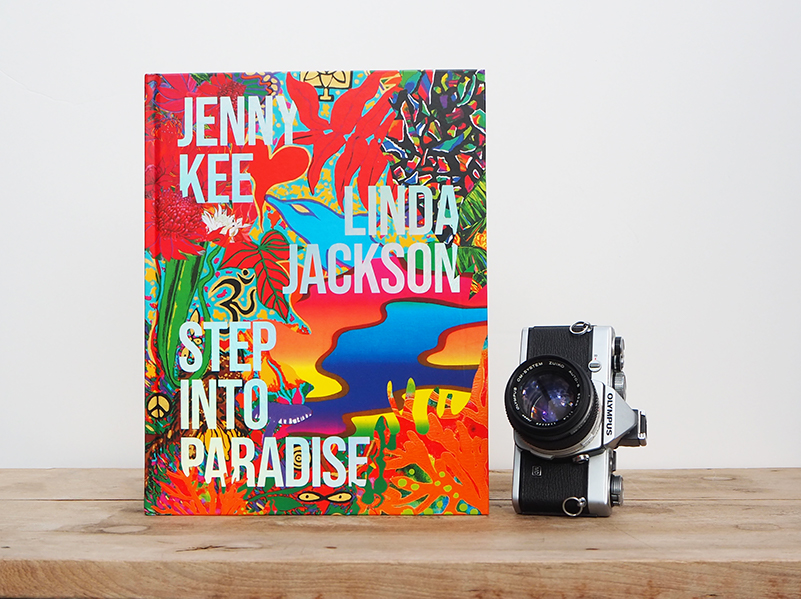
Step Into Paradise

By Jenny Kee and Linda Jackson

Cover imagery: collage of Jenny Kee’s and Linda Jackson’s works | Cover design: Daniel New| Product photography and styling: Jackie Money

Step Into Paradise documents the work of Australia’s best known designers, Jenny Kee and Linda Jackson, spanning more than four decades of their creative practice.

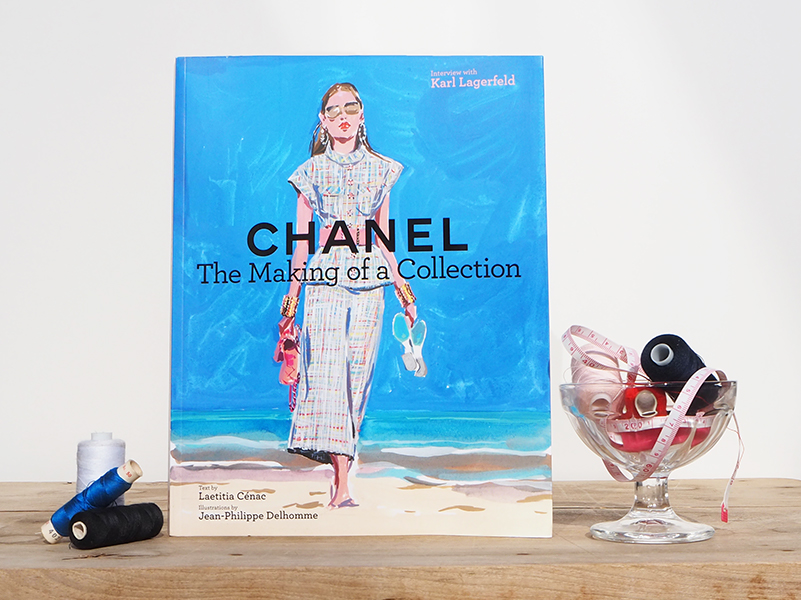
Chanel: The Making of a Collection

Text by Laetitia Cénac | Illustrations by Jean-Philippe Delhomme | Interview by Karl Lagerfeld

Cover illustration: Jean-Philippe Delhomme | Cover design: Shawn Dahl, dahlimama inc. | Product photography and styling: Jackie Money

Chanel: The Making of a Collection is a gorgeously illustrated exploration of the history, culture, and design process of famed fashion house Chanel.

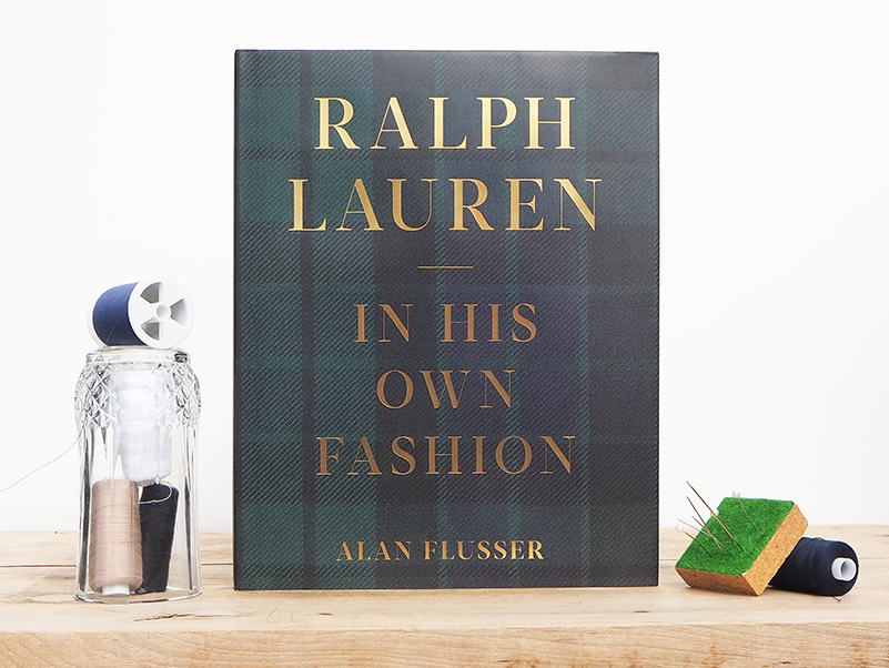
Ralph Lauren: In His Own Fashion

By Alan Flusser

Cover design: Emily Wardwell | Product photography and styling: Jackie Money

Ralph Lauren: In His Own Fashion is a fully illustrated biography of the iconic American designer, told through the lens of his impact on fashion and culture.


Posted on June 22, 2020
Posted on

Making Colour Visceral: How Paint is Made

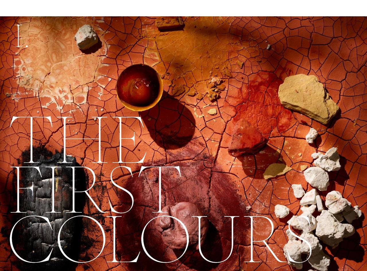
From one of the world’s most respected paint-makers, David Coles, Chromatopia reveals the stories behind fifty striking pigments. In this extract, Coles discusses the extraordinary process through which paint is made.

Photography by Adrian Lander

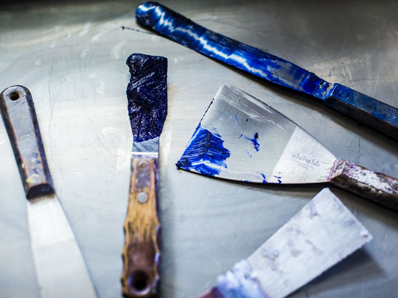
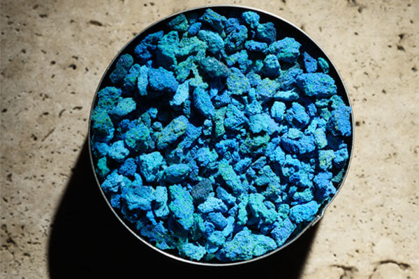
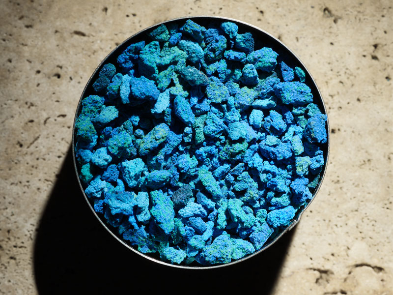
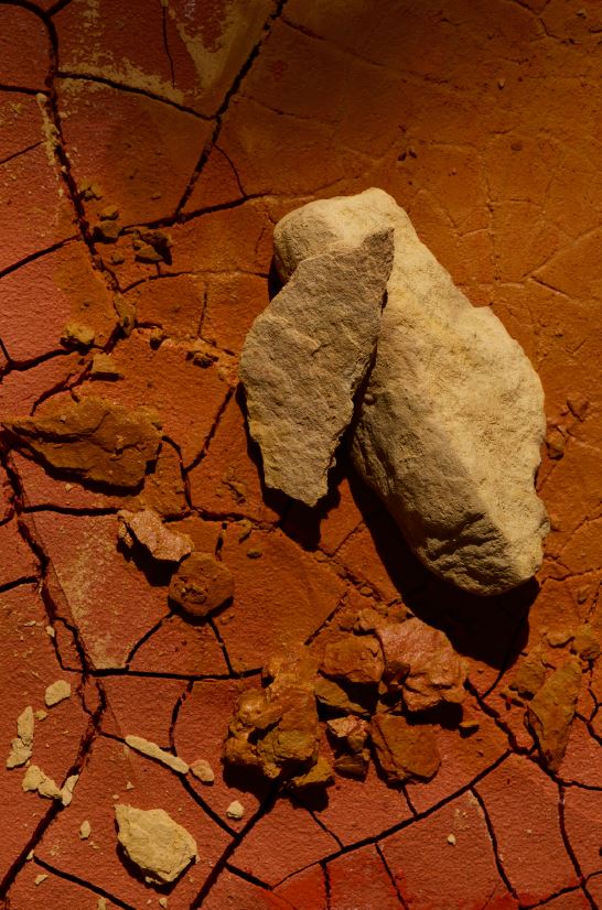
This book has looked at the origins of historical and contemporary pigments, but pigments are hardly ever used in their raw form. To be usefully employed as a colour, billions of individual grains of pigment must be glued together with a binder. This is, in essence, how you make paint.

Throughout history, people have found ways to permanently ‘fix’ colour to create lasting images of the most exquisite beauty. For instance, the binding of pigments in Neolithic cave paintings was probably serendipitous; cave walls containing silicas or limestone trapped the pigment and locked it to the surface over time. Since then, we have discovered a host of sticky, adhesive materials in nature that could hold pigments in place. Some of these earliest binders are still used by artists. Gum arabic, the water-soluble sap of the North African acacia tree, makes watercolours; and beeswax, collected and refined from hives, makes encaustic (molten wax) paint.

Mixing pigments with different binders successfully converts them into a material for uses as diverse as house paints, plastics, writing inks, automotive coatings, paper and – of most interest to me – artists’ paint.

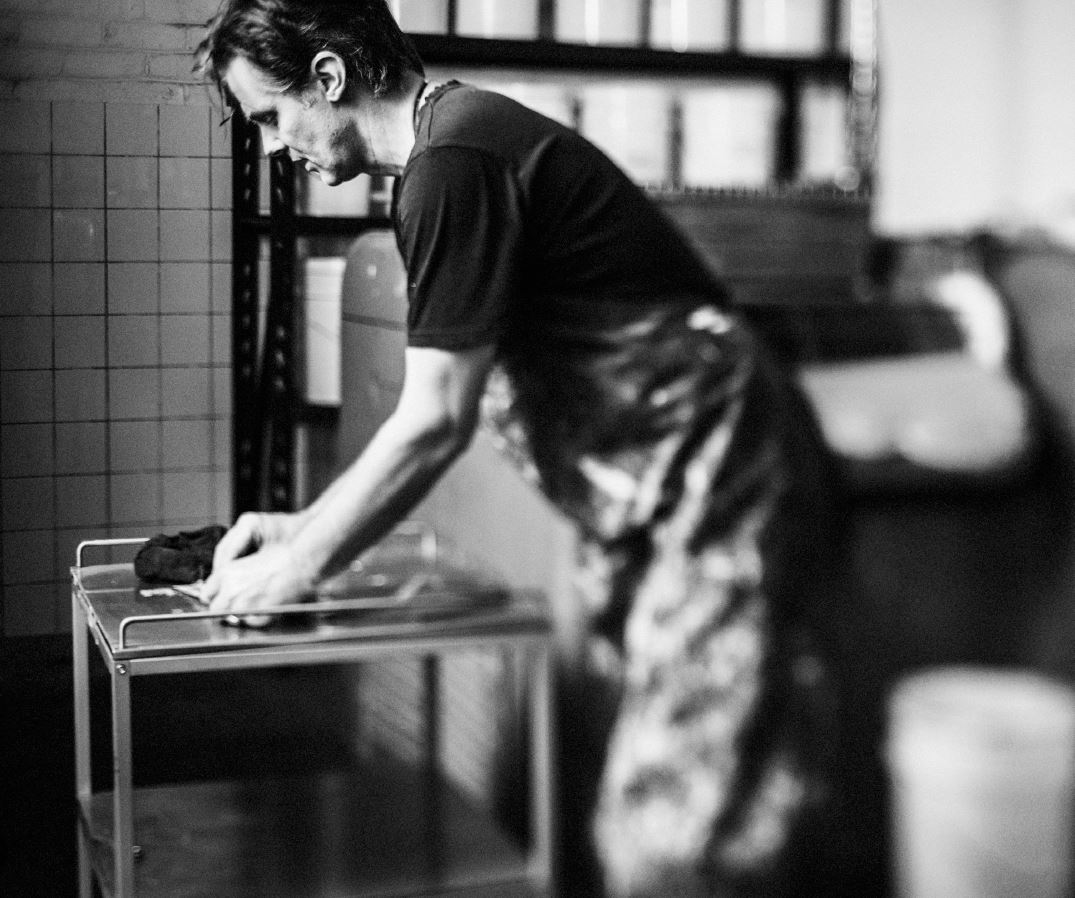
In my role as a master paint-maker, I make oil paint, which are by dispersing pigments in a ‘drying oil’ such as linseed, walnut, poppy or safflower oils. Linseed oil is by far the most important and widely used drying oil. When drying oils absorb oxygen they convert from a liquid into a hard, permanent coating. Pigments can be bound with very small amounts of oil. This means that oil paints contain much higher amounts of the pigment than watercolour or acrylic paints. For artists, this gives the paint a physical feeling. The paintbrush is literally pushing around dense, coloured pastes.

Photography by Adrian Lander

So how do we make our paint? Our first task was to source a high-quality linseed oil. We selected ours after sampling dozens of products from suppliers all over the world. We were looking for a clean, straw-coloured oil that was free of natural impurities. It had to have a good drying rate and minimal yellowing as it aged. Eventually we chose exceptional bright, clear oils made in Holland and Germany.

Next comes the selection of the pigments. There are so many manufacturers of pigments that the choice seems overwhelming. We hunt out pigments that have qualities equal to their noble intended use: they must be as lightfast as possible, chemically stable and exhibit colour qualities of benefit to the artist. The vast majority of pigments do not meet our needs. They are built for larger, more commercially important industries and have been tailored for industrial applications.

To select our pigments, we go through a long period of investigation. We select colours of interest, research the chemical construction of the pigment, and assess its suitability for artists’ paint before requesting samples for laboratory trials. The anticipation of opening a sample box and seeing a new pigment for the first time, in its raw unadulterated form, is exhilarating. There is always the nervous hope that the promise held out by this new pigment will be borne out, that its potency will not dull, and that its colour will not be lost when it is mixed with the binder. Backwards and forwards go the experiments – working out the right amount of pigment to add to the oil and correcting for undesirable qualities. Like a chef honing a new dish, small, delicate changes in the recipe can lead to dramatic differences in the finished product.

Photography by Adrian Lander

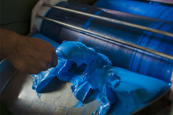
When we are ready to make the paint, the linseed oil is weighed out into 60-litre heavy-duty stainless-steel bowls. All of our manufacturing equipment and surfaces are stainless steel. The equipment is kept meticulously clean to prevent any chance of other colours contaminating the purity of each new batch.

Stearate, a wax-like material that is essential to the wetting and stability of the paint, is weighed and added to the oil. The bowl is secured in a planetary mixer and large, powerful motors slowly rotate the blade through the wax and oil mixture.

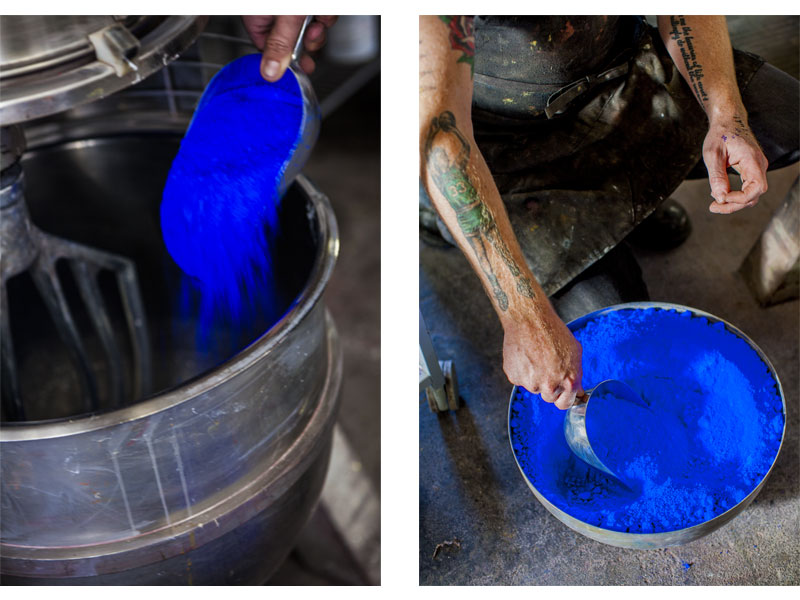
Next, another steel bowl is placed on the electronic scales, ready for the pigment. Even after all these years, opening the bins of pure pigment is a ridiculously breathtaking assault on the eyes. The pigment is scooped out, weighed and added slowly to the oil. There are no short cuts. Adding all the pigment at once would make incorporation impossible. The liquid oil allows the individual grains of colour to slide over each other. The physical shape of pigments means that, without this lubrication, they would drag over each other, causing extraordinary resistance, reducing the mixing action and – as happened once very early on – breaking the very expensive blade of the mixer.

The slow churning of the paste begins. Over the rumbling of the mixer’s motor, you can hear delicious slurping noises as the blade methodically drives through the mixture. As the dry pigment is gradually incorporated with the wet oil, it changes from an incredibly thick batter into what looks like an enormous vat of vividly coloured butter.

This process can take as long as four hours, but it is not the finished paint. Under close inspection, vast quantities of the pigments still cling together rather than being individually coated. This is where the triple-roll mill comes in.

Photography by Adrian Lander

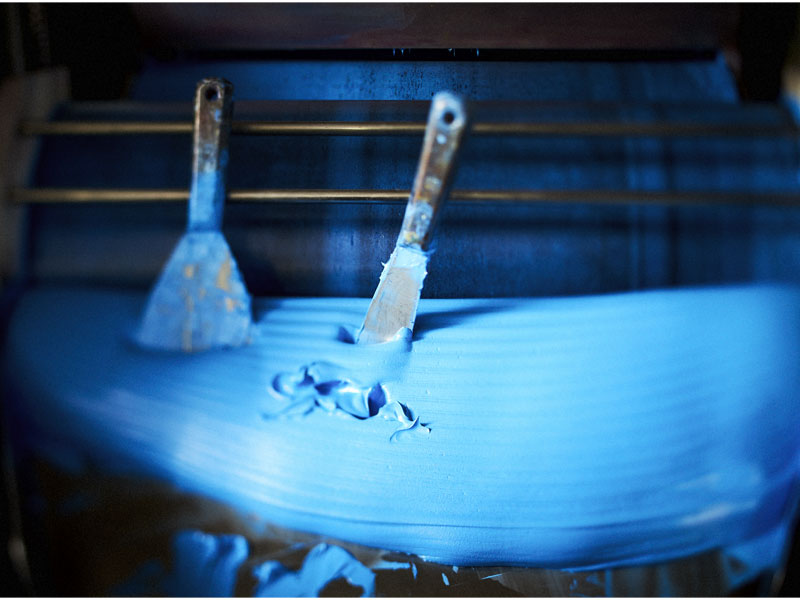
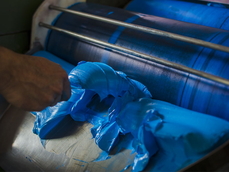
A triple-roll mill is at the heart of paint-making. At its most basic, it is three horizontal granite rollers that each run at different speeds and spin in alternating directions. The paste is scraped out of the mixer’s bowl with a baker’s blade and dropped into the hopper. Each giant dollop makes a delicious slap as it plops onto the rollers below. The paste is drawn down into the tiny space between the rollers, again and again. With each pass, the space is narrowed to more aggressively separate the pigment particles. If you have ever used a pasta-making machine with its two rollers forcing the dough through the small space between them you can understand the paint-making process. Just as the roughly made dough cannot pass through the narrowest setting first, so the pigment-paste must be passed through the mill rollers multiple times. It’s just that our mill is like a pasta-machine on steroids, with three rollers rather than two and a massive motor to drive the material through. For soft pigments such as zinc white only three passes are needed, but the synthetics can take up to nine passes. Synthetic pigments are very difficult to prize apart: their incredibly small size and specific shape mean they have to be painstakingly teased into dispersion.

The paint-maker must be constantly attentive to the vagaries of milling. Rollers heat up under the friction of pigment particles, which alters the size of the roller gap, and the fluidity of the oil is affected by changes in ambient temperature. Also, pigments behave differently from one batch to another. This is especially true of the natural earths, which vary in their mineral make-up depending on the part of the seam the earth was dug from.

Photography by Adrian Lander

Towards the end of the paint-making process, we take samples of the paint and test it for quality. Historically, paint-makers would rub the paint between their thumbnails – a simple but surprisingly delicate solution to feel for the grittiness of unmixed pigment. Nowadays we use a precisely honed stainless-steel gauge to check the quality of dispersion.

But we are still not ready to sign off on the product. Two extremely thin films of the freshly made paint are applied to paint-maker’s cards. One daub is the pure paint. The other is the paint mixed with a specified amount of titanium white.  By placing the card next to one from a previous batch of the same colour, we can ensure that every time we make the paint it has identical colour, tinting strength, tint colour and undertone to all previous versions.

Only after the paint has passed these tests is it approved for packing. It is hand-filled into collapsible aluminium paint tubes, labelled with hand-painted swatches of the individual colour, boxed and shipped to studios around the world.

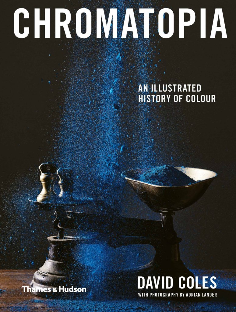
Chromatopia is available now. Text by David Coles, photography by Adrian Lander, and cover design by Evi. O Studio.

AU$34.99


Posted on June 17, 2020
Posted on

Flours, Feeding and Failures: Sourdough Troubleshooting with Roly Allen

By now, many of us have completed a back-breaking 1000-piece puzzle, tried our hand at something creative and baked our first (or tenth) loaf of bread.

We put a call-out on social media asking what sourdough issues you were facing and collated our top FAQs. Now, we sit down with sourdough expert and author of How to Raise a Loaf, Roly Allen, to have your questions answered.

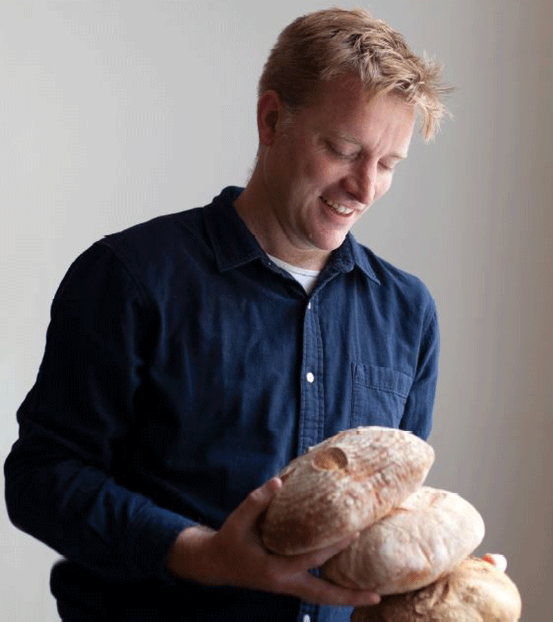
Roly Allen, photography by Ida Riveros

What is the difference between bread flour and plain flour?
Bread flour has a higher protein content – around 13% is typical. These proteins (specifically, glutiens) are collectively known as gluten and, because they are looooooong molecules, they hold the dough together, making it stretchier, tighter and able to hold bubbles. That’s why you need bread flour for bread. Plain flour has less gluten. Otherwise they are the same.

I feel like my bread is really dense. What do I need to do to my starter for it to be light and fluffy?
It might not just be the starter, but assuming it is, I find that starters get better the more often that you use them and refresh them. If I bake three or four days running, the starter seems to get bubblier and bubblier. If my starter has just been refreshed once, after spending a period of downtime in the fridge, then things can be flat.

What is the maximum amount of time you can keep your starter in the fridge without feeding it?
Tricky one. I’ve heard tell of a starter that was successfully refreshed after several years dormancy in the back of the fridge, but I’d personally not leave it longer than a couple of weeks. If I knew that my starter would be going a long time unfed, I would make a flourier mixture (less water), which will slow everything down. I would definitely give a dormant starter a couple of refresh-discard cycles for it to get its strength back up before baking.

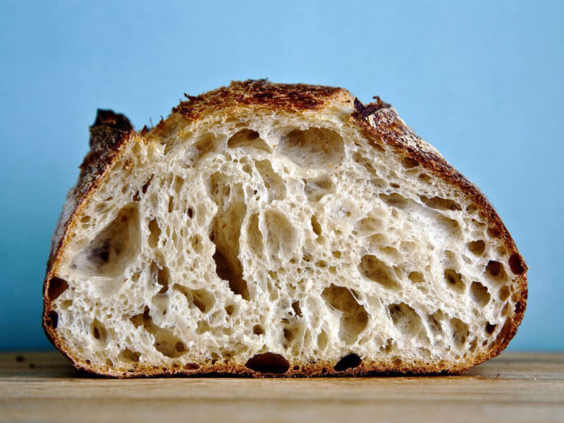
I learned that the word ‘crumb’ describes the inside of the bread from your book, which is interesting. Despite using a white flour but still can’t achieve the open crumb that I want. Any tips?
Try a mix with slightly more water and an overnight (or ‘retarded’) prove in the fridge. You mix and work the dough in the evening, and let it prove slowly at low temperature before baking in the morning. That might do it!

An open crumb, photography by Ida Riveros

I normally don’t eat white bread. I’ll always choose a wholemeal or multigrain. Do you recommend always starting with a white loaf first because it’s the easiest, or do you think jumping straight into wholemeal is achievable?
It is definitely easier to get a white loaf to rise and have an open crumb. That said, I really like denser brown breads myself and, if that’s what you like, I would just go ahead and start with them. Practice makes perfect, no matter what colour your loaf is.

Cooking time — dutch oven lid on for 45 mins and lid off for the final 15. Do you approve?
If it works for you, then yes!

What does adding a source of steam mean? I just have a regular fan-forced oven and no fancy equipment. What are some ways that I can easily add steam?
It is essential, but easy – just put a cup of hot water into an oven dish in the hot oven before you put the loaf in. The steam stops the crust from setting hard before the middle of the loaf has baked.

I just learned that you can overproof dough. Anything else we might not know about sourdough?
Salt is absolutely essential, and not just for taste. The salt works on a chemical level with the gluten to help the crumb form. If you forget to add salt, or don’t add enough, you get something that doesn’t taste, or look, that good. I’ve learned this the hard way.

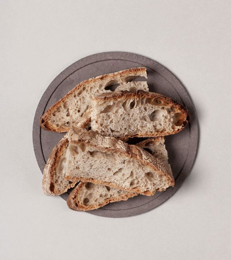
Photography by Ida Riveros

What do you think is the biggest mistake people make when they try to make their first loaf?
I can’t speak for everyone, but the mistake I made was leaving the dough to prove for too long. This means that the dough pancakes out and you get a discus-shaped loaf that’s really dense. You need to get that dough into the oven while it’s still nice and springy to the touch.

What are your favourite toppings for freshly baked sourdough?
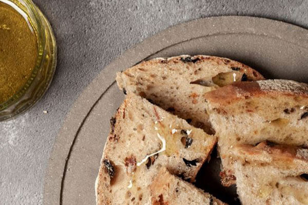
For breakfast: butter and apricot jam; for lunch, cheese and pickle; with dinner, butter or olive oil. If it’s toasted then it’s Marmite every time (Marmite is similar to Vegemite, but delicious).

Photography by Michelle Brasington

There are so many types of bread. Why do you think sourdough is such a craze?
Two reasons. Firstly, it’s a reaction against industrially-produced food. Sourdough bread is traditional, it doesn’t have additives, and you can tell that from how it tastes. Secondly, we are only now starting to understand how important our gut biomes are to our overall health – not just to our digestion. The lacto-bacteria that make sourdough taste slightly sour seem (don’t ask me for the detail!) to have a really positive effect in that department.

How to Raise A Loaf and Fall in Love with Sourdough is available now. Text by Roly Allen and published by Laurence King Publishing.

AU$25


Posted on June 16, 2020
Posted on

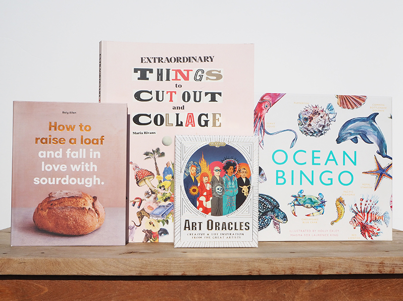
Complete your activities collection

These tried and tested activities come highly recommended from our staff for keeping yourself busy. Bake some bread, play a game, convene with oracles or delve into some arts and crafts.
 
Complete your activities collection today.

Photography and styling: Jackie Money

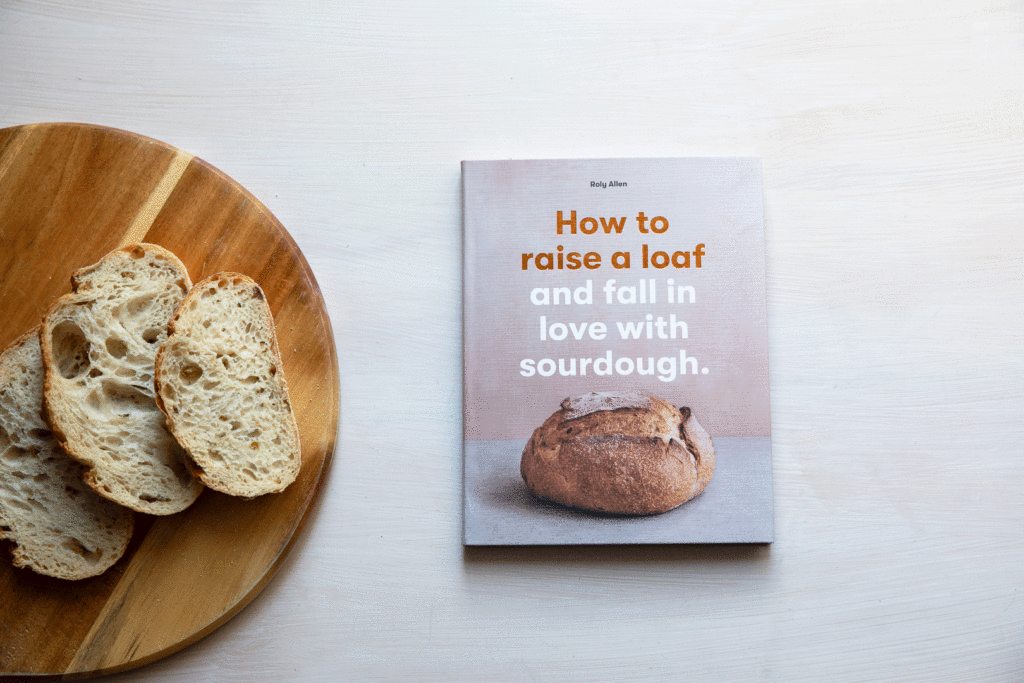
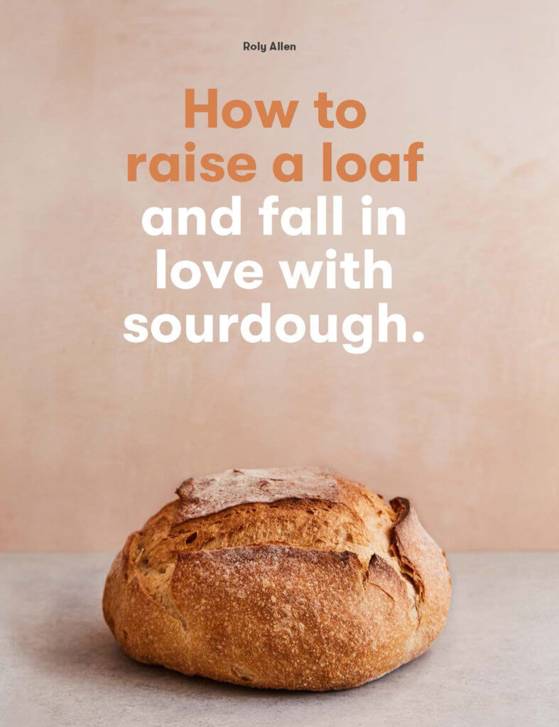
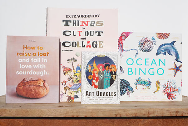
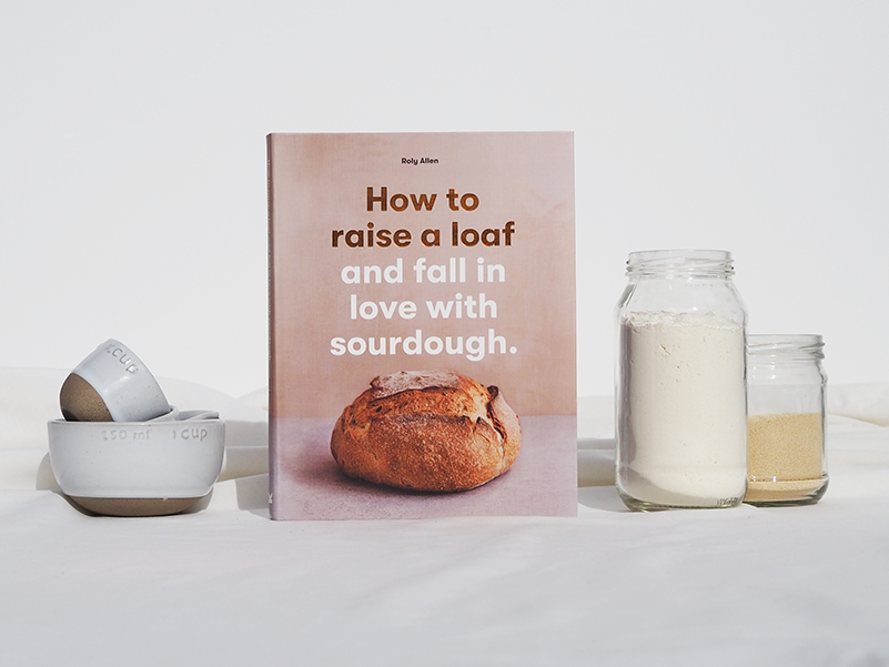
How to raise a loaf and fall in love with sourdough

By Roly Allen

Photography: Ida Riveros and Rita Platts. Design: Masumi Briozzo.
Product photography and styling: Jackie Money.

How To Raise A Loaf is your go-to guide for making sourdough. Let bread-master Roly Allen run you through the key techniques of traditional baking, creating a living starter, and mastering a crusty loaf. 

Art Oracles

By Katya Tylevich. Illustrations by Mikkel Sommer Christensen.

Illustrations: Mikkel Sommer. Product photography and styling: Jackie Money

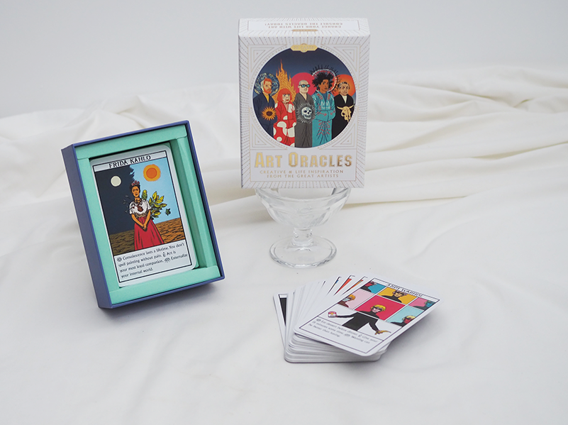
Are you suffering from creative block? Struggling to make a difficult life decision? Art Oracles is here for you. Find out what Picasso, Pollock, Kahlo and other great artists would have done with this set of fifty oracle cards. 

Extraordinary Things to Cut Out and Collage

By Maria Rivans

Design: Mariana Sameiro. Product photography and styling: Jackie Money

Discover the exciting world of Extraordinary Things to Cut Out and Collage, featuring hundreds of beautiful, quirky, and downright daft images, all here for you to cut out and stick.

Ocean Bingo

Illustrations by Holly Exley

Design: Inca Starzinsky. Product photography and styling: Jackie Money

Ocean Bingo is a family-friendly game is packed with ocean creatures for hours of bingo fun, featuring interesting facts and glorious illustrations designed to delight aquatic aficionados.


Posted on June 10, 2020
Posted on

Vogue & The Met: A Glance at Fashion History

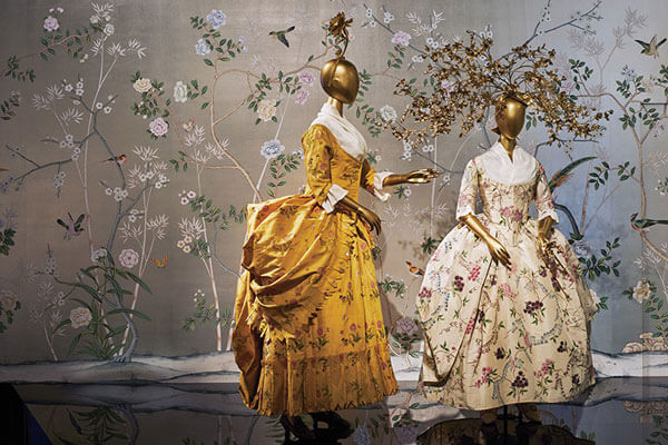
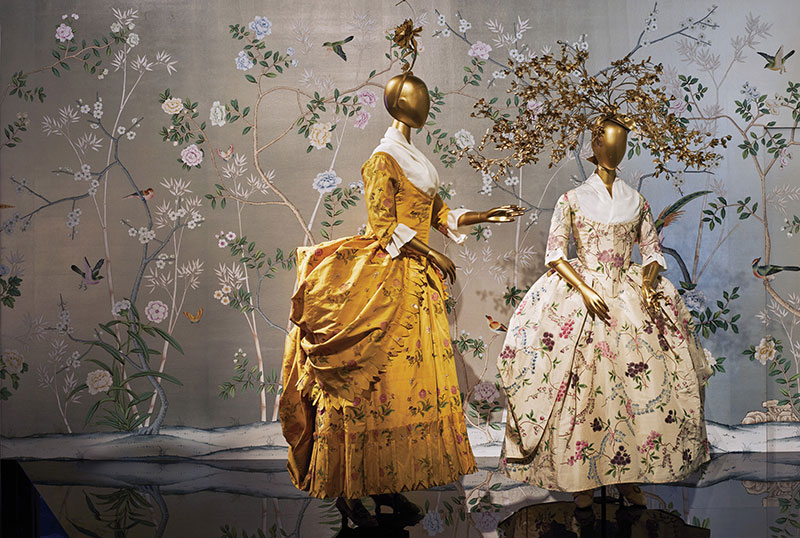
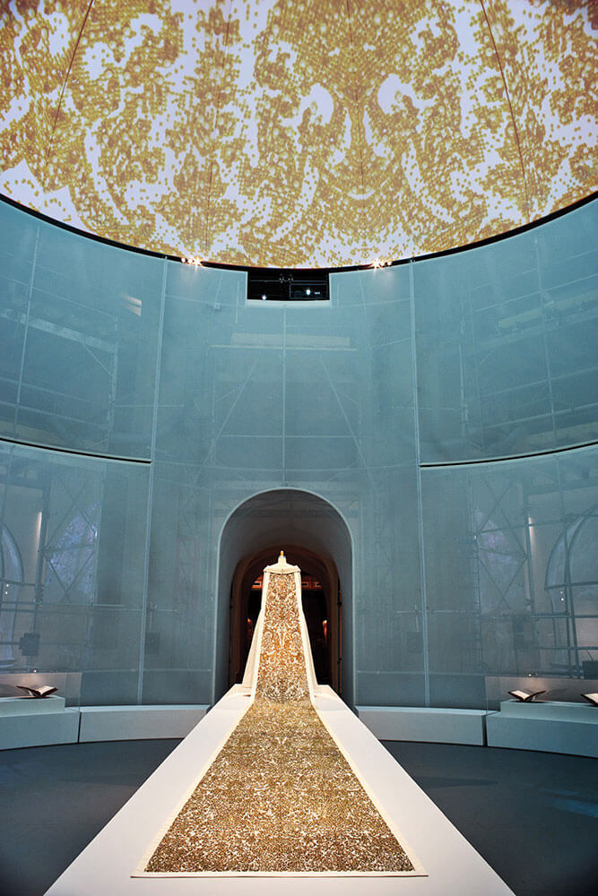
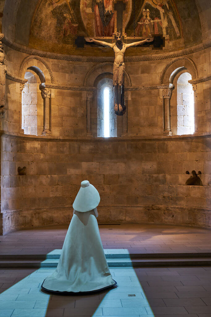
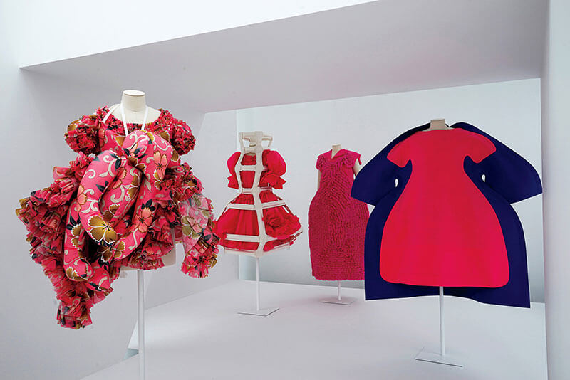
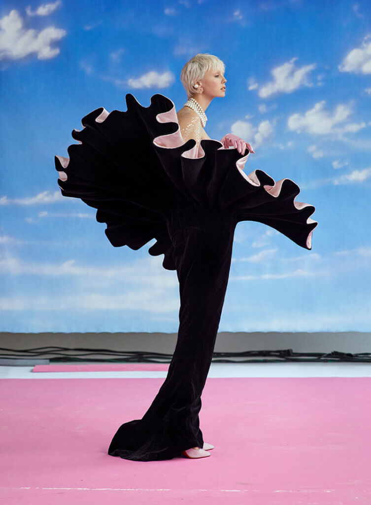
Over the past twenty years, The Metropolitan Museum of Art Costume Institute has produced, time and time again, fascinating and provocative exhibitions. Their annual exhibition is the most spectacular of its kind, providing a window into significant moments in fashion history. Even more, they reflect and create the contemporary zeitgeist. The show’s opening night fundraiser, commonly known as The Met Gala, is attended by notable stars, young creatives, and industry paragons alike.

Vogue & The Metropolitan Museum of Art Costume Institute: Parties, Exhibitions, People unveils the seamless collaboration between The Met and Vogue in bringing both the exhibition and gala to life each year. This updated and expanded version of the book, originally published in 2014, includes the dramatic and daring exhibitions of the past five years. Think 2015’s ‘China Through the Looking Glass’ through to 2019’s unforgettable ‘Camp Notes on Fashion’. In the absence of a 2020 gala, wanted to celebrate this ode to the museum and it’s history with a few of our favourite photographs from the book.

Photography by Eric Boman © The Metropolitan Museum of Art

Photography by Eric Boman

Vogue & The Metropolitan Museum of Art Costume Institute: Parties, Exhibitions, People is available now. Text by Hamish Bowles, foreword by Max Hollein, and introduction by Anna Wintour. Edited by Chloe Malle and originally published by Abrams Books.

AU$90.00


Posted on June 9, 2020
Posted on

Parents’ Notes for Kids of All Ages

After a term of homeschooling, the last thing you’re thinking about is setting another homework task, putting aside time for learning or trying to stretch out that 45 minute activity that your sweet angel completed in less than ten minutes.

For those times when you can’t possibly open up another teacher-resource, we have you covered; welcome to parents’ notes.

What are parents’ notes?

Our parents’ notes are just like teachers’ notes, but without the emphasis on learning. Parents’ notes are about inspiring conversation.

The best thing about our parents’ notes is that you don’t need any extra resources and you don’t need to buy the book. Everything you need is included on one page — the questions, the book’s cover and any other helpful illustrations.

We’ve put together parents’ notes for three of our best-selling Laurence King Publishing titles, one for each age group. You can download your parents notes here on our activity page.

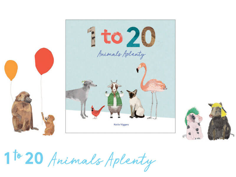
1 to 20 Animals Aplenty

Questions aimed at ages 3-5, download here

Example question: How many animals can you see on the front cover? Can you name them all?

1 to 20 Animals Aplenty is a delightful counting book that takes young readers from 1 to 20 – from dogs who have pet frogs and snakes who love to eat cakes to gorillas looking at mirrors and llamas wearing pyjamas! Beautifully illustrated by Katie Viggers and published by Laurence King Publishing.

Bob Goes Pop!

Questions aimed at ages 5+, download here

Example question: What are the physical differences between Bob and Roy?

From award-winning author Marion Deuchars and published by Laurence King Publishing, Bob Goes Pop is a charming and funny follow-up to Bob the Artist and Bob’s Blue Period, all about art and teamwork.

Match a Mummy

Questions aimed at ages 10+, download here

Example question: Based on the cat and cat mummy on the box, what can we assume about the ancient Egyptians’ relationship to cats?

Travel back in time to Ancient Egypt with this new children’s matching game, developed in partnership with the British Museum and published by Laurence King Publishing. Locate and match up the pairs to learn more about how the Egyptians lived.


Posted on June 9, 2020
Posted on

Complete your creative bookshelf

At Thames & Hudson Australia, we pride ourselves on our ‘museum without walls’, our books which explore every interest and spark creative energy.

Product photography and styling: Jackie Money

Over the coming weeks, we will be sharing our top titles for key interest areas, from lifestyle and architecture books, to activities, puzzles and games.

Complete your creative bookshelf today.

Complete your fashion bookshelf

Run away with the latest fashion bibles.

EXPLORE ➔

Product photography and styling: Jackie Money

Complete your activities collection

Fight boredom with our best activities on bread baking, bingo playing, fortune telling and collage making.

DISCOVER ➔

Product photography and styling: Jackie Money

Complete your lifestyle bookshelf

Discover a heady mixture of our favourite books on topics spanning plant medicine, floristry, home plant care and career advice in the creative industry.

READ MORE ➔

Product photography and styling: Jackie Money

Coming soon…

  • Complete your picture book collection
  • Complete your architecture bookshelf
  • Complete your art bookshelf
  • Complete your interior design bookshelf

Posted on May 20, 2020
Posted on

Colours in the Time of the Ancients

From one of the world’s most respected paint-makers, David Coles, Chromatopia reveals the stories behind fifty striking pigments. The book spans several time periods; here, we look at some of the colours featured from the ancient world.

Egyptian Blue

Photography by Adrian Lander

This was the first synthetically produced colour.

Invented at around the same time as the Great Pyramids were being built, Egyptian blue’s creation dates back about 5000 years. The Ancient Egyptians believed blue was the colour of the heavens and because of the rarity of naturally occurring blue minerals like azurite and lapis lazuli, they devised a way to manufacture the colour themselves.

Egyptian blue was not produced by blind chance: it was created with precision. Made by heating lime, copper, silica and natron, the pigment’s invention was a development of the ceramic glaze processes. The Egyptians controlled the firing of the raw materials with amazing accuracy, holding their kilns at a crucial temperature close to 830°C.

The famous crown of Queen Nefertiti owes its colour to Egyptian blue and the pigment was used extensively for painting murals, sculptures and sarcophagi. It spread from Egypt to Mesopotamia, Greece and the outer reaches of the Roman Empire and was used at the palace at Knossos, in Pompeii and on Roman wall paintings. Known to the Romans as caeruleum (from which the colour cerulean derives its name), it was widely used throughout the Classical Age, but the knowledge of how to make it was lost with the fall of the Roman Empire.

Discoveries made by Napoleon’s 1798 Egyptian expedition led to further investigation of Egyptian blue; and eventually, in the 1880s, the chemical composition of the pigment was identified and the manufacturing process was recreated.

Orpiment

Photography by Adrian Lander

Orpiment was the closest imitation to gold.

Its Latin name is auripigmentum (gold paint) and in the classical world, it was believed that this resemblance had deeper alchemical roots. It was even said that the Roman emperor Caligula could extract gold from the mineral.

In fact, orpiment carries a much more dangerous substance. It is a highly toxic sulphide of arsenic. The Persian word zarnikh (gold-coloured) became arsenikon in Greek and then arrhenicum in Latin, from which the English word ‘arsenic’ is derived. The Romans were well aware of orpiment’s poisonous nature and used slave labour to mine it. For the unlucky slaves this was, in essence, a death sentence.

Orpiment was used in Ancient Egypt as a cosmetic, taking its place in history alongside other deadly pigments used in makeup. It was used in painting for centuries throughout Persia and Asia, but in Europe, because of the dominance of lead-based yellows, it was most often employed in manuscripts.

A manufactured version, known as king’s yellow, was available from the 17th century. The name is believed to come from Arabic alchemy, which described orpiment and realgar as the ‘two kings’.

Both the naturally occurring and synthetic versions of orpiment were incompatible with other commonly used pigments, particularly lead-based pigments like flake white, and copper-based pigments like verdigris and malachite.  It was infamous for turning them black. With the introduction in the 19th century of the more chemically inert and less toxic cadmium yellow, orpiment fell out of usage.

Woad

Photography by Adrian Lander

Woad was widely used as a dye in Europe as early as the Stone Age.

Ancient Britons covered their bodies with woad to face the Roman legions and it is said that they struck fear into Julius Caesar himself.

The first part of the woad-making process involved taking fresh leaves of the woad plant, Isatis tinctoria, grinding them to a pulp, rolling them into balls the size of large apples and leaving them to dry in the sun. They could then be stored and used at a later date. Like indigo, the dye is extracted by fermentation. Traditional recipes specify that the plant be soaked in urine under the heat of the sun and trampled for three days. After that, the remaining liquid is a yellowish colour.

The indigo molecule is the blue colourant in woad. The magical quality of indigo is that the distinctive blue colour only develops after the textiles are removed from the dye bath and exposed to air. During the dyeing process, a scum called florey, known as the flower of woad, also develops on the surface. This was skimmed off and dried so it could be used separately as a paint colour.

The fermentation process releases large quantities of ammonia. Far worse, however, is that the plant depletes the soil that it grows in, leaving an infertile wasteland in its wake. Laws were passed in medieval Europe to curb this devastation.

Although indigo was known since Imperial Rome, the more colour-intense Indian indigo was not readily available in the west until commercial quantities were imported at the beginning of the 17th century. It supplanted woad, and production rapidly declined as a result.

Chromatopia is available now. Text by David Coles, photography by Adrian Lander, and cover design by Evi. O Studio.

AU$34.99


Posted on May 20, 2020
Posted on

Staying Green in Quarantine

Trying to figure out how to make the most of your time at home? Environmental activist and author of How to Save the World for Free Natalie Fee says it’s the perfect time to reset some of our routines and make small changes to encourage more environmentally friendly behaviour.

Natalie Fee on How to Save the World for Free

Don’t waste water

With all this extra hand washing, we’re using a lot more water. Keep a bowl in your sink to catch the water as you wash your hands then use it to water your plants. Or with all that extra time on your sparkling (er, dry and cracked?) hands, add a bit of tea tree oil to it to wash your floors. When it comes to the loo, if it’s yellow, let it mellow, if it’s brown, flush it down. 

Additionally, when making those never-ending cups of tea, make sure to only boil what you need, as kettles use up a serious amount of energy. If you forget and overfill the kettle, stick the rest in a hot water bottle or in a flask for herbal tea later in the day.

Take up cycling

If you’re avoiding public transport and tempted to jump in your car, don’t! If you’re physically able, get on your bike instead. Cycling is the perfect way to stay fit, get some fresh air and do some low-key, local shopping.

Take the time to research greener options

If you’ve got some ‘white space’ in your diary, block some time out to actually do some online switching of your heat or personal finances services. Switch to an ethical bank, a green energy provider, an earth friendly loo paper or a conscious laundry detergent.

Keep the heat off

As the days start to get colder, consider layering up to stay warm instead of whacking the heating on. Put some tights on under your jeans and wear a beanie or warm hat (maybe not when on Zoom or Skype, unless it’s a good look for you).

Don’t waste electricity

If your home has enough natural light for you to work, don’t turn your lights on during the day. Remember to switch off your electricals at the socket at night to save energy and money. And you’ll probably sleep better with the WiFi off anyway. “Alexa, stop listening to my conversations and using a crapload of data to do it”.

How to Save the World for Free is available now. Text by Natalie Fee, published by Laurence King Publishing

AU$25.00


Posted on May 18, 2020
Posted on

Complete your lifestyle bookshelf

This curated list of lifestyle books are the most current and coveted recommendations from our staff.

Right now, we’re delving into plants for the home, plants for medicine, flower arranging and career inspiration.

Complete your lifestyle bookshelf today.

Product photography and styling: Jackie Money

Plants for the People

By Erin Lovell Verinder

Plants for the People is a beginner’s guide to plant medicine by qualified herbalist and nutritionist Erin Lovell Verinder. Delve into the power of herbs by learning how to harness their healing energy.

Cover design: Alissa Dinallo | Photography: Georgia Blackie | Published by Thames & Hudson Australia | Product photography and styling: Jackie Money

The Flower Expert

By Fleur McHarg

“…tips, tricks and endless floral inspiration.” – SUNDAY LIFE

Master florist Fleur McHarg shares her wisdom in The Flower Expert, a practical guide to flower arranging and meditation on the form, beauty and symbolism of flowers.

Cover design: Evi-O studio | Cover photography: Nikole Ramsay | Product photography and styling: Jackie Money

Make a Living Living

By Nina Karnikowski

Make a Living Living by travel maven Nina Karnikowski is for anyone who has ever wished they could build a successful career doing something they love.

Designer: Mariana Sameiro|Product photography and styling: Jackie Money

How to raise a plant and make it love you back

By Morgan Doane and Erin Harding

Learn how to nurture your leafy co-habitants with How to raise a plant and make it love you back by Morgan Doane and Erin Harding. This easy guide to plant care covers plant selection and maintenance; easy-to-follow care instructions; DIY projects; and plant styling tips.

Design: Masumi Briozzo | Product photography and styling: Jackie Money


Posted on May 13, 2020
Posted on

Recipe: Speckled Beetroot Sourdough

There’s no better time to settle in to the ultimate, feel-good luxury of making homemade bread, and this Speckled Beetroot Sourdough is worth settling in to.

Whilst all the recipes in How to Raise a Loaf are suitable for beginners, this recipe should be attempted once you’ve already made your first basic loaf. The recipe for a basic loaf, as well as kneading and folding tutorials, are all included in How to Raise a Loaf. You’ll also find a step-by-step guide to making and using your starter. Head over to Laurence King’s Instagram story here to watch how we make our starter.


Speckled Beetroot Sourdough

With a distinctive appearance and earthy aroma, this is a real show-stopper, and a perfect, hearty accompaniment to winter soups or stews. Beetroots are a rich source of antioxidants, and also give the dough an unforgettable pink colour, which fades in the oven, leaving speckles in a classic open crumb.

Photography by Ida Riveros

Ingredients

· 200g starter
· 10ml (2 tsp) olive oil
· 180ml warm water
· 340g strong white bread flour
· 7.5g (1½ tsp) fine salt
· 150g fresh beetroot, peeled and coarsely grated
· rice flour or semolina, for dusting

1. In a large mixing bowl, whisk the starter, olive oil and warm water together until the starter has dissolved.

Photography by Ida Riveros

2. In another bowl, mix the flour with the salt. Add this to the wet mixture and mix well with your hand, then add the grated beetroot and mix until the beetroot is evenly distributed. Cover the bowl with a tea towel and leave to rest for 30 minutes.

3. Wet your hands, then pull, fold and rotate the dough 8—10 times, so that it forms a ball. Leave to rest for 10 minutes.

4. Repeat Step 3 twice so that you’ve worked the dough three times and it has rested for a
hour in total.

5. Dust a proving basket liberally with rice flour or semolina. Wet your fingers, work them around the bottom of the ball of dough and gently transfer it to the proving basket, keeping the seam upwards.

6. Cover with a tea towel and leave in a warm place to prove. Depending on the temperature and the activity of the yeast, it may take three to six hours to gain about 50 per cent in size.

Photography by Ida Riveros

7. When the loaf has proved, preheat the oven to 230°C (210°C fan)/gas mark 8, with a heavy baking tray or baking stone on the middle shelf, and add a source of steam. Turn the loaf out of the proving basket onto the heated surface, cut it twice across the top with a sharp blade or scissors, then place it in the oven.

8. Bake for 10 minutes, then reduce the temperature to 210°C (190°C fan)/gas mark
and bake for another 40 minutes, or until the loaf is done and sounds hollow on the base
when tapped with a fingertip.

9. Leave to cool on a wire rack before eating.

Photography by Ida Riveros

This is a recipe extract from How to Raise a Loaf, published by Laurence King Publishing, $25, available here.


Posted on May 11, 2020
Posted on

At home with cake queen Alice Oehr

Alice Oehr is passionate about her career in illustration and design, but her heart truly belongs to cake. In her first book, The Art of Cake, Alice explores the wonderful culture of cake, profiling fifty of the world’s favourite in her signature illustrative style. We visited Alice at her colourful home to chat about her road to becoming one of Melbourne’s most popular artists and all things dessert.

Can you share a bit about your background and what led you to becoming one of Melbourne’s favourite illustrators/designers?

I have always made things and enjoyed art, but it took me a while to come around to committing my life to it as I had other interests. I did an arts degree, travelled, and had some fun before knuckling down and studying graphic design. This gave me a set of skills that I could immediately use to realise my ideas, and to work for people who needed things done. I gradually leaned more into illustration as this is where my passion lay: colour, pattern, and so forth.

What was your approach to decorating your home, and what makes it quintessentially ‘you’?

I think a lot of artists are collectors (or hoarders, for a better word) as they are romantically drawn to objects and the life that thing has had. This is the case for me. I had no planned approach to decoration but over time, my home has become filled with things that all have sentimental value; objects passed down from grandparents, artworks from friends and souvenirs collected from round the world. Thus, the house is rather colourful, eclectic and chaotic, and that is me.

What is your favourite item in your house, and what does it mean to you?

I don’t really have a favourite, though some things do bring back very good memories. The corn jug is something that really makes me laugh, as it is so kitsch. I bought it at a flea market in France on holiday with my family. It appalled my mother, walking, as it does, the line of good taste. I enjoy this object because I can actually use it, and regularly put flowers in it.

How do you split your time between your home and your studio?

The only approach that works for me is to treat my freelance work as a full-time job. I work 9am to 6pm at my studio, and almost never at night or on weekends. I don’t  go out for lunch or go shopping during work time as I find this will come back to bite me later, when I find myself staying up until 2am finishing it.

You say that cakes are embedded in our memory, ‘laced with a heavy dose of nostalgia from the sweet moments of our past.’ Where does your love for cakes and pastries come from?

At first, I didn’t really know; but through the process of making this book, I have realised it is from the great sense of occasion my parents attributed to a visit to the cake shop when I was a kid. It served as a bribe, and it worked. In childhood too, the grand event of a birthday cake was long drawn out: choosing the flavours and the decoration, anticipating it, then being presented with it in front of a crowd in a great show of sparklers and singing. All that emotion is deeply embedded in the way I think about desserts – they are always special, and something to get excited about.

When did you start illustrating cakes, and at what stage did The Art of Cake come into conception? Can you talk a little about the creative process behind the cakes in the book?

My habit of drawing everything I see when I go travelling is what sparked the idea for the book. When I’m away I notice everythingand draw all the things I see and do. Each country I’ve visited has their own unique answer to a ‘sweet treat’, especially in places like France and Italy – their cakes are like works of art. Coming from Australia where we have more of a ’Women’s Weekly’ approach to cakes; the ostentatious decoration of France’s petits fours, for example, really appealed. The book seemed like a good idea as the universal appeal of a cake was clear. Every culture, from pretty much time immemorial, has had its own form of sweet dish – often associated with reverence or celebration – and I felt that this could be explored. I researched what are considered the most beloved cakes around the world and compiled a list. I investigated each cake to write my description of it’s flavour and presentation, as well as its history and most interesting tidbits. Then I drew them all!

What’s the best place in Melbourne for cake or a sweet treat?

For cake, absolutely without question, Beatrix in North Melbourne. If you’re after a more ‘bread–like’ snack, for instant a croissant or brioche pastry, Baker D. Chirico in Carlton is the best in that department.

What other projects have you been working on that we can expect to see this year?

My favourite on-going project is the weekly still life drawing class that I teach at Lamington Drive gallery in Collingwood. I choose a theme, set up a scene on a table, and 20-30 people come in to explore drawing the still life on an iPad Pro. Exploring digital drawing is a new and exciting activity and always promotes interesting conversation.

Alice’s still life drawing classes have taken a pause during isolation but are set to resume later this year.

The Art of Cake is available now. Text by Alice Oehr.

AU$24.99


Posted on May 11, 2020
Posted on

Shortlist: Illustrated Book of the Year at the 2019 ABIAs

Australia Modern has been shortlisted for the Illustrated Book of the Year award at the 2019 Australian Book Industry Awards. We’d like to extend a warm congratulations to the authors, Hannah Lewi and Philip Goad, the designer, Stuart Geddes, and all of the contributors and editors involved with the creation of the book.

Get to know Australia Modern

Australia Modern is the most complete survey of modernist Australian architecture, interiors and landscape design spanning 1925 to 1975. With a focus on buildings and places that still exist, the book features 100 significant site examples by Australia’s most revered architects, rich archival imagery and expert essays exploring how modernism has shaped Australian society.

The book pays tribute to all types of examples of Australian modernism, whether big or small, famous or everyday. From the Sydney Opera House and the National Gallery of Victoria, to a Pop-Brutalist courthouse in regional Victoria or a modest lawn bowls club, Australia Modern recognises both the iconic and the now-obsolete. As the authors note, these examples are ‘part of our history, tangible physical reminders of the twentieth-century hopes, aspirations and growth of our local communities, cities, towns and landscapes’.

Where to catch the award ceremony – that’s right, you’re invited!

This year, the ABIAs will be held virtually via the official YouTube channel. The perk of going virtual? Anyone can tune in to watch the announcement of the winners on Wednesday 13th May from 4pm AEST.


Australia Modern is available now. Text by Hannah Lewi and Philip Goad and design by Stuart Geddes.

AU$80.00


Posted on May 4, 2020
Posted on

My Bedroom is an Office: Joanna Thornhill on your Interior Design Dilemmas

When My Bedroom is an Office was published in March 2019, we had no idea it would be so relevant over a year later. Now, Joanna Thornhill reminds us that even if your office is just an outdoor table at the end of your bed, it’s still worth making it a space you are happy to spend the day in.


No one wants to stare at a messy workspace at the best of times, least of all when dozing off in bed at the end of the day. But if the bedroom is your only viable space to set up shop, however small the available area, if you’re savvy and organised you can create a spot that functions as a place of productivity without causing nightmares.

For the workspace itself, think about repurposing a piece of furniture that will fit the aesthetic of your bedroom. A bureau or secretaire can work brilliantly, and you can just shut the hatch when you’re not using it. A simple writing desk, console or even small dining table can be a good option, but try to make a raised platform for your monitor (perhaps just a shelf resting on two wooden battens) to ensure that it sits at the correct eye level; you can tuck your keyboard under this when it’s not being used. If your table has no drawers, a basic fabric skirt fixed around the top can hide a multitude of sins, from printers to power cables.

Left: Hiding in plain sight can be a good approach for the bedroom office. Through the use of cute accessories, charming vintage furniture and a pretty overall aesthetic, this study spot is a chic addition rather than an unfortunate eyesore.
Right: An ingenious fold-down wall desk can work wonderfully in a tiny space. A purpose-built unit allows you to keep your laptop and a few other essentials hidden away, while a wall-mounted drop-leaf table or a drop-leaf butterfly table would do a similar job.
Below: Natural materials can offer the perfect counterbalance to a tech-filled study space. Paired with simple floral cuttings and touches of greenery, this work nook looks the opposite of corporate. Clever, subtle tech, such as the lamp that incorporates a wireless charging base, allows the desktop to remain relatively cable-free.
Image © Tiffany Grant-Riley / 91 Magazine

Since space will no doubt be limited, think laterally to make the most of your work nook. If your desk is in an alcove, this can offer the ideal spot to add shelves for storage, but otherwise a ladder-style leaning desk unit may be most efficient, or even a modular shelving system incorporating a desk. Soften the appearance of work paraphernalia such as box files or ring binders by covering them with fabric or wallpaper swatches that tie in with your room decor, and be creative with storage – why not keep archived paperwork in a small vintage suitcase, for example, or stack your printer paper in an old wooden fruit crate?

An ugly office chair will never enhance any bedroom, so consider working from a more visually pleasing dining chair or even a padded stool. If this is your full-time workspace, however, a proper computer chair is best for your body, so shop around for an aesthetically pleasing one (they may be few and far between, but they’re out there). If you’ve already got a bog-standard one, try covering it with a chunky throw when it’s not in use, or make fitted covers in a charming fabric to give it a more homely feel.

Joanna Thornhill
Joanna Thornhill, author of My Bedroom is an Office. See Joanna’s Instagram takeover here

If you’re up for a DIY challenge, try converting a cupboard or wardrobe into a bijou office. Add a deep shelf across the whole space at desk height, place additional shelving above for storage, tuck your printer underneath and simply shut the door when you’re done.


My Bedroom is an Office

This is an extract from My Bedroom is an Office, published in March 2019, by Laurence King Publishing, $29.99, available here.


Posted on April 27, 2020
Posted on

At home with Thames & Hudson Australia

Like so many throughout the world, our team is working from home. Some of us are surrounded by plants, some by arts and crafts, all of us by books. We love seeing the ways people are making new workspaces at home and we wanted to share some of ours with you.

Michelle Brasington | Publicity Manager

Here is my workspace. I have a lot of light streaming in through the kitchen window in the mornings and it prompts me to get the dishes done before I start work!

Design Lives Here design: Claire Orrell. Plants for the People cover design: Alissa Dinallo. Photography: Georgia Blackie.

My go-to books at the moment are:

Plants for People: A modern guide to plant medicine

This ode to plants reconnects me to nature making me feel relaxed and comforted. I am working my way through Erin’s recipes for teas and my favourite so far is the ‘daily multi’ which is packed with nutritional goodies.

Design Lives Here

This is definitely an aspirational book for me! I find it fascinating how these bespoke pieces of furniture and lighting have found their home and fit so well in these stunning architecturally designed houses.

My co-worker, Charlie the whippet, is probably the most stylish part of my home! I love all dogs, but there’s a special place in my heart for whippets. She’s a good listener and never argues when I talk to her.  All she wants is a pat and a dog biscuit!

Jackie Money | Marketing Manager

Firstly, these pictures of my house are entirely misleading, because I could never keep it so clean. Thank you to this content piece for making me tidy up. Secondly, welcome to my (working from) home.

My desk gets some lovely afternoon sunshine, making a great natural filter for video meetings. I keep that pile of work books on the chair next to me for easy reference, and art supplies at the ready for my lunch break.

RIGHT: Framed print by Carlos ARL, lovingly given as a birthday gift

When the sun gets a bit much, I can retreat to my bedroom where the bookshelves live. The books which don’t fit there have to live in piles stashed around the apartment. That doesn’t mean I love them any less than the bookshelf ones, but it does mean I have more books than I have proper places to put them.

The Flower Expert cover design: Evi-O Studios. Cover photography: Nikole Ramsay.

Lately, I’ve been pouring over The Flower Expert by Fleur McHarg. The only flower I could identify before reading this book was a sunflower, and now I can tell you what a rose looks like. Maybe even a daisy. It has so many brilliant tips on arranging flowers, like what colours to put together and how much green stuff (ie. foliage) to use. If you’re a flower novice like me, or a master like Fleur, this book will bring you pure, colourful joy.

Lisa Schuurman | Editorial Assistant

Here is my work from home desk. I’ve retreated to my parents’ house on the Mornington Peninsula for some fresh air and space while self-isolating. Currently half my desk is my mum’s sewing area and the other half is taken up by my computer, books, flowers from the garden and quite often Pepper, my dog. She has a habit of sitting in my chair but most of the time she’s under the desk trying to nibble my toes. 


I am one of those messy people who will tell you everything is organised, which is half true, but I definitely try to squish everything in wherever I can. The bookcase includes: some of my favourite THA books, a lot of YA from when I ran an online book club, a yellow duck, a fifteen-year-old lucky horse shoe with my name stamped into it, my favourite vinyl records, a small snow globe of a sheep from NZ and one of my favourite postcards that says ‘de wereld is mooier met jou’ which translates from Dutch to ‘the world is more beautiful with you’.

To match my slightly chaotic shelves, I am also a messy reader. I start multiple books and never finish them, don’t read for many months and then I’ll end up reading multiple books at a time. One book I haven’t put down is Portraits Destroyed by Julie Cotter. I started at THA just when we were beginning to work on the book but I never got a chance to read it until now. Julie Cotter has such great insight into the fascinating world of portraits and the role they play in history. You also can’t deny the power of a great pic section in bringing the words to life. 


Posted on April 22, 2020
Posted on

A Q&A with design expert Penny Craswell

Photography by Fiona Susanto

Sydney-based editor, writer and curator Penny Craswell has built a career doing what she loves: showcasing exceptional Australian architecture and interiors and writing about why they really matter. Now, Penny has released her first book, Design Lives Here, a compelling look at the connection between spaces and objects that puts the spotlight on local makers. We spoke to Penny about the inspiration behind the book, her favourite project featured, and her predictions for the future of Australian contemporary design.

Where did your love for design, architecture and interiors stem from?

It all started in Amsterdam, where I had originally planned to do an internship for a photography magazine (my first degree was Art History and Curatorship).The photography magazine didn’t have enough desks, so I went to Frame magazine, which happens to be the world’s biggest (and best) design magazine. I fell in love with design there, and when I moved back to Australia, I decided to pursue a career in design magazines and writing.

How does this translate into your blog, The Design Writer?

My blog features amazing design happening in Australia – from architectural and interiors projects like houses, restaurants and retail, to the best design objects, furniture and lighting. I also promote ethical design – design that is doing good for the environment and society.

Design Lives Here goes a step further by paying homage to local designers and makers who have crafted bespoke pieces of furniture and lighting for stunning Australian residential architecture and interiors. What led you to this project and how did it take shape?

I have a real love of interiors stemming from my time as Deputy Editor of Indesign magazine and Editor of Artichoke magazine. Far more than just colours and patterns, it is an incredible skill of understanding how spaces are used and how they should be proportioned – a too-large room is just as badly designed as a too-small room. But I also love design objects – my masters thesis was about objects and products, and how people attach stories to them – how they are made, how they are used. This book combines the two – it’s about the stories attached to both interior and object.

The idea for the book was to show the beauty of Australian design – I wanted to pair each house or apartment with one piece of Australian furniture or lighting design. In some cases, I found the pairing through the architect or interior designer and in some cases I found it through the furniture or lighting designer.

Photography by Michelle Brasington

For those who haven’t read Design Lives Here, can you tell us a bit more about the importance of spaces and objects being connected by the design process?

Every designer, whether they’re an architect, interior designer, object designer or fashion designer, starts with an idea and then works this through various iterations – sketching by hand or on a computer or both – and then works with materials to make that idea come to life. Through exploring how something was made, we can peel back the layers and truly understand its meaning and value.

Is there a takeaway for our readers on how they can bring this ethos into their own homes?

I would say that the first solution is not necessarily the best solution – sometimes you need to go through a process to find the right answer. Obviously, professional designers are the experts, so hire them if you can to help you, especially on larger projects. I would recommend that everyone consider buying Australian design – the quality and originality of the design is there, often without the huge price tag.

Do you have a favourite project from Design Lives Here?

I tried to choose a range of projects – large and small, urban to remote, for small families and large. But for me, my favourite has to be Indigo Slam by Smart Design Studio – it is a truly monumental house that is also intimate in places, and the furniture, designed and made by Khai Liew in Adelaide, is exquisite.

What would you say is the most unique object featured, and is there more to its story than revealed in the book?

I really love the Black Sambuca Chandelier by Ruth Allen – she is a glass artist and she recycles used Black Sambuca bottles – those long elegant glass shapes – into pendant lights. I didn’t mention it in the book, but Ruth told me that black glass is quite rare so working this way offers the designer/maker the chance to recycle something that would otherwise be post-consumer waste, while also working with a rare material.

Sunflower chair (Khai Liew) at Indigo Slam (Smart Design Studio), photography by David Roche
Black Sambuca chandelier (Ruth Allen) at Kiah House (Austin Maynard Architects), photography by Tess Kelly

In the book, you say that ‘the Australian dream of owning a quarter-acre block with a picket fence and a garage is no longer relevant – or at least no longer so simple.’ Can you explain why this is?

It is partly because property prices are so high these days that many young people can’t afford a mortgage on one salary the way our parents could – and sometimes they can’t afford it with two salaries. These days, we may not need a garage as many people prefer bicycles and/or public transport. Also, for financial reasons, apartments are becoming more popular in Australia, as is inter-generational living.

Where do you think Australian contemporary design is headed?

All signs show that Australian design is continuing to grow. I think we need to work on educating the general public about the value of design – there is a burgeoning design industry in Australia and people need to know they can choose to buy Australian design. As long as this continues to happen, the future looks bright for designers, makers, manufacturers and brands looking to grow their business.

What other projects are you working on, and what’s next for you?

I’m working on my blog right now and doing some preliminary research for my next book!

Design Lives Here is available now. Text by Penny Craswell and cover design by Claire Orrell.

AU$59.99


Posted on April 21, 2020
Posted on

Mind Travel: Nina Karnikowski Takes You on Your Wildest Journey Yet

Words by Nina Karnikowski, author of Make a Living Living, introduction by Bianca Jafari

Nina Karnikowski is one of Australia’s most loved travel writers. Her career has seen her journeying through Mongolia in ex-Russian military vehicles, exploring the Namibian desert in open-sided safari trucks and dodging icebergs in Antarctica in an icebreaker ship. But, for Nina, travel is more than just a job.

Our adventures (imagined, planned or taken) shape a unique part of who we are. They help form our beliefs, expand our way of thinking and provide endless inspiration. With many of the world’s international borders now closed, there’s no obvious replacement to fill the void. Now, Nina brings us one step closer, taking us on a journey that defies physical boundaries.

Nina Karnikowski, photography by Peter Windrim

Last week, I learned a new word. My mum taught it to me, sending me a BBC article she’d read about something called ‘fernweh’. Call it motherly intuition, but it was the exact word I had been searching for. It means, literally, ‘distance sickening’, and nods to that deep craving we all occasionally have to see far-flung places.

‘What if our lust for travel causes us a deep yearning pain, an ache that reminds us we have to get out and see the world?’ asked the BBC article. ‘What if we’re trapped inside our homes because a virus has taken the Earth and its inhabitants hostage, and we feel despair that we simply cannot travel at all?’

The story was a comfort. Having been a travel writer for the past seven years, visiting a dozen countries a year on assignments covering destinations as diverse as Antarctica, India and Zambia, to Japan, Nepal and Peru, the sudden end to this constant wandering has left me feeling stagnant and uninspired.

Reading about ‘fernweh’, though, reminded me how many other travel-hungry humans are stuck in their homes feeling this very same thing – this growing restlessness, this deep thirst for the exotic and the strange and the extraordinary, that seems increasingly far away with every passing day. Maybe, I’ve been thinking, in the absence of real travel and in the face of this very real crisis, we might need to start escaping for some mind travel occasionally, taking inner journeys in the absence of outer ones.

But how do we plan these inner journeys? Well, I think we start by appealing to our senses. This past week, for example, when an intense craving to visit India crept up on me, I brewed pots of sweet masala chai and listened to my favourite Bollywood music and burned nag champa incense and dreamt of the wild adventures I’ll eventually have in the Indian Himalayas when this life pause is over. And yes, I also spent time leafing through the pages of Make a Living Living to find the India tales tucked away in there. It helped.

Mukul Bhatia, one of 26 inspirational creatives featured in Make a Living Living, photography by Aleena Das

Films, books and podcasts are other things we can ‘pack’ for these mental journeys around the globe. Over the past week I’ve escaped to 18th-century Qing dynasty China while watching Ang Lee’s Crouching Tiger, Hidden Dragon, northern India via Wes Anderson’s The Darjeeling Limited, and Greenland, Iceland and Afghanistan during The Secret Life of Walter Mitty. Diving into transportive travel podcasts like Conde Nast Traveller’s Women Who Travel and Travel With Rick Steves has also proven to be a wonderful escape portal. I’ve spent time ‘travelling’ via forgotten coffee table books, to Africa via Peter Beard’s stunning photographs, and India through Steve McCurry’s. I’ve also been dipping into Paul Bowles’s Travels, Collected Writing, 1950-93, covering tales from Morocco to Kenya, Thailand to Sri Lanka and beyond, and Leigh Ann Henion’s Phenomenal, a Hesitant Adventurer’s Search for Wonder in the Natural World, which whisks the reader away to Mexico to witness the great monarch butterfly migration, to Venezuela to see their notorious lightning storms, and Hawai’i to climb active volcanoes.

Mood boarding is another fun way I’ve found to mind travel, grabbing a stack of old magazines, some scissors and glue and a bunch of coloured pencils, as well as found objects like coins, flowers and feathers, and cutting and pasting my way to a faraway land. It’s a way of immersing yourself with a place in a tactile way (I explain in further in one of the eight creativity-stoking exercises peppered throughout Make a Living Living), and could even prove a useful starting point for organising your next journey when we’re all ready to take flight again.

Mood boarding, photography by Peter Windrim
‘From mimic to master’, one of eight exercises in Make a Living Living

Some of the best ‘adventures’ I’ve taken since this all started, though, have been while sitting still. Simply sitting and listening to the sound of my breath in my body has allowed me to not only accept the situation just as it is, and to transform fear into curiosity and creative thinking, but also to cut through the noise and find fresh time and energy to share with those closest to me.

Home meditations and yoga classes via YogaGlo.com have been pulling me out of catastrophic thinking, as have listening to podcasts like Ten Percent Happier by Dan Harris, a practical deep-dive into mindfulness and Buddhism aimed at ambitious modern listeners, and those by Buddhist teacher Tara Brach. These tools have opened up potent periods of stillness and clarity in my days that have made me realise that the greatest adventure any of us might hope to take right now, or perhaps ever, is that of going nowhere at all.


Make a Living Living is for anyone who has ever wished they could build a successful career doing something they love. Structured around the stories of inspiring individuals, from a vegan chocolatier to a nomadic photographer and a tiny-house builder, the book explains how they achieved their ideal existence, and the challenges they faced along the way.

Make a Living Living, published in March 2020, by Laurence King Publishing, $29.99, available here.


Posted on April 16, 2020
Posted on

Kids games and activities to entertain the whole family

We took our epic collection of fun, family activities on a balcony picnic to give them a whirl! Read on to see what we’re playing and how they work.

Jungle Bingo

For ages 3+

Classic bingo with a jungle twist! Play along with the blue Ulysses butterfly and the inedible tomato frog, along with many other exotic jungle creatures. Easy to play and simply delightful, for all animal-loving children and adults.

LEFT: 150 tokens, 48 jungle tokens in one lion head box, 8 double-sided game cards and one large game board | UPPER RIGHT: game card and tokens | LOWER RIGHT: close up of the beautifully designed game board, tokens and lion head box, illustrated by Caroline Selmes

Jungle Bingo, illustrated by Caroline Selmes. Published by Laurence King Publishing.

$29.99

Build Your Own Mars Colony

For ages 6+

Build Your Own Mars Colony is a pop-out assembly set, no scissors or glue necessary. Set up your own rockets, astronauts, robots and hover craft. Heck, name your space cat Major Tom and enjoy hours of extraterrestrial fun.

UPPER LEFT: flat lay example of two pop-out boards, illustrated by Jana Glatt | LOWER LEFT: close up of assembled pieces | RIGHT: Mars colony, assembled and ready for take-off!

Build your Own Mars Colony, illustrated by Jana Glatt. Published by Laurence King Publishing.

$24.99

I Saw It First! Ocean

For ages 4+

300 sea creatures are hiding on this game board – can you be the first to spot the clown fish or the killer whale? The rules are simple: take a creature token from the box and show it to the group. The first to spot the creature on the big board, wins the token. The one with the most tokens, wins!

LEFT: the great double-sided, hexagon board, tokens and token box | RIGHT: close up of the beautifully designed sea creature tokens and board
LEFT: sea creature tokens sunny side up, featuring gorgeous illustrations by Caroline Selmes | RIGHT: sea creature tokens, flipped over to reveal their proper names

I Saw It First! Ocean, illustrated by Caroline Selmes. Published by Laurence King Publishing.

$29.99

The Superhero Handbook

For ages 6+

All you need to know to become the ultimate superhero! Featuring 20 activities and a sticker sheet, this colourful activity book reveals superhero secrets like how to make yourself invisible, and handy tips from finding your superhero name to designing your costume.

LEFT: The superhero handbook featuring illustrations by Jason Doyle | UPPER RIGHT: open page on superhero gadgets, with words by James Doyle and more illustrations from Jason Ford | LOWER RIGHT: flicking through the pages

The Superhero Handbook, text and illustrations by James Doyle and Jason Ford. Published by Laurence King Publishing.

$19.99

Puzzle Play

For ages 2+

Colours, animals and numbers combine in this beautiful jigsaw. Children will love these five simple puzzles, making learning fun.

LEFT: Puzzle play box surrounded by its colourful puzzle pieces | UPPER RIGHT: the five four-piece puzzles | LOWER LEFT: close up of a puzzle combination, featuring the beautiful illustrations by Jana Glatt

Puzzle Play, illustrated by Jana Glatt. Published by Laurence King Publishing.

$19.99

The Big Sticker Book of Birds

For ages 3+

This book is packed with more stickers you can shake a tail feather at (over 200!) and glorious activities to stick them on. Design a hoopoe’s crown, stick the right egg in its nest and play blackbird bingo in this beautifully designed sticker activity book.

LEFT: The Big Sticker Book of Birds by Yuval Zommer| UPPER RIGHT: Puffins, chillin’ and one making their way through a maze | LOWER RIGHT: stickers! So many stickers.

The Big Sticker Book of Birds, text and illustrations by Yuval Zommer. Published by Thames & Hudson UK.

$17.99

Dogs & Puppies: A Memory Game

For ages 4+

Featuring 25 breeds of your favourite four-legged friends, this memory game will keep you entertained for hours.

LEFT: open game box, featuring the classic card design on one card and a golden retriever puppy on the other. We’ve named him Bert | RIGHT: game cards, featuring the Pug cards face up. All illustrations by Marcel George

Dogs & Puppies: A Memory Game, illustrated by Marcel George. Published by Laurence King Publishing.

$21.99


Posted on April 9, 2020
Posted on

Alice Oehr’s wonderful world of cake: a gallery

The Art of Cake is illustrator, designer and artist Alice Oehr’s playful ode to cake for its devotees everywhere. Through her distinctive, quirky style, she captures cake as an art form that satisfies not only our taste buds but also our eyes and imagination.

Learning about the history of fifty cakes adored across the globe is like the sweet escape you didn’t know you needed. We’ll take a bet here and guess that you don’t know the story of the Cannoli, the origin of the Éclair, or the scandal behind the Sachertorte. Alice covers them all with a sense of nostalgia and whimsy. The Art of Cake also features six of Alice’s own homespun recipes to keep you busy and baking.

Take a look through our gallery of six of our favourite cakes from the book: the humble carrot cake, the controversial pavlova, the dainty strawberry shortcake, the strikingly layered red velvet cake, the elegant éclair and finally the alluring black forest gâteau.

previous arrow
next arrow
previous arrownext arrow
Slider


The Art of Cake is available now. Text and illustrations by Alice Oehr and design by Ashlea O’Neill

AU$24.99 / NZ$29.99


Posted on April 8, 2020
Posted on

Join our Worldwide Collage Party or Host Your Own Extraordinary Virtual Event

collage example, collage

In Extraordinary Things to Cut Out and Collage, artist Maria Rivans has sourced over 1,500 interesting images that can be combined to make one-of-a-kind works of art.

The word collage describes both the technique and the resulting work of art in which pieces of paper, photographs, fabric and other ephemera are arranged and stuck down onto a supporting surface. With roots in the early twentieth century Dadaism movement, collaging was popularised by famous artists like Man Ray and Hannah Höch. It has since evolved into a lasting art form that can be found everywhere from teen girls’ bedroom walls to the mood boards that inspire the new collections of illustrious fashion houses.


What do I need to get start a collage?

A collage party is the perfect feel-good activity regardless of whether you are gathered at the same kitchen table or video chatting from afar. The beauty of collage is that you probably already have enough material laying around the house — old magazines, family photos, wrapping paper, newspaper clippings, food packaging.

collage

You can organise a virtual collage party with your friends on video platforms like Zoom or Houseparty. With some good tunes in the background and a cup of tea (or glass of wine!) by your side, it won’t be long before you’re all lost in the bizarre world of collage.

If you’re staying home with young artists, collage is the perfect way to occupy an afternoon. With a bit of help with the scissors, little hands will love choosing their images and getting messy with the glue.

It’s time to get started! For inspiration, check out our author Maria Rivans or incredible Australian artists Madelaine Buttini and Karen Lynch.

Maria Rivans "Juno", collage, artwork, example
Juno by Maria Rivans

Share your work with #ExtraordinaryCollage

On Thursday 2nd of April, Laurence King Publishing are hosting a worldwide virtual collage party and you’re invited.

Simply share your collage masterpiece on Instagram with the #ExtraordinaryCollage for a chance to win a copy of Extraordinary Things to Cut Out and Collage. Maria Rivans will be choosing five winners on April 14th.

collage

This is an extract from Extraordinary Things to Cut Out and Collage by Maria Rivans.

Published in March 2020, by Laurence King Publishing, $29.99, available here.


Posted on March 31, 2020
Posted on

#SupportingLocal: bookstores offering delivery and more

Now is a more important time than ever to support your local bookstores. Stock up for your personal library and check out our live list of bookstores offering free delivery services, pick-up options and over-the-phone book recommendations to get you through.

This is a live list, get in touch if you would like to add a service being offered by a local bookstore.

VICTORIA

Aesop’s Attic (Kyneton): Accepting phone orders and offering a drive through pick-up service.

Antipodes Gallery & Bookshop (Sorrento): Accepting phone and email orders and offering free home delivery to local suburbs.

Avenue Bookstore (Richmond, Albert Park and Elsternwick): Accepting phone and email orders and offering free same day delivery to local suburbs for orders over $30 placed before 3pm.

Avoca Hill Bookstore (South Yarra): Free delivery to local suburbs for orders over $20 and next day delivery for in stock items.

Beaumaris Books (Beaumaris): Over-the-phone book recommendations, free gift wrapping and offering free delivery to local suburbs.

Benn’s Books (Bentleigh): Accepting phone, Instagram and email orders and offering free delivery to Bentleigh, East Bentleigh, McKinnon, Moorabbin and Murrumbeena.

Blarney Books (Port Fairy): Accepting phone and Facebook orders and offering free delivery to local suburbs.

Book and Paper (Williamstown): Accepting Instagram, Facebook and text orders and offering home delivery to local suburbs.

Brunswick Bound (Brunswick): Accepting phone and online orders and offering free delivery to Brunswick, Brunswick East, Brunswick West, North Carlton, North Fitzroy, Coburg, Moonee Ponds and Essendon.

Brunswick Street Bookstore (Fitzroy): Accepting phone, email and online orders and offering free delivery to local suburbs.

Collins Moonee Ponds: Accepting online orders and offering click and collect services.

Collins Ballarat: Accepting online orders and offering free home delivery within Ballarat.

Coventry Bookstore (South Melbourne): Accepting online orders and offering free delivery for orders over $20 with next day delivery for items that are in stock.

Diabolik Books (Mount Hawthorn): Accepting phone orders for delivery and offering home delivery within a 3km radius of the store.

Dymocks CBD: Accepting phone and email orders and offering free delivery for orders over $50.

Dymocks Camberwell: Accepting phone and email orders and offering free delivery to local suburbs.

Dymocks Tooronga: Accepting phone and email orders and offering free delivery to local suburbs.

Eltham Bookshop (Eltham): Accepting phone and email orders and offering delivery to local suburbs.

Escape Hatch Books (Kew East): Free delivery to local suburbs.

Fairfield Books (Fairfield): Accepting phone orders and offering both a pick-up from your car service and free delivery to local suburbs.

Farrell’s Bookshop (Mornington): Accepting phone and email orders and offering free delivery to local suburbs.

Happy Valley (Collingwood): Accepting phone and email orders and offering free delivery to Collingwood, Fitzroy, Clifton Hill and Carlton North.

Hares & Hyenas (Fitzroy): Delivery via Books-on-Bikes for those staying in their homes or who cannot afford postage. 

Hill of Content (CBD): Accepting online, phone and email orders and offering free delivery for orders over $50.

Ink Bookshop (Winchcombe): Free delivery in Mansfield and surrounding areas.

Jeffreys Books (Malvern): Accepting phone, email and online orders.

Just Books (Bairnsdale): Free home delivery to customers in Bairnsdale, Lakes Entrance and surrounding areas.

Metropolis Bookshop (CBD): Accepting online orders and offering free postage delivery for orders over $50.

My Bookshop by Corrie Perkins (Toorak): Accepting phone orders and offering home delivery within a 20km radius of the store as well as a same-day delivery service if order is placed before 3pm.

Neighbourhood Books (Northcote): Accepting online orders and offering free delivery to Northcote, Thornbury, Preston, Reservoir, Fairfield, Carlton North, Carlton, Fitzroy North, Fitzroy, Collingwood, Princes Hill, Clifton Hill and Brunswick.

New Leaves (Macedon Ranges): Accepting phone orders and offering free delivery to the Macedon Ranges area.

Paperback Bookshop (CBD): Accepting phone and email orders.

Readings (Carlton, Doncaster, Hawthorn, St Kilda and Malvern): Accepting online orders and offering free delivery for orders over $60.

Squishy Minnie (Kyneton): Accepting online orders and offering free delivery within the Macedon Ranges.

The Book Bird (Geelong West): Accepting phone, Instagram and email orders and offering free delivery to Geelong, Geelong West, North Geelong, Newtown, Manifold Heights, Rippleside, Hamlin Heights, Herne Hill, Bell Post Hill, and Bell Park.

The Bookshop at Queenscliff: Accepting phone and email orders and offering free delivery to the local area.

The Grumpy Swimmer (Elwood): Accepting phone and email orders and offering free delivery to Elwood and local suburbs for orders over $25.

The Leaf Bookshop (Ashburton): Over-the-phone book recommendations, accepting phone orders and offering free delivery within a 5km radius of the store.

The Little Bookroom (Carlton North): Accepting online orders and offering free delivery to Carlton North, Carlton, Fitzroy North, Fitzroy, Princes Hill, Clifton Hill, Brunswick, Northcote and Coburg.

The Sun Bookshop and The Younger Sun (Yarraville): Accepting phone orders and offering free same day delivery to Yarraville, Seddon and Kingsville, and next-day deliveries by car to Spotswood and Newport.

Thesaurus Books (Brighton): Accepting phone and email orders and offering free delivery to Brighton, Brighton East, Hampton and Bentleigh. 

Top Titles Bookstore (Brighton): Accepting phone orders and offering free delivery to local suburbs.

Torquay Books (Torquay): Accepting online orders and offering delivery to local suburbs.

T.S. Bookshop (CBD): Accepting phone and online orders between 10am and 5pm, Monday through Friday, and offering free delivery across Australia for orders over $50.

Turn the Page (Cowes): Accepting phone orders and offering local delivery.

Verso Books (Healesville): Free delivery to local suburbs.

NSW

Beachside Bookshop (Avalon): Accepting phone, email and online orders and offering both a carpark pick-up service and free delivery to local suburbs.

Berkelouw Books (Cronulla): Accepting phone and email orders and offering free home delivery to Cronulla, Kurnell, Woolooware, Caringbah, Miranda, Gymea, Kirrawee and Sutherland on the 26th March.

Berkelouw Books (Hornsby): Personalised, curated book lists as well as pick up and home delivery with free shipping for orders over $99.

Berkelouw Books (Leichhardt): Curated book lists here, accepting phone orders and offering $5 delivery for orders over $49 or free delivery for orders over $99 to local suburbs.

Berkelouw Books (Rose Bay): Free home delivery to Rose Bay, Vaucluse, Watsons Bay, Dover Heights, Point Piper and Bellevue Hill.

Better Read than Dead (Newtown): Delivering curated staff picks right to your desktop or phone screen via their Virtual Bookseller which you can access here, and offering free delivery across Australia.

Book Bazaar (Umina Beach): Offering free delivery to local suburbs.

Bookoccino (Avalon): Accepting phone and email orders and offering free delivery within a 10km radius of the store.

BooksPlus (Bathurst): Free delivery within Bathurst.

Collins Booksellers (Orange): Offering free delivery across Orange.

Dymocks (Chatswood): Accepting phone and email orders for delivery.

Gertrude and Alice (Bondi Beach): Accepting phone orders and home delivery around the Bondi and Tamarama area.

Gleebooks (Glebe): Offering free postage delivery to Inner Western suburbs or Australia-wide for orders over $50.

Harry Hartog (all stores): Offering curated book lists here.

Harbour Bookshop (Ulladulla): Accepting phone, email and social media orders and offering $6 delivery across Ulladulla.

Kinokuniya (Sydney CBD): Accepting phone and online orders and offering over-the-phone book recommendations.

Lost in Books (Fairfield): Offering delivery across Australia and digital creative programs.

Megalong Books (Leura): Recommendations over the phone and free home delivery to local residents in the Upper Mountains

Oscar and Friends (Double Bay): Free home delivery in Surry Hills, Redfern, Double Bay and Bellevue Hill.

Potts Point Bookshop (Potts Point): Accepting phone and online orders and offering free delivery to local suburbs.

Reader’s Companion (Armidale): Free delivery to customers in Armidale, Uralla and Guyra district.

The Book Room at Byron (Byron Bay): Free same day book delivery in the Byron shire and Lennox Head.

The Bookshop (Bowral and Kiama): Personally curated bookstacks, accepting phone and email orders, and offering delivery to local suburbs.

The Little Lost Bookshop (Katoomba): Accepting phone, web and email orders and offering free delivery across Katoomba.

The Wandering Bookseller (Katoomba): Accepting email orders and offering free delivery Australia-wide.

Wise Words Bookshop (Moree): Accepting phone or DM orders and both mail order and home delivery.

TAS

Fullers Bookshop (Hobart): $5 delivery across Tasmania.

Petrarch’s Bookshop (Launceston): Delivery to Launceston.

The Devonport Bookshop (Devonport): Accepting phone orders and offering free delivery across the Devonport area.

The Hobart Bookshop (Hobart): Free delivery within the Hobart metropolitan area as well as a pick-up service.

ACT

Dymocks Canberra: Free delivery in the ACT.

Dymocks Belconnen: Free delivery in the ACT and Murrumbateman.

QLD

Avid Reader (West End): Free delivery to local suburbs and free postage delivery across Australia for orders over $50.

Books@Stones (Stones Corner): Free delivery across Australia until April 8th.

Dymocks (Brisbane): Free delivery for orders over $75.

Dymocks (Toowoomba): Free delivery to people over 70 and $2 shipping to local suburbs.

Folio Books (Brisbane CBD): Accepting phone and email orders and offering free postage to Brisbane customers for orders of two books or more.

Mad Hatters Bookshop (Manly): Free delivery to Wynnum, Manly and suburbs within 5km of the store for orders over $30.

Mary Who? (Townsville): Accepting phone orders and offering free delivery to the inner Townsville area for orders over $50.

Riverbend Books (Bulimba): Accepting phone and online orders and offering both a pick-up option and home delivery to postcodes 4170 and 4171.

Sequel Books (Moorooka): Accepting phone and email orders and offering free home delivery to local suburbs.

The Book Tree (Toowoomba): $2 home delivery to customers in the 4350 postcode.

Where the Wild Things Are (West End): Accepting phone orders and offering offering free home delivery to postcodes 4170 and 4171 and free delivery to other areas for orders over $50.

WA

Beaufort Street Books (Mount Lawley): Free delivery within a 5km radius of the store.

Collins (Cottesloe): Accepting online and phone orders and offering free delivery in Western Australia.

Collins (Bunbury): Free home delivery on purchases over $30 to Bunbury, Eaton, Australind and Dalyellup areas and postage to other areas for $6.95.

Crow Books (East Victoria Park): Accepting phone and email orders and offering home delivery to local suburbs.

Dymocks (Busselton): Free home delivery within the South-West, including same-day delivery if in-stock books are ordered before 2:30pm.

Dymocks (Morley): Accepting phone and email orders and home delivery at a reduced price of $2 for Booklover members or $5 for non-members in the suburbs of Bassendean, Bayswater, Inglewood, Kiara, Mirrabooka, Morley, Nollamara, Noranda, Tuart Hill and Yokine.

Dymocks (Karrinyup): Accepting phone and email orders and home delivery at a reduced price of $2 for Booklover members or $5 for non-members in the suburbs of Karrinyup, Trigg, Innaloo, Gwelup, Scarborough, North Beach and Karine.

Dymocks (Joondalup): Accepting phone orders and offering free local delivery.

My Little Bookshop (Halls Head): Free delivery from Perth metro area to Bunbury.

Paperbird Books (Fremantle): Free delivery to Fremantle and surrounding suburbs.

Planet Books (Mount Lawley and Northside): Accepting online, phone and email orders and offering free delivery to local suburbs.

SA

Imprints Booksellers (Adelaide): Accepting phone and email orders and offering free postage across SA and free home delivery around Adelaide.

Matilda Bookshop (Adelaide): Accepting phone orders and offering free postage across SA and free home delivery to local suburbs.

Mostly Books (Torrens Park): Free delivery south of Adelaide, to the suburbs of Mitcham and surrounding suburbs.

The Raven’s Parlour (Tanunda): Delivery to local residents in quarantine or self-isolation.

NT

Red Kangaroo Books (Alice Springs): Accepting phone and email orders and delivering across Alice Springs.

Books are everywhere.

Plenty of bookstores that support us not listed here will be delivering online, and you can also purchase books from Booktopia and other online retailers.

The Australian Booksellers Association’s Love Your Bookshop Day is also sharing a range of ways in which you can continue to support your local bookstore, including purchasing vouchers, signing up to their e-newsletter list and pre-ordering titles. #loveyourbookshopeveryday


Posted on March 25, 2020
Posted on

The beginner’s guide to brewing medicinal plants

‘Often the easiest approach is the most potent.’

Learn the difference between teas, infusions, decoctions and sun brews with master herbalist Erin Lovell Verinder’s guide to brewing medicinal plants. Find this extract in her new book, Plants for the People, alongside her accompanying recipes for brews to aid immunity, digestion, vitality, and sleep.

Photography by Georgia Blackie

Teas, infusions, decoctions and sun brews have been in use for as long as plants and people have been kin, and are four of the most accessible ways to work with plants, dried or fresh.

Essentially, infusions, decoctions and sun brews follow the principles of tea, but they are amplified in the medicinal sense. Medicinal teas are made by steeping the plant material in boiling water for a quick 10–20 minutes. Follow with a simple strain and sip mindfully.

An infusion involves longer steeping in boiling water, for a gentle extraction and activation of the plant material. It is best used for the softer aerial parts of a plant – think flowers, leaves, buds and berries. Bear in mind that there are some plants that prefer a cold-water infusion as their delicate properties are sensitive to heat. Infusions extract the volatile oils, vitamins and precious enzymes of medicinal plants, so be sure to cover the infusing concoction to trap all of these beneficial elements. Infusions can be 20–30 minute brews or left for 4–12 hours to deepen the medicinal impact.

A decoction is used more for the woody parts of plants – think roots, rhizomes, seeds, twigs, bark – which require more time and amplified heat to liberate the medicinal constituents. A decoction calls for a slow, covered boil, around 20–40 minutes.

A sun brew is simply an infusion made by combining dried or fresh herbs with filtered water, sealing and popping out in the sun to brew for a day.

A golden principle of medicinal teas, infusions, decoctions and sun brews is that they are best used straight away. As water is their base, there is no preservative present and we want to avoid any mould formation. However, infusions can be kept for up to 24 hours; sun brews and decoctions can be refrigerated and will stay active for around 48 hours.

A Guide to Brewing Medicinal Plants

Herbal Teas

Pour boiling water over the dried or fresh herbs and steep for 10-20 minutes. Strain out the plant material with a fine-mesh sleeve, and enjoy.

Infusions

Add the plant material to a heatproof mason jar, fill with boiling water and infuse for 3-4 hours minimum, or leave overnight to deepen the strength. Simply strain out the herbs with a fine-mesh sleeve and sip throughout the day. Infusions make a perfect iced tea; however, if you desire a little warmth, you can gently heat on the stove.

Decoctions

Simply add your hardy herbs to a saucepan with water, and bring to a boil. Allow the concoction to simmer for at least 20-30 minutes, then strain and enjoy!

Sun Brews

Spoon the herbal blend of your choice into a glass jar, generally filling around half the jar with fresh plant material or a quarter of the jar with dried plants. Fill to the brim with cool water, pop on a muslin top or lid to keep the bugs away, and leave out in a sunny spot to imbue the brew with warmth.

Plants for the People is available now. Text by Erin Lovell Verinder, photography by Georgia Blackie and cover design by Alissa Dinallo.

AU$39.99 / NZ$45.00


Posted on March 17, 2020
Posted on

A Q&A with plant whisperer Erin Lovell Verinder

Photography by Georgia Blackie

‘Plant medicine is your birth right.’ This is the mantra of Erin Lovell Verinder, a fully qualified and much-loved Western herbalist, nutritionist, energetic healer, mentor and educator. Her first book, Plants for the People, draws on ancient wisdom with a modern approach to medicine. Inviting you to return to the roots, this is the ultimate beginner’s guide to using plants to restore wellbeing. We chatted to Erin about her journey to discovering the healing realms of the plant world and inspiring others to do the same.

Where did your passion for naturopathy, healing and the plant world begin? 

I have felt a deep sense of belonging amongst nature for as long as I can recall. When I think of my childhood, I think of the height of the Eucalyptus trees in the park nearby and the fragrant smells of summer. The plants made an early impression on me.

I was enamoured with all things esoteric and mystical and began studying energetic healing (crystals, reiki, kinesiology, colour therapy, sound healing, breath work) at 16 years old I was not your typical teenager, that’s for sure! Training in the healing realms for many years taught me so much about the spiritual, mental and emotional bodies, and I really yearned to know more about the physical body. This is when I began training in Naturopathic medicine – forking off into deeper studies in Western Herbal Medicine and Nutritional Medicine, graduating with my bachelor’s degree as a Herbalist and Nutritionist. I loved learning about how plants hold an embodied power with a deep affinity for our bodies, and how ultimately nature’s way is the greatest healer.

Tell us a bit about your naturopathic philosophy. For you, what does it mean to be a true naturalist?

To me, being a true naturalist means walking the plant path – there are many ways to do this! I walk this path dedicating my life to working with plant medicine, by choosing to live amongst wild nature and by doing my very best to be a woman in tune with nature in all of her glorious facets.

I guide people to shift their health stories and thrive with the assistance of plant medicine as a gateway to radically awesome health. I have been working within the field of healing for 21 years now, with a strong focus on my clinical practice with clients, bridging the gaps between naturopathic and nutritional medicine, grass roots herbalism, and intuition. Much of my mission is to assist and educate people on the generous healing nature can offer us all, in combination with honouring and listening in to our bodies and beings. This is my holistic approach to health and healing and my naturopathic philosophy.

Photography by Georgia Blackie

What does a typical day for you look like at home in the Byron hinterland?

I rise with the sun, mornings are slow and soft, and include breakfast at home with my husband around the kitchen table. There is always a meditation, pottering in my herb garden, a beach swim or a bush walk (communion with nature). We work from home, which affords us a lot of freedom and comfort. My days are full of mentoring, clinic, writing, or creating in some way. I make a commitment to take breaks, with a pot of herbal tea under my big pecan tree often. All work is switched off by 5pm, and as the sun sets and the yin of the night ushers in, there is always a nourishing home cooked meal, a sleepy time tea, conversation, candlelight, books, calm music and then in bed by 9pm.

What about a day in the clinic?

The days in my clinic are full and seem to zoom by. I follow my daily rhythms and set my hours with clients and mentoring around this. For me, being in practice for many years has given me a lot of opportunity to refine what works best for me as a clinician and space holder. As much as it is key to activate your intuition when working with people’s health, it is a very heady job that demands a lot of mental focus! I need it to feel paced, with little breaks, nourishing snacks and meals in between, and plenty of time with each client or student to fully be present for them. I keep my mornings chill, and although I sometimes work until late in the evening with clients, I am sure to switch off and give myself space to decompress. For this reason, I keep a lot of supportive foundations in place for myself to be able to do my work with clarity and confidence. It is an incredibly rewarding job to witness people get better and improve their health outcomes with natural interventions and plant medicine support. Truly it never ceases to amaze me that this is the work I get to do and offer.

Plants for the People is the perfect guide for plant medicine aficionados and those who have just started out on their plant path. What would your main piece of advice be for the beginners about to delve into your book?

To start with what resonates, which plant/s jump out to you in the Materia Medica section? Which recipes sound good to you? Start with what you are drawn to the most; the plants and recipes that stand out to you are usually what you may be needing the most.

Photography by Georgia Blackie

Do you have a favourite recipe from the book?

It is very hard to choose one. I do really love the Elderberry elixir recipe, which is super delicious and a great staple to keep in the fridge to support immunity.

What’s next for you?

This year is big, bold and bountiful for me! I will be promoting the book in three counties, travelling, continuing to work with clients and mentoring in my clinic, building my digital offerings and writing more.

Plants for the People is available now. Text by Erin Lovell Verinder, photography by Georgia Blackie and cover design by Alissa Dinallo.

AU$39.99 / NZ$45.00


Posted on March 11, 2020
Posted on

Jonathan Drori takes us Around the World in 80 Trees

Trees are one of humanity’s most constant and most varied companions. From India’s sacred banyan tree to the fragrant cedar of Lebanon, they offer us sanctuary and inspiration – not to mention the raw materials for everything from aspirin to maple syrup.

Jonathan Drori’s bestselling book, Around the World in 80 Trees, is now available in paperback. In this extract, we take a closer look at something local, the Jarrah, and then journey to Iran to hear about the origins of the pomegranate.


Jarrah

Eucalyptus marginata, Western Australia

Jarrah

Jarrah: a name that sounds quintessentially Australian. The word comes from the Nyungar language of the continent’s far southwest. In pre-colonial times, there were millions of acres of jarrah forest on the leached soils of what is now called the Darling Plateau. It is a majestic tree, easily 40 metres (130 feet) high and its trunk 2 metres (6 feet) across, with rough, very dark-brown bark. Gloriously fragrant flowers, miniature white starbursts, festoon the tree in clusters of ten or so, attracting bees, which make a distinctively malty, caramel-flavoured honey from its nectar. Jarrah is the linchpin of an important and complex forest ecosystem, home to unspeakably cute marsupials with names to delight any Scrabble player: the numbat, the potoroo, the quoll and the quenda.

Jarrah trees are long-lived – at least 500 years and up to a millennium or more – if they get the chance. British colonists quickly saw the value in the rich red jarrah wood, which was immensely strong and resistant to rot, insects, wind and water. It was eagerly taken up for shipbuilding and harbour pilings. When convicts arrived en masse from 1850, the fl ood of cheap labour meant that jarrah could be exported across the British Empire to feed its insatiable appetite for railway sleepers and other durable infrastructure such as telegraph poles, wharves and even tea sheds. A network of steam-powered sawmills and railways sprang up to extract the timber.

Jarrah

On the other side of the world, Londoners were trying to work out
what to use to pave their roads, which by the 1880s were hectic with horsedrawn traffic. Stone blocks and cobblestones were deployed on substantial sections of main roads, but they were expensive and caused horses to slip and skitter in the city’s frequent rain. Tarmac, known then as macadam, would still need another few decades of development before it was robust enough. Then there was wood. Softwood deal and pine paving from the Baltic had advantages over stone: it was much quieter, more easily swept and kinder to horses’ hooves. But those woods wore and rotted quickly, and would soak up the swill of equine urine and ordure and, under pressure from a heavy wheel, squirt it out at passers-by. Unsurprisingly, then, when jarrah wood was exhibited in 1886 at the Indian and Colonial Exhibition in London and advertised as a durable paving material, there was immediate interest. It turned out to be extraordinarily hardwearing, losing only 3 millimetres (1∕8 inch) a year on busy roads. Lasting decades and blessedly non-porous, it was popular with man and beast alike. By 1897, despite the huge shipping costs and distance, some 30 kilometres (20 miles) of London’s busiest and swankiest streets had been clad in Australian jarrah wood – millions and millions of blocks, mostly laid over concrete. Back in Australia, the huge demand spawned many competing and unregulated jarrah-wood companies. Competitors repeatedly dropped their prices to gain orders, to the point that in 1900 Australian jarrah was being sold in England for less than vastly inferior woods brought from nearby Sweden. It was a lucrative but ludicrously unsustainable business; the forests could never withstand such rapacious exploitation. Despite the rapid forest loss, it wasn’t until the end of World War I that laws were introduced to manage more sensibly the trees that remained. And while asphalt replaced wooden paving blocks soon afterwards, the demand for jarrah timber for construction work never went away.

Aside from a few spectacular protected areas, most of the jarrah forests are gone now, felled for timber or to make way for agriculture and mining. What is left is at risk from global warming and the cascade of complex changes that come with it. The fungus-like organism Phytophthora cinnamomi is causing deadly dieback, and in summer there are increasingly frequent droughts and heatwaves. The original unbridled exploitation of jarrah and the depletion of its fragile ecosystem coincided with the demise of Nyungar culture. The remaining jarrah is again in danger, this time from climate change, to which we all contribute and by which all cultures are threatened.

Jarrah

Pomegranate

Punica granatum, Iran

Pomegranates feature frequently in writings from ancient Egypt and classical Greece, in the Old Testament and Babylonian Talmud, and in the Qur’an. Their abundance of seeds and juice consistently link the fruit to fertility. The ancestors of the cultivated pomegranate grew several thousand years ago in arid, hilly regions between Iran and northern India, and today’s cultivars still prefer hot days and cool nights. Small, many-branched trees of 5–12 metres (16–40 feet), with shiny leaves of deep green, they are long-lived, perhaps to 200 years. Pomegranate flowers are a sight to behold. Distinctive calyxes, protective layers around the base of each flower, form sturdy funnels from which crumpled petals burst exuberantly in lurid shades of scarlet and crimson.

Pomegranate flowers

Pomegranate fruit range in colour from yellow with a blush of pink to burnished rose or even maroon. They have a tough, leathery skin, ensuring the fruit last well after picking; historically, they were a refreshment taken on long journeys. Inside, held within a spongy cream membrane, are hundreds of seeds, each within a juicy sarcotesta (a swollen seed coat), ranging from translucent pink to deep purple. The turgid grains interlock satisfyingly with one another – a triumph of efficient packing – and the juice within each one is delectably sweet, tart and mildly astringent. These are ample compensations for the dry woodiness of the seeds and the dilemma, for some, of whether to spit or swallow.

While fresh pomegranate fruit, juice and cordials are widely available from the western Mediterranean to south Asia, the Iranians have truly embraced pomegranate culture. Specialist stalls stock juice from different cultivars. Mounds of seeds – fresh, dried or frozen – are ready to be sprinkled on top of juice or ice cream, sometimes with a pinch of thyme. In autumn, fresh juice is boiled until it thickens into dark-brown molasses, a key ingredient of khoresht fesenjan, a chicken and walnut stew. And of course, Tehran has the requisite annual pomegranate festival.

Pomegranates have a reputation for health benefits. Traditional uses for diarrhoea, dysentery and intestinal parasites are long established, and the fruit contains antioxidants that are likely to be beneficial; some gung-ho anti-cancer and anti-ageing claims, however, require better evidence. But perhaps we shouldn’t dismiss the psychological benefits of a fruit whose consumption requires our undivided attention.

Pomegranate fruit

Jonathan Drori is a Trustee of The Woodland Trust and The Eden Project, an Ambassador for the WWF and was for nine years a Trustee of the Royal Botanic Gardens, Kew. He is a Fellow of the Linnean Society and the Zoological Society of London, and a Member of the Institution of Engineering and Technology. In 2006 he was made CBE. You can read his full biography here or listen to his TED talks here.

Jonathan Drori

This is an extract from Around the World in 80 Trees. Text by Jonathan Drori and illustrations by Lucille Clerc.

Around the World in 80 Trees paperback edition, published March 2020, by Laurence King Publishing, $24.99, available here.


Posted on March 3, 2020
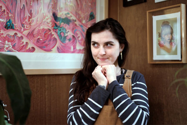
Posted on

The art and musing of Ken Done

Playful, vibrant and bold, Ken Done’s artwork is truly one-of-a-kind. In the Ken Done: Painting Australia series, Ken captures his love of the Australian landscape, from the joyful shout of Sydney and the Aussie Beach to the calm beauty of the Outback and Reef.

Scroll through some selections of Ken’s work below, carefully curated from each book and accompanied by his charming commentary.

Story by Jackie Money

SYDNEY

Sailboats on music sheets
The Wednesday Race I, 1980. Oil crayon and ink on paper. ©Ken Done

“The world-famous musician James Morrison is an old friend. He once released an album of music inspired by a number of my paintings. In one song he gave a musical notation to the way I had placed my drawings of yachts in this work, The Wednesday Race. Who could ask for more?”

– Ken Done

Book cover of Ken Done's Sydney
Cover design: Evi-O.Studio
On the cover: White Opera, yellow sky, 1998. Acrylic on canvas. ©Ken Done

BEACH

Sunbakers at the beach
Sunbakers II, 1995. Acrylic on canvas. ©Ken Done

“This work was one of a number I showed in my first exhibition in Paris. The picture of the sunbaker by the famous Australian photographer Max Dupain is one of our most revered images. I’ve made numerous paintings using the iconic form as a graphic device, always with reverence and respect.”

– Ken Done

Book cover of Ken Done's Beach
Cover design: Evi-O.Studio
On the cover: Balmoral I, 1993. Oil and acrylic on canvas. ©Ken Done

OUTBACK

Ned Kelly in a canyon
Nolan canyon, 2019. Oil on canvas. ©Ken Done

“When I look at the Outback, I often think of Sidney Nolan. One of our most influential artists, I was lucky enough to meet and talk with him a couple of times. For me, he will always be the Kelly figure looking at the landscape.”

– Ken Done

Book cover of Ken Done's Outback
Cover design: Evi-O.Studio
On the cover: Postcard from the Bungle Bungle, 2001. Acrylic on canvas. ©Ken Done

REEF

Sea creatures
Drawings of things in the sea, 1993. Oil, acrylic, oil crayon, pencil and ink on canvas.
©Ken Done

“A jelly and a fish. Then a jellyfish. Lots of things you find in the sea. This painting, now in a big Japanese collection, is fun. Some images are tight, and some I’ve played games with. Being underwater should always be fun.”

– Ken Done

Book cover of Ken Done's Reef
Cover design: Evi-O.Studio
On the cover: Zebra fish, 2013. Oil and acrylic on linen. ©Ken Done


Posted on February 26, 2020
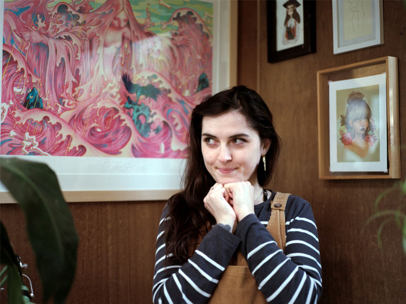
Posted on

Shortlist: Cornish Family Prize for Art and Design Publishing

Four of our books have been shortlisted for the coveted Cornish Family Prize for Art and Design Publishing.

Warm congratulations go to the creators, collaborators and contributors of Australia Modern, Step into Paradise, Harry Seidler’s Umbrella and The Light Fades but the Gods Remain.

As part of NGV’s Melbourne Art Book Fair, taking place from 13 – 15 March, this prize is a celebration of art book publishing and supports innovation in the field. We are honoured to have our books shortlisted in such an important initiative.

Read on for a glimpse into these stunning shortlisted books.

AUSTRALIA MODERN

Hannah Lewi and Philip Goad | Book design: Stuart Geddes

The essential text on Australian modernism with rich archival imagery and expert essays on how modernism has shaped Australian society.

The Sydney Opera House under construction, 1974-75. Photograph: Michael Lewi.

Capitol Theatre, Melbourne, VIC, 1921-25. Architect: The Office of Walter Burley Griffin and Peck & Kempter. Photograph: Walter Burley Griffin, 1939. Pictures Collection, State Library of Victoria, H2009.21/73.

STEP INTO PARADISE

Jenny Kee AO and Linda Jackson AO | Book design: Daniel New

The compelling stories of iconic designers Jenny Kee and Linda Jackson, creators of a bold and unashamedly Australian fashion identity.

Jenny and Linda wearing Linda’s Tutti Frutti and Love Letters outfits, cotton, Bondi, 1975. Photograph: Annie Noon, Linda Jackson archive, MAAS Collection.

Models Micki and Gerlindé wearing Jenny’s knitwear, cotton, with handpainted straw hats, Palm Beach, NSW, 1979. Photograph: Linda Jackson, Linda Jackson archive, MAAS collection.

HARRY SEIDLER’S UMBRELLA

Joe Rollo | Book design: Garry Emery

An incisive and personal collection of writings on architecture and design, offering an exciting way of looking at the built world.

Hamer Hall: Melbourne VIC. Photograph: John Gollings

Seidler House: Killara, Sydney, NSW. Photograph: Max Dupain © Penelope Seidler

THE LIGHT FADES BUT THE GODS REMAIN

Bill Henson | Book design: Daniel New

A glimpse into Henson’s brilliant mind as he ponders the passing of time.

Untitled 55 1985–86. Photography: Bill Henson

Untitled 153 1985–86. Photography: Bill Henson. Monash Gallery of Art, City of Monash Collection.


Posted on February 14, 2020
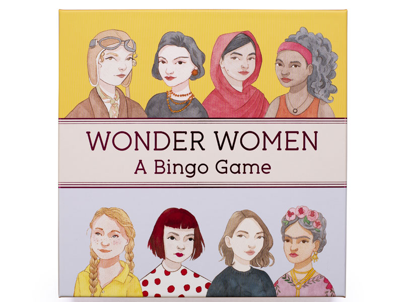
Posted on

The other side of the world: An extract from Mirka Mora

A glimpse into Mirka’s first strides in Melbourne after emigrating from Paris, taken from the chapter ‘Movers of the new force’.

Upon arriving in Australia, the Moras found themselves in a house at number 6 Ellindale Avenue, in the suburb of McKinnon, 12 kilometres to the south-east of Melbourne’s CBD. Feeling dislocated and isolated, Georges and Mirka did not like it at all: ‘I couldn’t stand it, it was so dead.’

Mirka had always sewn her own dresses, and made frequent Saturday trips to the city to buy fabric from the fashionable Melbourne department store Georges. On one of these visits the man behind the fabric counter asked her if she was a seamstress. Although this wasn’t really the case, she nevertheless answered ‘Yes’. Impressed by this French ‘dressmaker’, he began to send her clients. Some of the commissions were challenging – a man’s suit, for example. But Mirka had always been resourceful; she waited until her husband was in bed and unpicked his jacket to see how it was made, sewing it back up again afterwards, all done while he was still sleeping. She soon had many customers, making ‘ladies clothes, suits and all. I never said no to anything. I had to work so hard, and I had the two girls to help me’. One of her assistants was Helen Ball, who would later marry the painter Leonard French (1928–2017). Mirka was already taking liberties with convention: she recalls a ‘very beautiful and elderly lady’ for whom she made a raincoat with slit pockets. At the fitting, Mirka realised that she had put one pocket up and one pocket down. But the lady ‘must have seen my shock when I saw that and she said, “Oh, this is so modern and I love it, I love it!”’ and kept it as it was.

Through a woman they met on the plane to Melbourne, the Moras were introduced to Colin Wainwright, a lively character who had many connections in the city. Colin became a friend – and even came to live with them in McKinnon. One day Mirka, tired of the suburban house after a few months living there, told him that she could not stay any longer – she wanted to find a proper studio to live in. Colin found the studio/apartment for her – in the centre of Melbourne, at Grosvenor Chambers, 9 Collins Street. It had a rich history, having been the studio of artists Sir John Campbell Longstaff (1861–1941) – who had once demolished a wall to let in the horse he was painting; Frederick McCubbin (1855–1917); and Arthur Streeton (1867–1943). The situation wasn’t straightforward: the landlord was a tad grumpy, and other people, including the painter Lina Bryans (1909–2000), were also interested in the studio. It took a lot of persuasion (which included suggesting that Mirka was opening a French-style haute couture studio) and Georges’ patience and diligence to convince the old man to rent it to them. In mid-1952 the family moved into 9 Collins Street, where they lived for the next 15 years.

Mirka was visited at the studio by many customers. The most important encounter – for her, for Georges and for Melbourne’s art world – happened via an introduction from the Herald newspaper’s music critic John Sinclair, whom she had met at a party at a customer’s house. (He was notorious for his sharp tongue: ‘Beware of snakes, spiders and Sinclair’ was a common warning given to musicians coming to play in Melbourne.

Sinclair was a friend of John and Sunday Reed. John (1901–81) and his wife Sunday (1905–81) were patrons of modern Australian art and literature, and their house, ‘Heide’, in Bulleen, Victoria, was a hub for avant-garde artists. Sidney Nolan (1917–92), Albert Tucker (1914–99) and Joy Hester (1920–60) lived and worked at Heide for lengthy periods. In 1977, Sunday donated 25 of the 27 paintings in Sidney Nolan’s Kelly series – painted by Nolan at Heide – to the National Gallery of Australia. The Reeds’ house and collection ultimately became the public art museum Heide Museum of Modern Art.

Sinclair recommended the young French seamstress to Sunday Reed, who rang the next day to order a dress. Sunday apparently never wore the dress (an elegantly simple white linen garment), and instead hung it on the wall because it was so beautiful.

The meeting with Sunday Reed was to have a great influence on Mirka’s career and on Melbourne’s art scene for the following decades. It triggered a long-lasting friendship between the Reeds and the Moras, who became instrumental in the revival of the Contemporary Art Society (CAS) and in the creation of the first Museum of Modern Art in Melbourne, in a local environment that was at the time quite bleak for the arts.

Mirka with her ‘Bip’ doll. Photograph by Sabine Cotte.

Mirka Mora: A Life Making Art is available to purchase here.


Sabine Cotte is a French-Australian paintings conservator. Trained in Paris and Rome, she worked for French national museums for ten years before moving to Melbourne in 2001. She has led several workshops in the Himalayan region for UNESCO, ICCROM and private NGOs, training local people in conservation and in disaster recovery, and has published articles in professional journals and given talks at conferences. She is an Honorary Fellow of the Grimwade Centre for Cultural Materials Conservation, University of Melbourne, where she is also a casual teacher. Her PhD focused on the materials and techniques of Mirka Mora and led to the writing of this book.


Posted on August 8, 2019
Posted on

Meet Natalie King, series editor of the new Mini Monographs

Image (left): Sean Fennessy

Natalie King has a gift when it comes to visual culture, creative collaboration and bringing attention to both new and established artists. We spoke to Natalie – curator, professor and now series editor – about her career path, the inspiration behind our new series Mini Monographs, her goals for the year to come, and more.

Natalie, how did you start out in the art world, and what brought you to curatorship?

My paternal grandmother was a ballerina and we were very close. As a child, I adored going to matinee ballets with her at the Forum Theatre and remember the enchantment when the lights were dimmed and the ceiling glimmered with a trompe l’oeil sky. I was also an avid reader during a tumultuous adolescence and fiction allowed me to go into imaginary realms. I convinced a friend at school to illicitly procure his sister’s copies of books by D.H. Lawrence which I found scintillating.

On reflection, these childhood experiences shaped my pathway into curatorship though there was a temporary detour studying law. After a couple of years at law school, I travelled solo to Florence to study Italian and found myself taking respite in churches with frescoes and wandering through museums. It was like falling in love. Soon after, I changed my course to art history and museum studies at Monash University.

Where did the idea for Mini Monographs come from, and how did the project take shape?

The initial concept for Mini Monographs was formulated by publisher Kirsten Abbott with whom I have a prior relationship having worked with her on Tracey Moffatt: My Horizon for the 57th Venice Biennale 2017. We shaped the concept of Mini Monographs comprising a special selection of images accompanied by an essay from an author from a parallel field, adding an extra frisson.

Conventional monographs often accompany a retrospective exhibition and take a long time to compile, whereas our Mini Monographs celebrate a unique selection of images alongside a captivating essay, paired and in dialogue, compact and accessible. We especially want to celebrate the exceptional practices of women artists and hope that the series will be timeless.

Image from Polixeni Papapetrou: The Visitor, 2012. Images courtesy of the artist, Michael Reid Gallery, Sydney, and Jarvis Dooney Galerie, Berlin. Digitised by Dr Les Walkling.

How did you select Polixeni Papapetrou and Del Kathryn Barton as the first artists for the series?

We believed that both Poli and Del are immensely worthy of being represented in the first tranche of Mini Monographs, inaugurating this new series. It’s an original and unique concept that celebrates Poli’s distinctive photographic ensembles and Del’s sensual portrait paintings.

What do you think defines Polixeni Papapetrou’s work?

Poli was a close comrade and colleague, who sadly passed away one year ago. We worked closely on the sequencing of her images and it is a tribute to her that this was our final project together. She was both feminist and feminine in her approach to all aspects of her life. Previously, I have curated Poli’s photographs into the Dong Gang International Photo Festival in Korea and the TarraWarra Biennial: Whisper in My Mask in 2014, plus I have published various interviews and essays on her work, so we had a strong affinity.

Poli’s work is defined by a highly staged and taut mise-en-scène, choreographed with costumes, sets and props and featuring her children, especially her daughter, Olympia. On the cover, we have selected Heart from the series Eden 2016. Here, Olympia holds a wreath or garland of flowers against a floral backdrop and dress, the patterns merging foreground and background. I think Poli might have been thinking about the Garden of Eden and the afterlife as well as celebrating the cusp of feminine adolescence and adulthood. The maternal gaze is powerful in Poli’s photographs, and her work is about relationships and love, staging and theatricality, landscapes and loneliness.

Images from Del Kathryn Barton: (left) what am I also, 2013. Courtesy of Del Kathryn Barton and Roslyn Oxley9 Gallery, Sydney; (right) i am true about this, 2007. Courtesy of Del Kathryn Barton and Karen Woodbury Gallery. Photos: Jenni Carter. 

And Del Kathryn Barton?

Del works adeptly across painting, drawing, film, textile and sculpture in highly ornate renditions of friends, family and characters often merging with creatures. Having won the coveted Archibald Prize twice, Del has a feminine sensibility, yet there is an uncanny or foreboding quality to her sinewy figures.

We love Joanna Murray-Smith and Sarah Darmody’s personal essays accompanying Polixeni Papapetrou and Del Kathryn Barton respectively. What do you feel each essayist brings to the monograph?

Thank you. I also love the unexpected qualities to Joanna Murray-Smith’s and Sarah Darmody’s writings, which are both deeply personal, reflective and original essays. Joanna’s relationship with Poli invoked a certain intimacy, whereas Sarah’s experience of motherhood and viewing Del’s retrospective at the NGV lends a giddy vividness and velocity to her writing, almost like the frenzy in Del’s paintings.

What was the selection process behind all the breathtaking images in both books?

We worked closely with the artists and, at times, with their gallerists on the sequencing of images so that rhythms unfold. In particular, I worked one year with Poli on the arrangement of visuals: arranging, rearranging and deleting images, almost like a form of choreography. Lesser known images are placed in tandem with more familiar works to take the reader on a visual journey.

Image from Polixeni Papapetrou: Study for Hattah Man and Hattah Woman, 2013. Images courtesy of the artist and Michael Reid Gallery. Sydney, and Jarvis Dooney Galerie, Berlin. Digitised by Dr Les Walkling.

What have you enjoyed most about the process of bringing the series to life?

I am really proud of the series and have relished the process of working with Thames & Hudson, especially the visionary Kirsten Abbott and the artists whom I admire immensely.

In 2018, you were a finalist in the AFR 100 Women of Influence. How do you hope to use this influence in 2019?
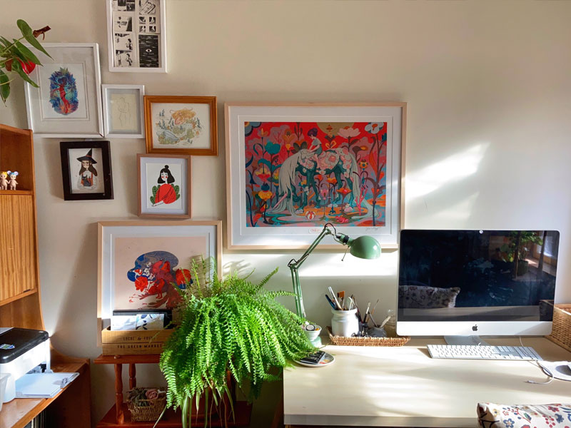
It was an honour to be a finalist in the AFR 100 Women of Influence. I try to advocate and support other women to ascend and flourish. I am part of Mentor Walks whereby senior female professionals meet monthly for a walk and talk at dawn with emerging leaders to discuss their burning issues and concerns.

I hope I can show other women that together we can build inspired, collaborative working environments that can lead to transformation in our fields and beyond. We must remember that we aren’t aspiring to the existing paradigm of leadership but are making a new one. And, we have an obligation to steward our creative resources for the betterment of a faltering society. 

Image: Alli Oughtred

Natalie King is a curator and writer working in Melbourne. She is currently Enterprise Professor at the Victorian College of the Arts, and was named in The Australian Financial Review 100 Women of Influence awards for Arts, Culture and Sport in October 2018. Natalie was also Chief Curator at Melbourne Biennial Lab, Creative Associate of MPavilion and Curator of Tracey Moffatt: My Horizon at the 57th International Art Exhibition, Venice Biennale 2017, as well as the editor for Tracey Moffatt: My Horizon.


Posted on June 6, 2019
Posted on

Unlock the potential of shared spaces with Shared Living.

A very special Q&A with the author as well as your chance to win.

Shared Living: Interior Design for Rented and Shared Spaces features 21 shared homes around the world that are getting it right. Inspirational rather than aspirational, these homes are the work of creative thinkers who focus on savvy ways of decorating eclectically rather than with big ticket items. A weatherboard cottage in Sydney boasts a ready-made gallery with an enviable swapped-art collection; an apartment in Berlin exudes bohemian luxury through a combination of vintage finds and exotic curios; a Tokyo share house reveals a bedroom art installation; and a small London apartment merges bold colours with clusters of collectables to achieve domestic harmony.

With the reality of share houses becoming a long term option for the new generation of adults, Emily is working to reverse the bad rap that share houses have traditionally received. We spoke to Emily about her passion for designing spaces and her inspiration for Shared Living.

Read on for our very special interview with Emily, and scroll down for your chance to win a stack of books for your share house!

Q: Emily, what made you decide to create a book about interior design for shared spaces?

I had been writing about multi-million-dollar homes (as a writer for realestate.com.au) where boujee couples were able to spend thousands of dollars on their décor and I just couldn’t relate to what I was writing about. I thought to myself ‘hey, I love design and I have friends who love design, why should we be discounted in the design world just because we share a house and have a limited budget?’

Emily Hutchinson (left) with her housemates Maddy Dixon and Felicity Burke.

Q: Where did your passion for designing spaces come from?

I grew up with a mum who had a passion for interior design, but preferred to keep her colour palette beige. I think from growing up in this more pared back environment, I rebelled and opted for a style that showed off colours, collectables and creativity.

As soon as I was in my first share house at 21, I started to gain more confidence in my style. I would get a rush from finding something unique at a garage sale, or bringing home a new plant baby for my window sill. Looking around after a long day and enjoying the objects I had carefully selected for my space sparked joy and it still does to this day.

Q: How did this project take shape, and how long did it take you to compile all of these contributions?

The book took about a year to get all the photo shoots and words completed. I wasn’t just getting interviews back from one person, most of the time it was waiting for all of the housemates to come back to me with their responses to my questions because it was so important to have each of their voices in the story.

I hope they can all look back on it one day and fondly say ‘I remember that share house! What a time!’

Q: Did you come out the other side with any new revelations about shared living?

Yes, absolutely. I really appreciate my own housemates’ design choices much more than I did before. I often look at the things they bring home now, which might not be something I would have chosen, but it just works in our space and reinforces the fact that shared living is about being open with your housemates’ styles and willing to try something new. I think my own style has evolved because of this.

Q: Do you have a favourite household in the book?

They are all very special, but there is a historical apartment in the heart of Berlin which I wanted to move straight into. It’s lived in by a furniture designer, so the home is filled with unique creations and the other housemate buys and sells vintage clothes.

Hello dream living situation!


GIVEAWAY: WIN A STACK OF COFFEE TABLE BOOKS FOR YOUR SHARE HOUSE

To celebrate the release of the book, we are giving away $300 worth of coffee table books (of your choice) for your own share house. All you have to do is fill out the form below and tell us, in 25 words or less, what is your favourite share house story?

Competition ends 8pm Thursday 4th April. Winners announced and notified Friday 5th April.


Posted on March 27, 2019
Posted on

Celebrating the life of fashion icon Karl Lagerfeld

The one-man fashion phenomenon has passed away, aged 85

When Karl Lagerfeld took the helm of Chanel in 1983, he set out to radically shake up and update its image – not only through bold collections but also by choosing to photograph the fashion house’s campaigns himself, a move that was unprecedented for a fashion designer at the time.

Chanel: The Karl Lagerfeld Campaigns

Though Lagerfeld began his career with designer Pierre Balmain before moving onto Patou, Chloe and then Fendi, it was his pioneering and irreverent work with Chanel that catapulted him to Rockstar status and cemented him as a beacon of inspiration to those in the global fashion community.

An undeniable modern master of couture, Karl was also famously outspoken. His pronouncements on fashion, women, art, politics, love and life, have been seized upon by fashionistas, acolytes and sages around the world. Cultivated, unpredictable, provocative, sometimes shocking – Lagerfeld’s ‘bon mots’ were as impossible to ignore as the man himself.

The World According to Karl: The Wit and Wisdom of Karl Lagerfeld

In celebration of Karl Lagerfeld’s life and achievements we are pleased to present a selection of titles by and about the fashion icon.


Posted on February 20, 2019
Posted on

A Q&A with Kim Walvisch, author of The Burbs

We spoke to Kim Walvisch about her new book, The Burbs: A Visual Journey Through the Australian Suburbs 

How did you start as a photographer, and what was your inspiration to create the @sublurb Instagram account?

My daughter was an atrocious sleeper and the best way to get her to nap was to go on long walks around the local streets. Sometimes I’d walk for hours and, to keep myself occupied, I started taking photos of things that caught my eye – weird gardens, unusual chimneys, unique fences, peculiar letterboxes and other odd suburban details. I decided to start sharing those photos on Instagram to my account @sublurb and, after a number of years, I built up quite a loyal following of people also interested in suburban curiosities. Whenever I left the house to push Peggy in her pram, I’d also take my camera. I started travelling to suburbs all over Melbourne and photography became a serious passion. I decided to create an archive of what the Australian suburbs looked like before there was so much architectural development. I was keen to capture old-school suburbia before it vanished.

Who are your favourite photographers?

I’m a huge fan of American photographer William Eggleston and his use of colour. I’m crazy about Stephen Shore and his shots of banal scenes across the States: lots of old cars, parking lots, storefronts and that kind of thing. Joel Sternfeld takes photos in a similar vein, same with Fred Herzog. I’m basically a huge fan of colour photography of mundane or ordinary subject matter and the places we live.

What draws you to photographing homes?

A few things. I definitely appreciate certain styles of architecture, such as art deco and mid-century modernism, so I’m attracted to houses that reflect those eras. I also like unusual architectural detail that might appear on simpler postwar houses – ornate chimneys, stair railings, fancy brickwork – special touches that would have been made by brickies and other thoughtful tradesmen. I feel like a lot of housing today just doesn’t reflect the same level of technical skill, so I’m always on the lookout for those stand-out details. I’ve seen a house where the chimney is shaped like a large jug. Apparently, the owner was a wine connoisseur and had this detail built in especially. I love that kind of thing. Sometimes the ‘plain Jane’ houses have very special touches.

What is it that draws you to the buildings you photograph?

I’m looking for buildings with personality. I like imperfection, dilapidation, obvious signs of ageing. I like to capture buildings that might imminently disappear. I’m also a huge fan of symmetry, so I love houses that have symmetrical gardens or old matching chairs on the porch. Peculiar buildings intrigue me too. I’m looking for homes, buildings or gardens that convey the occupant’s eccentricities.

What was the biggest challenge you faced in creating The ’Burbs?

Deciding what pictures to include! I literally had thousands of shots, so it was really hard narrowing it down to a number that could be featured in the book.

How long did the project take?

I’ve been accumulating photos for about seven years now and was always hopeful a book project would arise. Thankfully, Thames & Hudson gave me the opportunity to share my shots with a larger audience.

This is your first book. What have you most enjoyed about the process of creating it?

I’ve found the whole process pretty fascinating. My first ever job was in a bookshop and I’ve always had a bit of a dream of creating my own book. I had no idea the publishing world moved so slowly, so it’s definitely been an exercise in patience! I enjoyed working alongside the designer and seeing the pages come to life. The most exciting moment was going into the Thames & Hudson offices and flicking through the advance copy. It was like holding a baby for the first time!

Kim Walvisch has been steadfastly documenting Melbourne suburbia for the past five years. Her Instagram account @sublurb now has more than 13k followers. She has taken photos in more than 100 suburbs and created a nostalgic archive of how things looked before the takeover of development. 


Posted on December 12, 2018
Posted on

Bohemian Living: An interview with the author

  • On Creating Authentic Spaces Full of Verve and Vitality with Juliette Arent and Sarah-Jane Pyke
  • Read an Extract from The Conversation's Latest Book of Essays: Long COVID should make us rethink disability and the way we offer support to those with ‘invisible illness’
  • The Contemporary, Textural and Colour Oriented Work of Yvette Coppersmith
  • Christmas Gift Guide 2022


‘Everyone lives in a bubble, so why not make it a beautiful bubble.’ – Gavin Brown
An interview with the creator of Bohemian Living


Bohemian Living by acclaimed Australian photographer and writer Robyn Lea features the homes of 20 accomplished creatives from Australia, Europe and the USA and celebrates what it’s like to live a uniquely creative life. In each artist’s profile, Robyn explores their often unusual childhoods and often unorthodox adult worlds, asking what does it mean to be bohemian in the modern world.  
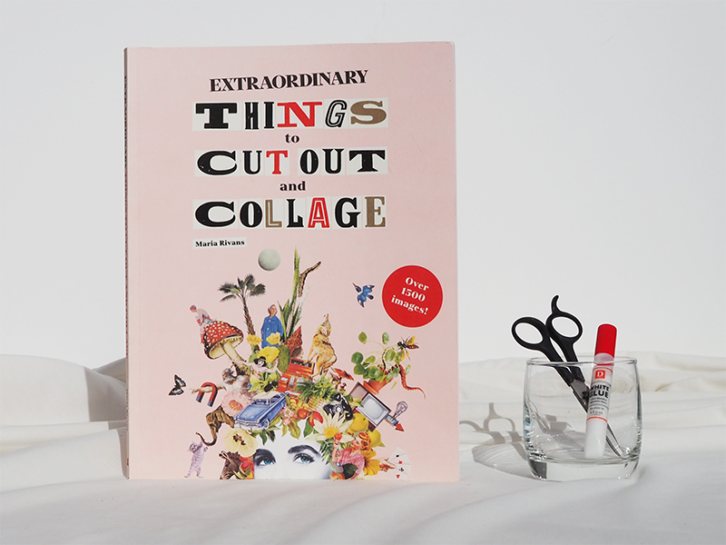
We spoke to author Robyn Lea and her editor Kirsten Abbott about this visually stunning and thought-provoking new book.


Robyn, firstly, congratulations on this, your new book. It is stunning to behold and the stories behind your pictures are a delight. They are insightful, curious and sometimes sad – providing such texture to the artists’ homes and deep insights into their styles. This is a book that feels very personal to read. How did the project take shape for you?

When Kirsten Abbott from Thames & Hudson Australia called me to discuss this concept, I was immediately attracted to the idea. I’ve always loved writing about art. When I studied at RMIT, I did some journalism subjects and I’ve always had a deep interest in understanding why people are who they are. This book really allowed me to explore that question and feed my curiosity. More than any other book I’ve done, I think this book has a broad appeal. The diversity of the artists, their interests and their backgrounds will speak to many different people.

I know you as an acclaimed photographer; I think everyone who reads this book will agree that you are a beautiful writer too. You clearly love words as much as you do pictures. How did you start writing and what do you enjoying reading?

I started writing regularly when my husband and I moved to the US with our children in 2011. The country was just beginning to regain a little confidence after the global financial crisis, but local agents weren’t putting on new photographers, and photographers were not getting as much work. So it was quite a hard time to be there. In an effort to stay sane and feed myself creatively, I called interesting people in New York and asked them if I could interview and photograph them. Surprisingly, given I did not have a writing CV, most of them said yes. I then found a magazine that printed my stories. Each time I created a new feature, the process got a little easier and over time my confidence in interviewing and writing began to grow.

In regard to books I enjoy, well, I certainly love art and design books. Two of my favourite books, which I purchased in the 90s,are The English Archive of Design and Decoration and The French Archive of Design and Decoration, both published by Thames & Hudson. I also love biographies and autobiographies and prefer those written about women. Favourites include Personal History by Katharine Graham and Indira: The Life of Indira Nehru Gandhi by Katherine Frank.


What prompted the idea of the book initially?

Kirsten: I am quite a maximalist and I wanted to see a book that celebrated maximalist, eccentric interiors with real people and the way they create a space with meaning.

How did you select your list of people to interview and photograph?

Robyn: It started out as a very long list of artists whose work I felt drawn to. I took the list to Kirsten and we narrowed it down together. Then I would dive into some more research on each person – looking deeper into their work, their lives and how they viewed the world. Logistics, of course, also played a par tin the final selection – how many weeks I would be in a country, for example,and who was available at that time. As I got into it, I also found that one interview led to another, that the artists would recommend others in their networks, or people they admired.

Your eyes light up when you talk about research, Robyn!

Yes, I do love research, it stimulates the grey matter and forces you to consider things from other perspectives. Trying to understand someone’s point of view when it’s different to your own experience can be fascinating and it can even be transformative. This project did that for me and I hope it will for others too. .

Were there any themes that emerged during this project?

Robyn:  Ah, yes, as I wrote in my introduction, I’ve always thought of my camera as a magic key, a key to adventure and key to connecting with people. What was interesting was that the motif of the key also came up in the work of a few artists I interviewed and that they also felt drawn to a symbol of a key, a key that connected them to different worlds.

What was the was the most challenging part of this project?

Robyn:What was surprising, and what emerged as a major theme, was how much significance there was behind the interiors: that these homes really weren’t designed for the approval of others, or to be sold, but as a personal extension of self and artistry – like living visual diaries. As I started to understand this, I realised that the artists’ homes told me so much about their dreams, their troubles, their hopes, their heritage and their families.

Artist Gavin Brown said to me: ‘Everyone lives in a bubble, so why not make it a beautiful bubble.’ This really resonated with my experience on this project, as one of the most attractive themes I experienced was a shared sense of joy. Modern life is busy and domestic life can really weigh you down; it can be very monotonous and mundane. I found a lot of the artists worked to maintain the joy in their homes and their lives.

What was the most challenging part of this project?

Robyn: Well, for me it was writing the first paragraph of the introduction! I drafted it a number of times, but it just never seemed right. It was only after I saw the final book cover design by Daniel New, with the concept of the key, that everything clicked, or should I say unlocked. I’ve always thought of my camera as a magic key – a key to adventure and key to connecting with people. It made perfect sense to open the introduction with that concept. What was interesting was that the key motif also appeared in the work of several of the artists, including Annabelle Adie and Barnaba Fornasetti.

Page Stevenson

After interviewing so many fascinating people, what tips, or insights do you have for others who would like to emulate bohemian style?

Robyn: That is good question, as all of the artists were truly unique, but if I had to outline some commonalities I would say:

  • Follow your heart, not trends
  • Celebrate colour
  • Collect on your travels
  • Showcase your obsessions
  • Decorate with passion and personal meaning

Bohemian Living is available now and features the lives and times of artists including Barnaba Fornasetti, Joshua Yeldham, Simone Bendix, Helene Schjerbeck, Greg Irvine, Gavin Brown, Peter Curnow, Claire Guiral and many more.

More about Robyn Lea

Robyn Lea is an acclaimed photographer, writer and director whose work has been published in Elle Décor UK, The New York Times, Vogue, Architectural Digest, Wall Street Journal and The New Yorker Magazine amongst many others. She is the bestselling author of Dinner with Jackson Pollock: Recipes, Art and Nature and Dinner with Georgia O’Keefe: Recipes, Art and Landscapewww.robynleaphotography.com

Robyn Lea and Kirsten Abbott

Posted on November 21, 2018
Posted on

For the love of gardening: a Q&A with Simon Griffiths

To celebrate the publication this week of the stunning Garden Love, we caught up with photographer, gardener, dog lover and bestselling author Simon Griffiths, to discover a little more about his fabulous new book, his approach to photography, how he got started and, of course, dogs, plants and country gardens.

How did you first start as a photographer, and what was your earliest inspiration?

I got my first camera when I was about 5 years old – a funny plastic ‘Diana’ camera, but it used real film, and I was hooked. At school I was good at art and science, and I suppose that’s why I was drawn to photography, as it’s that creative mix of both. After high school, I went to study photography at RMIT, which is still probably considered one of the best photography courses in the world.

Who are your favourite photographers?

I love Eugène Atget, a French 19th-century photographer, who was one of the first people to photograph gardens. His work documented French streetscapes and gardens around Paris, and also the French people. His body of work is still amazing all these years later. He had special times of the year when he would shoot gardens, such as when the buds were just about to burst in spring, which he said made the trees glow. He created stunning images, all on an early plate camera.

Jardin [du] Luxembourg (Luxembourg Gardens); Eugène Atget, French, 1857 – 1927; Paris, France, Europe; 1902 – 1903; Albumen silver print; Image: 17.5 x 22.1 cm (6 7/8 x 8 11/16 in.); 90.XM.64.54
Eugène Atget [No restrictions or Public domain], via Wikimedia Commons

John Dugdale is another photographer whose work inspires me. His beautiful still lifes and portraits are shot on a plate camera and printed using early photographic techniques. They have a quiet, fragile beauty to them, which is different to the clinical properties of digital photography.

How many books have you been involved in, and do you feel that the process has changed at all?

I have worked on over 70 books now. They really are a passion of mine and I have been lucky enough to travel all over the world shooting for different authors and publishers. Garden Love is the fourth book I have both written and photographed.
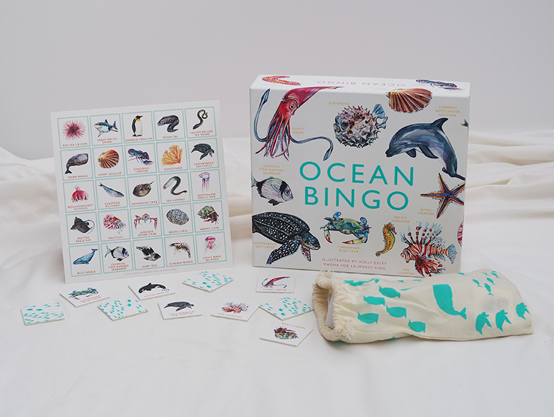
The process has changed a lot over the years. I used to shoot on film and it was always stressful to be travelling with 400 or 500 rolls of film and going through x-ray machines, worrying the film would be damaged. Digital is fantastic and has helped free up the creative process for me: I can shoot as many images as I want as there is no film budget now for books. When I started, the books I worked on had a limited number of colour photographs, with many still printed in black and white, as printing in colour was much more expensive. Now there seems to be no limitation to the number of photographs a book can contain.

What draws you to photographing plants and gardens?

I’m a gardener at heart, so I approach shooting gardens from that perspective. I’m interested in plants, in how they grow and in documenting that. You can learn something from every garden you visit. It might be a colour combination or a plant you have never seen before, or it might be the way a gardener has grown a plant, pruned or shaped it. If you lived for 1,000 years, you would still not learn everything about gardening and that’s what fascinates me. And when I’m not photographing gardens, I’m gardening at home.

What is your favourite part of your own garden?

I love the topiary in our garden – the Buxus (English box) shapes I have been clipping for 10 years now, which act like punctuation marks in the garden in the same way that full stops or exclamation marks complete a sentence. The topiary gets clipped twice a year and helps give the garden structure. I actually think I might add some more as it’s very effective.

Was there anything uniquely Australian that connected all of the gardens in the book?

Yes – all the incredible stories the garden owners had about snakes and other garden critters. One gardener, who thought she had picked up the garden hose, had actually picked up a snake. And nearly all the garden owners had stories like it. Gardening in Australia is a difficult process – we have a climate of extremes, and lengthy periods of drought – and you could only be in Australia with all those snake stories.

What inspired you to feature the dogs (and other animals in your new book)?

The dogs and cats or other animals we choose to surround ourselves with become part of our gardens, bringing them to life – they are as much a part of the garden as the plants themselves. I have two whippets and our garden wouldn’t be the same without them. Animals bring life and warmth to a garden.

If there was one garden from Garden Love that you would like as your own, which one would it be?

I have to say probably ‘Foss’. It’s a really magical place, and you always feel great whenever you wander around the garden there. It’s six parts magic, four parts garden. Last time I was there, the Manchurian pear trees were in flower, and it was incredible. The blossom was so thick on the trees, it was like walking through a large white fluffy cloud.

Plants, Dogs and Country Gardens … what else do you need to add to the list, for complete happiness?

A cottage and books, then life would be perfect.

Garden Love, priced $59.99, is available now in all your favourite book shops across Australia.


Posted on September 27, 2018
Posted on

John Russell and Vincent Van Gogh

John Russell was a close friend of Vincent van Gogh and Auguste Rodin, taught impressionist colour theory to Henri Matisse and dined with Claude Monet.  Watch this fascinating short video to learn a little more about the particular bond he shared with Van Gogh.

John Russell: Australia’s French Impressionist has been published by the Art Gallery of NSW to accompany the exhibition of the same name which runs until November. 

Bringing together 120 paintings, drawings and watercolours – including a number of works by his contemporaries – this major retrospective is the first survey of Russell’s work in 40 years. It offers fresh perspectives on French impressionism, reintroducing Russell’s extraordinary painting to today’s audiences.

John Russell: Australia’s French Impressionist by Wayne Tunnicliffe

Posted on September 21, 2018
Posted on

Wild Land, a journey into the Earth’s last wilds

Four years in the making, this is one of the most ambitious travel stories of our time.

Wild Land is an epic and unprecedented portrait of some of the most untouched parts of our planet, and a timely message highlighting the urgent need for them to be preserved for the future of the planet, and a future on which humankind’s very survival is dependent.

The video below shares the story of the inspiration behind Peter and Beverly Pickford’s quest to find the last remaining wild lands on each continent, as well as some of the stunning images they created on their journey.

Wild Land by Peter and Beverly Pickford

Posted on September 14, 2018
Posted on

The beautiful Southern Highlands of New South Wales

Author Jaqui Cameron on the unique appeal of the Southern Highlands of NSW, and its community.

I am not a horticulturist. At this point in my life I am barely even a gardener, but I grew up with a large country garden and understand the dedication such a space demands. Having lived on a farm in the Southern Highlands with my young family for nearly a decade, growing and selling trees, I have come to know the dedication and passion of garden owners in this area. I also know that every garden comes with a tale as unique as its design and I’m incredibly inquisitive – some would say nosy! I love writing, I love a good story and I have always loved a great romance.

Over the years I have learnt that the Southern Highlands is an area with a gardening history as rich and deep as the local soil. Well known for its beauty, it has long attracted garden enthusiasts because the climate provides the opportunity to celebrate the beauty of a garden across the four distinct seasons. What is not so well known is the extraordinary variety of gardens that exist across the region, nor that it can deliver four seasons in a single day, with a clear summer morning quickly transformed by a thick wintry mist rolling in.

I have spent countless happy days driving along the quiet village streets and country laneways of the Southern Highlands, looking over gates and hedges, desperately trying to get a glimpse of whatever hidden gem might lie beyond.

I have met a wonderfully eclectic community of gardener owners, garden specialists and artists, and I have been lucky enough to visit some of the most breathtaking landscapes. I have found the beauty and the very personal love affairs people have with their gardens inspiring and delightful, and with each new discovery the idea to create a book telling the stories behind Southern Highlands properties began to grow. I wanted to uncover hidden, previously unseen gardens and explore the passions of the owners who had dreamt and worked hard to create their own private oases. My challenge was to find these private gardens and convince their owners to allow me to share their stories.

That’s where the strength and generosity of the local community came to the fore. It quickly became evident to me that there is no ego in a garden. At each site I visited, the owner would recommend another garden they considered to be an equal, if not grander, triumph with its own amazing story.

This serendipity led me to the wonderful characters, beautiful gardens and amazing stories that fill this book. I was overwhelmed with suggestions and never disappointed.

Beyond the Garden Gate, by Jaqui Cameron 

You never can tell what lies beyond the garden gate.

Text © Jaqui Cameron, Photography © Sue Stubbs


Posted on September 7, 2018
Posted on

The First Colour – an extract from Chromatopia by David Coles

In this extract from his new bestselling book Chromatopia, author and master paint maker David Coles looks at the origin of ochre – believed to be the first pigment used to create human artworks.

The oldest human artworks still in existence are vivid depictions of animals, humans and spirits that were created using ochres. There is evidence of their use as far back as 250,000 years ago. Ancient ochre artworks are found all over the world, from the earliest cultures of India and Australia to the famous cave paintings of Lascaux in France.

Naturally occurring iron-containing ochres of the earth provide a wide range of yellow, red and brown colours.

The natural mineral could be collected or dug-up and then simply ground against a harder rock and water added to make fluid. Later civilisations refined this process to include washing the ochre of impurities, drying and then grinding to a fine powder. 

Yellow ochres are an impure form of iron oxide called limonite. They can also be roasted to produce other hues

by placing on a fire or in an oven. A moderate heat turns the yellow to orange; stronger heat makes the colour turn red. These roasted red ochres are often called ‘burnt’ (for example, burnt sienna). Naturally occurring red ochres are richer in anhydrous iron oxide called haematite. They also vary widely in shade, hue and transparency.

There are many earth pigments whose specific colour comes from natural mineral admixtures. The pigments known as ‘umber’ contain iron plus manganese oxide that lends a greenish hue. Iron-oxide-free earths are not strictly ochres, but it is important to include them here as their use alongside the true ochres is significant throughout history; white earths from pipe-clay, black earths of manganese and the light green pigment terre-verte (green earth) from mineral celadonite.

Text © David Coles from CHROMATOPIA, published by Thames & Hudson.

Photographs © Adrian Lander

Chromatopia by David Coles is out now.  AU$49.99

Posted on September 7, 2018
Posted on

Botanical Treasures from Cook’s First Voyage

This is the first full-colour publication of some of the most extraordinary botanical prints of the 18th century. Banks’ Florilegium is not only a great scientific record, but also a major achievement of collaborative Enlightenment art, and a work of botanical illustration of outstanding beauty.

Joseph Banks accompanied James Cook on his first voyage around the world between 1768 and 1771. A gifted and wealthy young naturalist, Banks collected exotic flora from Madeira, Brazil, Tierra del Fuego, the South Pacific, New Zealand, Australia and Java, bringing back over 1,300 species hitherto unknown to science.

On his return, Banks commissioned over 700 superlative engravings as a scientific record. Known collectively as Banks’ Florilegium, they are some of the most precise and exquisite examples of botanical illustration ever made – yet they were never published in Banks’ lifetime.

The present selection has been made from a unique limited colour edition of the prints, with expert botanical commentaries provided by Professor David Mabberley. Mel Gooding describes the Endeavour voyage and the making of the Florilegium. An afterword by Joe Studholme outlines the history of the modern printing.

Mel Gooding is an art historian, writer and curator. He has taught at Edinburgh and Wimbledon Schools of Art, among others, and contributes regularly to the art press.

Professor David Mabberley has served as Executive Director of the Royal Botanic Gardens and Domain Trust in Sydney. He is an Emeritus Fellow at Wadham College, Oxford, Adjunct Professor at Macquarie University, Sydney, and Professor Extraordinary at the University of Leiden, The Netherlands.

Joe Studholme co-founded Editions Alecto and undertook the printing of Banks’ Florilegium from the original copper plates between 1980 and 1990.

‘Splendid … much to enjoy for the general reader’
Apollo

‘A stunning piece of history, art and botany in one’
The Field

‘This magnificent modern compilation is quite breathtaking in its beauty and detail’
This England

‘Beautifully crafted and lovingly presented … a joy to behold’
The Garden, Royal Horticultural Society’s magazine


Contents List

The Making of Banks’ Florilegium I: The voyage of Endeavour, Mel Gooding • The Plates, David Mabberley • The Making of Banks’ Florilegium II: The Florilegium, 1772–1990, Mel Gooding • The Modern Printing of the Florilegium, Joe Studholme


Specifications

Format:Hardback with tipped on colour plate to front board (without jacket)

Size:35.5 x 26.5 cm

Extent:320 pp

Illustrations:181

Publication date:19 October 2017

ISBN:9780500519363


Posted on July 16, 2018
Posted on

An Interview With Author Yuval Zommer

The internationally renowned children’s author discusses exploring the ocean in his latest work ‘The Big Book of the Blue’.

“I try to connect with my inner child: that eager curiosity about the world around us,” explains author Yuval Zommer. Having applied that winning process to bugs and beasts, his latest creation is The Big Book of the Blue – supplying readers with illustrated fun facts about everything from whales and dolphins to jellyfish and sea turtles.

The non-fiction book process is a lengthy one, notes Zommer. “It’s double or more the pages of a normal picture book, and you’re packing in lots of information. Details are very important to me, like the patterns, textures, structures and just sheer beauty. Nature is an unparalleled artist. Even the tiniest creature is amazing when you look at it closely – which is what children do.” There’s a lovely literal example of that in the book, as Zommer gets up close with krill through a magnifying glass.

“Children appreciate anatomically correct depictions,” notes Zommer. “When I draw, I try to understand the creature’s shape, movement and colour palette, then add in the detail. I always think: ‘What is its essence?’” He worked with sea life expert Barbara Taylor to ensure that “everything is factually robust, as well as asking what would be fun to discover – those quirks and surprises.”

From interacting with fans of his books on social media and at events, Zommer knows they’re adopted by a wide age range, so he takes care to include elements for everyone: from striking visuals for non-readers through to fascinating facts for those who are knowledgeable about the topic. Appropriate analogies help readers connect (such as comparing sea turtles’ sight to swimming goggles), and there’s plenty of wit to make parents smile.

One striking aspect of his work is the way that he overlays text and pictures. “My pet hate is books with one page that’s just an image and another that’s a big chunk of text. That’s a disconnect. Reading is about travelling through the story. It also works well for repeated reading, as you come back and discover something new, or can easily find your favourite page.”

Zommer’s personal favourites include the jellyfish page, which is backed by black so we can see the jellyfish glow and get a sense of their transparency, as well as the evocative night-time krill page and that depicting the duality of penguins: gangly on land and “almost balletic” in their grace underwater. But he’s delighted with the book’s overall variety, reflected too in its form: “It’s good to have a mix of portrait and landscape pages in a large format like this, so readers can twist the book or read it upside down. It adds another dimension to the experience.”

On a more serious note, there’s a section on threats to marine life – from oil spills and overfishing to global warming and plastic. “It’s something I thought about from the start. Even as a child, I was interested in ecology and wanting to protect the planet,” recalls Zommer. “It’s something kids really connect with, and they want to know how they can help.” An illustration of a whale whose belly is packed with plastic waste is a potent image for readers of any age.

Zommer is thrilled that his books have been translated into different languages and travelled everywhere from Europe to China, America and Russia. “The books travel more than I do! Once a book exists, it has its own life – you never know where it will go or who will read it. I love seeing kids getting into reading, and it really shows that children worldwide are fascinated by nature; its appeal is universal. That gives me great joy.”

Interview conducted by Marianka Swain @ The Arts Desk.


Posted on June 14, 2018